Our new briefing reveals “Mass Incarceration: The Whole Pie”
Our newest briefing includes the first graphic we’re aware of that aggregates the disparate systems of confinement in this country into one big-picture chart.
March 12, 2014
Ever wonder exactly how many people are locked up in the U.S. and why? Many people, interested citizens and policy wonks alike, find that seemingly simple question to be frustratingly difficult to answer. Until now.
Today, the Prison Policy Initiative releases its newest briefing, Mass Incarceration: The Whole Pie, that includes the first graphic we’re aware of that aggregates the disparate systems of confinement in this country into one big-picture chart:
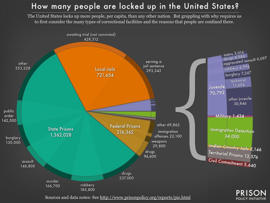
As we discuss in our briefing, this broader context pulls back the curtain and reveals answers to questions such as:
- How many people are behind bars for drug offenses?
- Which system holds more people: state prisons, federal prisons, or local jails?
- How many kids are locked up for offenses that most people don’t even think of as crimes?
- Where do we even have to look to find everyone who’s behind bars for immigration-related issues?
At the end of the day, locking up the more than 2.4 million people represented on this pie chart gives the United States the dubious distinction of being the number one incarcerator in the world. Policymakers and the public both have a pressing responsibility to take a good hard look at each slice of this pie and weigh any potential benefit of keeping those people behind bars against the significant social and fiscal cost.


Invaluable and compelling information – thank you!