Our best data visualizations in 2014
Our six favorite data visualizations from Prison Policy Initiative reports in 2014.
by Peter Wagner, December 29, 2014
2014 was a big year for ground-breaking data visualizations from the Prison Policy Initiative. These are our six favorites:
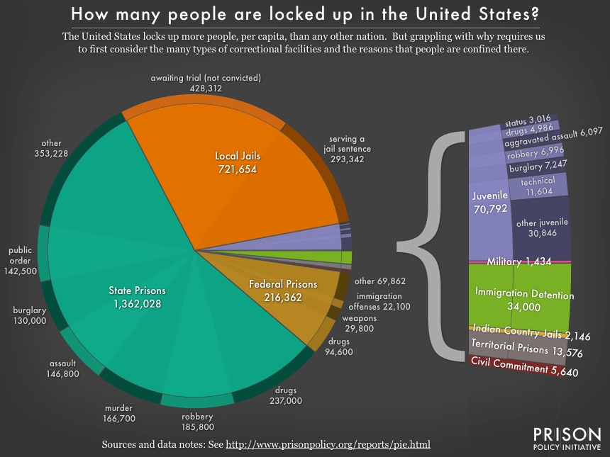 From: Mass Incarceration: The Whole Pie.
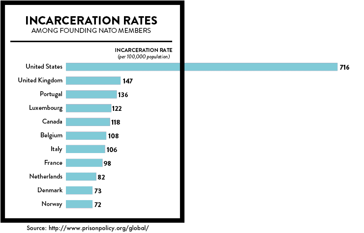
Josh Begley made this graph as part of our collaboration for States of Incarceration: The Global Context.
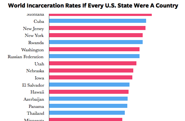
Josh Begley made this interactive graphic of “World Incarceration Rates If Every U.S. State Were A Country” as part of our collaboration for States of Incarceration: The Global Context.
From Tracking State Prison Growth in 50 States. (Also see larger or as raw numbers.)
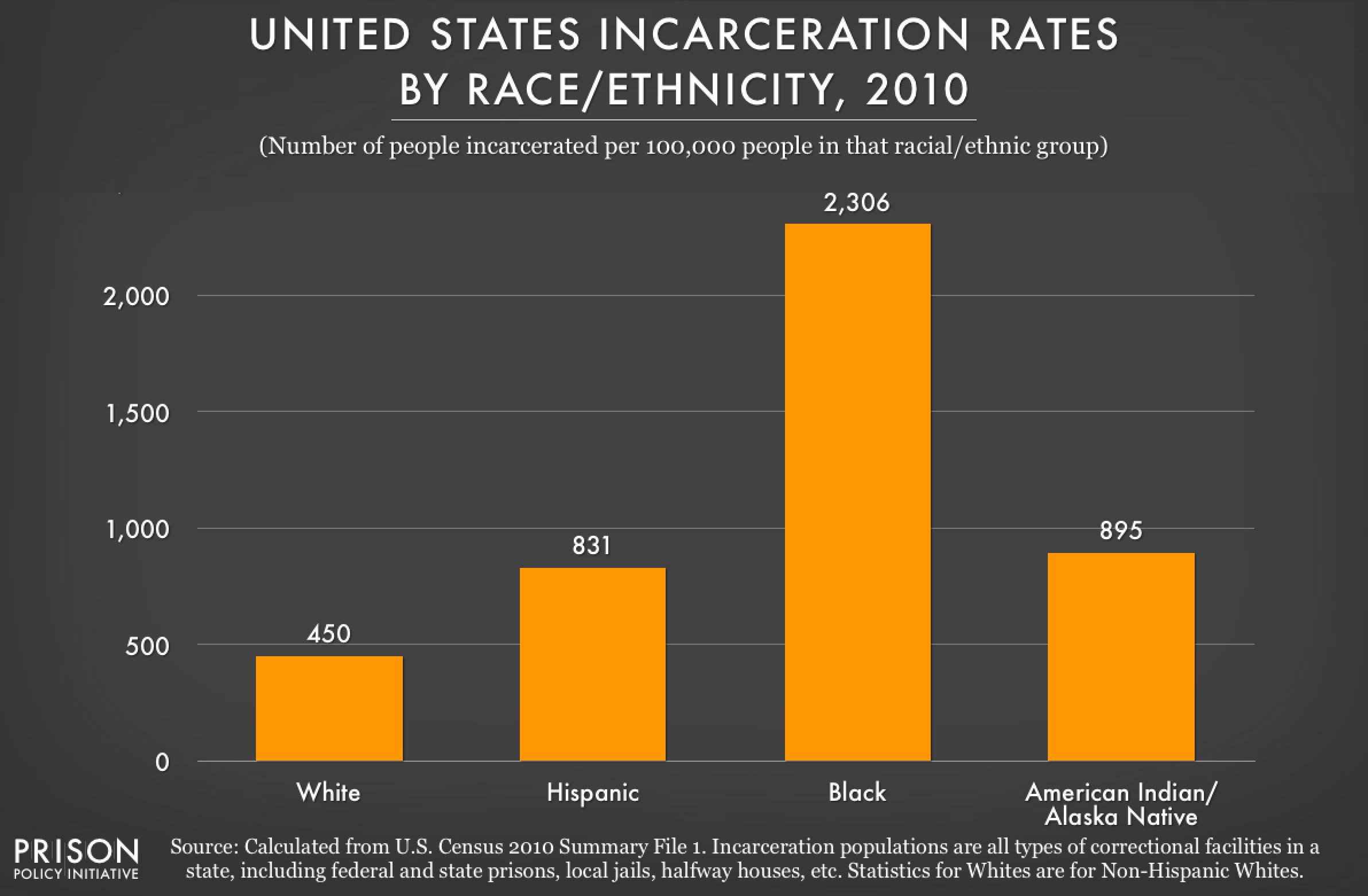
From: Breaking Down Mass Incarceration in the 2010 Census: State-by-State Incarceration Rates by Race/Ethnicity. This data, plus much more, is also available in 50 state profiles.
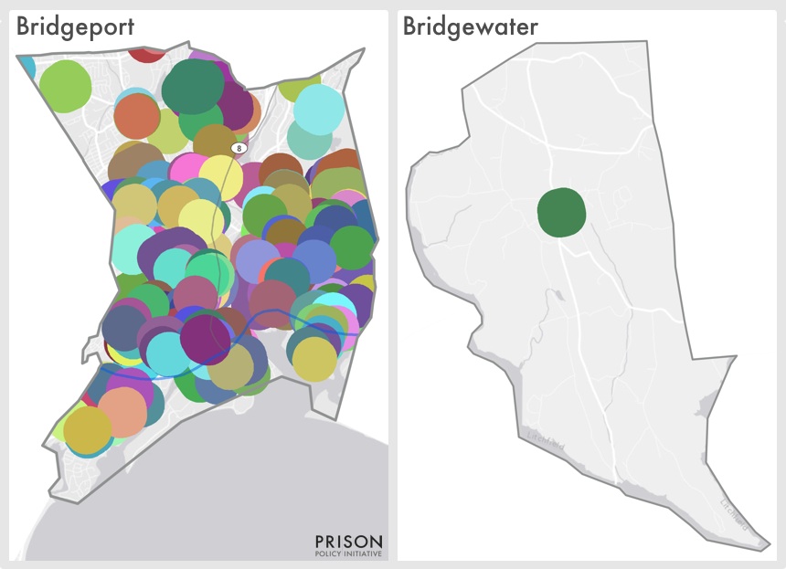
From Reaching too far: How Connecticut’s large sentencing enhancement zones miss the mark comes this map, showing that overlapping sentencing enhancement superzones blanket Bridgeport Connecticut, covering 92% of the city’s residents while more rural Bridgewater contains just one zone, covering 8% of the town’s residents.


