In Harvard Business Review: Audience Matters
The question isn't which data visualization technique is best; it's whether a visualization is even the best tool for the job.
by Peter Wagner, May 31, 2015
I was thrilled to see one of our graphs featured in Harvard Business Review in a great piece by Scott Berinato this week:
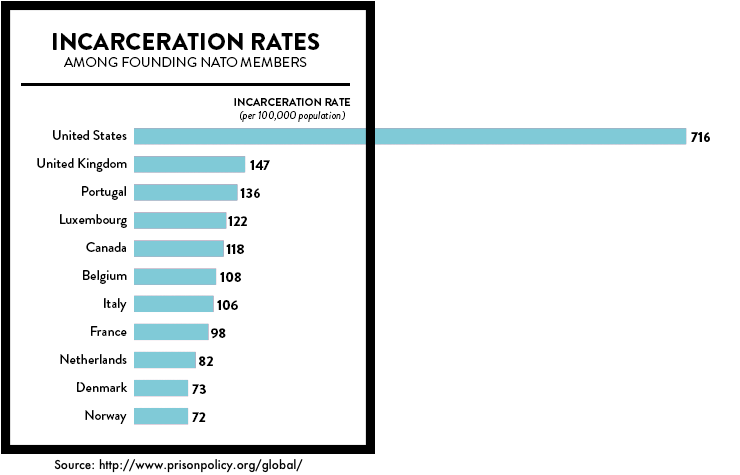
When we want to be persuasive, we are more effective if we buffer our case with visuals like charts and graphs. For example, I can tell you that the United States incarcerates five times as many people as most nations despite having similar crime rates. I can cite sources and link to essays and research. Or, I can show you this:
The immediate, visceral reaction we have to charts like this one, which was created by the Prison Policy Initiative, is no accident. Visual perception research has established the fact that visual information is powerfully and inescapably persuasive in a way that text and speech aren’t.
The Prison Policy Initiative has become known for our use of graphics to tell the story of mass incarceration, but what is so gratifying our being singled out in this way was that Berinato’s article wasn’t the typical discussion about the difference between a good data visualization and a bad one. Instead, he focused on the most basic point in communication that is all too often absent when talking about visual communication: Audience matters.
Basic factors like whether the audience agrees with you, their mood, and many other factors all change whether visualizations are even the right tool. For example:
The user’s attitude matters. Research from Ansul Pandey and colleagues at New York University indicates that the persuasive power of dataviz may not be perfectly universal. The success of a visualization seems to be dependent on the initial attitude of the person assessing it. When participants in their study didn’t have strong opinions about the message being conveyed, visuals persuaded effectively. But they were less effective when participants held strong opinions in opposition to the message being conveyed.
This makes sense. It takes more to convince someone who doesn’t believe you than someone who simply doesn’t know or doesn’t care. But there’s more. Those with stronger opposing views were more likely to be swayed when a disagreeable message was presented in the form of a table. Even now, good old-fashioned rows and columns sometimes outperform charts.
So while we’re proud of the diversity of communications skills we’ve developed over the last 14 years, what we think really matters most is the ability to tell an engaging story that inspires people to think and then to act.
The goal needs to always be on effective communication to the intended audience. None of this work is done for us, after all. It’s done for you.


I absolutely agree with Mr. Berinato´s observation in the Harvard Business Review about the importance of graphics. – Or should I say, Mr. Berinato clearly agrees with me. As I have been impressed with PPI for about 10 years. I am not an academic, but I have had personal experiences with incarceration. All the Prison Policy information is so easy to understand… (Only sometimes as in the graphic above you can´t believe what you are reading re. the U.S. figures compared to other nations, and it takes a moment in believe what you are reading/seeing.)
Thank you PPI. Glad the rest of the world is catching up with your fabulousness!