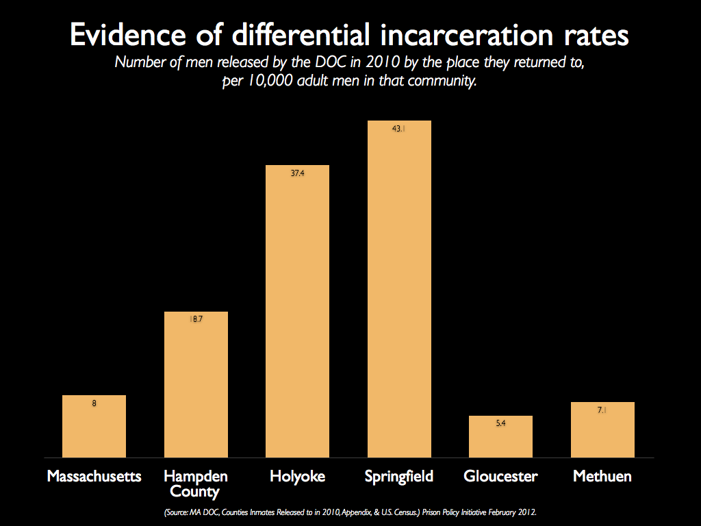
Data Source: MA DOC, Counties Inmates Released to in 2010, Appendix, & U.S. Census). (Graph: Prison Policy Initiative, 2012)
Evidence of differential incarceration rates: Number of men released by the DOC in 2010 by the place they returned to, per 10,000 adult men in that community.
