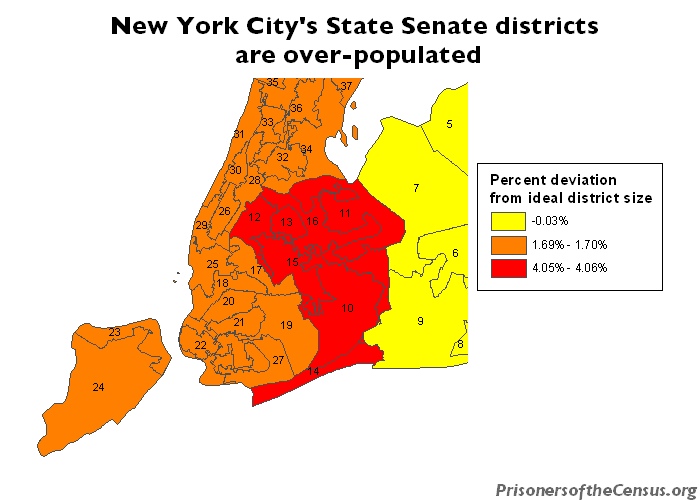
Data Source: U.S. Census, 2000 and Empire State Development. (Map: Peter Wagner, 2004)
This map originally appeared in Gerrymandering in New York.

Data Source: U.S. Census, 2000 and Empire State Development. (Map: Peter Wagner, 2004)
This map originally appeared in Gerrymandering in New York.