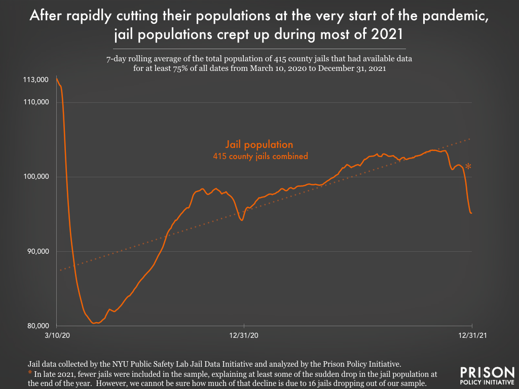
Data Source: Jail data collected by the NYU Public Safety Lab Jail Data Initiative and analyzed by the Prison Policy Initiative. The temporary population drops during the last weeks of May, August, and November 2020 and February 2021 are the result of more facilities than usual not being included in the dataset, rather than any known policy changes. (Graph: Emily Widra, 2022)
This graph originally appeared in State prisons and local jails appear indifferent to COVID outbreaks, refuse to depopulate dangerous facilities.
Jails across the country initially responded to COVID-19 by reducing the number of people detained, but that trend reversed direction in May 2020, only two months after the World Health Organization declared COVID-19 a global pandemic. Since May 2020, the data show a trend of jail populations slowly increasing. This graph contains aggregated data collected and provided by NYU’s Public Safety Lab and updates a graph in our October 2021 analysis. It includes all jails where the Lab was able to report data on March 10th and for at least 75% of the days in our research period, which ended December 31, 2021. (Data are not available for all facilities for all days, and the Lab interpolated missing data to fill those gaps.) This graph presents the data as 7-day rolling averages, which smooths out most of the variations caused by individual facilities not reporting population data on particular days. To see county level data for all 415 jails included in this analysis, see Appendix B.
