Tracking State Prison Growth in 50 States
Briefing by Peter Wagner
May 28, 2014
Over the last three decades of the 20th century, the United States engaged in an unprecedented prison-building boom that has given our nation the highest incarceration rate in the world. Among people with experience in criminal justice policy matters, the “hockey stick curve” of the national incarceration rate is well known; but until now more detailed data on the incarceration rates for individual states has been harder to come by. This briefing fills the gap with a series of more than 100 graphs showing prison growth (and sometimes decline) for every state in the nation to encourage states to confront how their criminal policy choices undermine our national welfare.
Ending the U.S. experiment with mass incarceration requires us to focus on state policy because individual states are the most active incarcerating bodies in the nation:
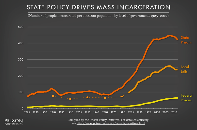 Figure 1: Graph showing the number of people (per 100,000 national population at that time) that is confined in state, local and federal correctional facilities from 1925 to the present. State prisons are the largest part. (See as raw numbers.)
Incarceration rates or incarceration numbers -- What's the difference?
Incarceration rates — which control for the significant differences in population size between U.S. states — allow meaningful comparisons between places or time periods of different population sizes.
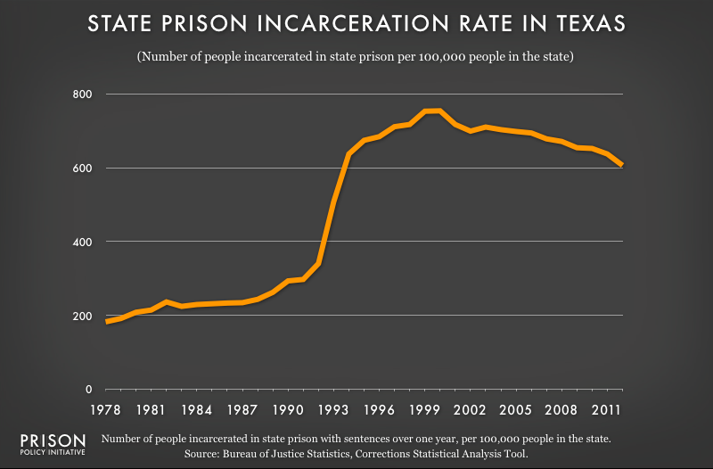
Generally, rates are more useful for policy analysis, but that’s not always the case. For example, while Texas’ incarceration rate has fallen over the last decade:
 The scale of that change is far less significant when we take into account the fact that the total number of people incarcerated in the state has remained relatively unchanged:
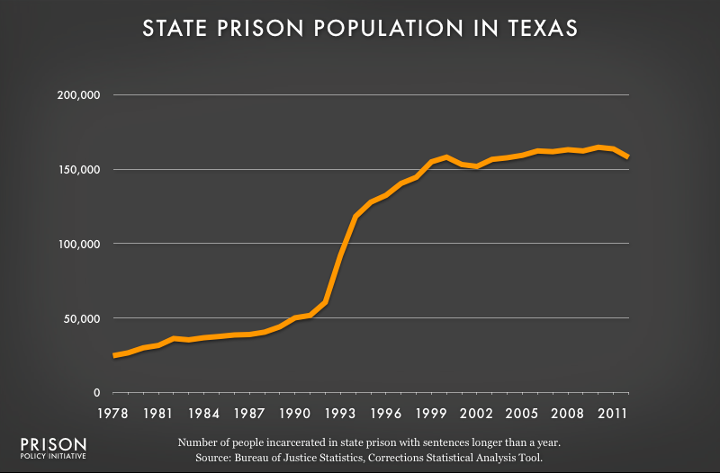 Texas has clearly made a policy choice to stop building more prisons as the state’s population has grown, but unlike New York and California, the state is not making the active choice to shrink its prison population.
Most (57%) people incarcerated in the United States have been convicted of violating state law and are imprisoned in a state prison. Another 30% are confined in local jails — which are outside the scope of this briefing — generally either for minor violations of state law or because they are waiting to be tried for charges of violating state law. Federal-level policy directly accounts for only the 10% of people behind bars in the U.S.; they have either been convicted of violating a federal law or are being detained by the immigration authorities and are awaiting potential deportation to anther country.1
In the aggregate, these state-level policy choices have been the largest driver of our unprecedented national experiment with mass incarceration, but not every state has contributed equally or consistently to this phenomenon. In the U.S., each state is responsible for making its own policy choices about which people to lock up and how for long. We can’t end our nation’s experiment with mass incarceration without grappling with the wide variety of state-level criminal justice policies, practices and trends.
Take, for example, the below comparison in Figure 2 of the incarceration rate for the United States (in yellow) with data from five individual states (in orange). We can see that Minnesota has long been less likely to incarcerate than other states, but also, like the country as a whole, markedly increased its use of imprisonment in the late 20th century. On the other extreme, Alabama and Louisiana have consistently maintained above-average rates of incarceration, and their use of the prison continues to grow.
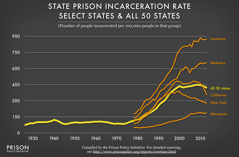 Figure 2: Focusing on only the national trend obscures the large and varied differences in both the pace and direction of state changes over time.
But another, contrary, trend is visible in figure 2: the recent rapid decline of imprisonment in the populous states of New York (starting in 1999) and California (beginning in 2006 and accelerating in 2009). The number of people incarcerated in those two states is so large that prison population changes within those states are, in large part, responsible for the recent drop in the national incarceration rate. So, while the United States incarceration rate has dropped for four years in a row, over that same time period 15 states have made policy choices that increased their individual incarceration rates.2
Although individual state comparisons are probably the most informative, regional data reveal significant patterns as well. For example, the South has consistently had a higher rate of incarceration than the other regions of the United States:
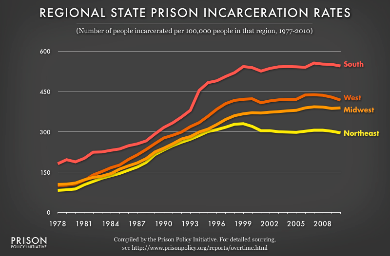 Figure 3: For the last 30 years, there have been clear regional differences in states' use of the prison, with the southern states relying on the prison the most often.
All of the yearly variations in these graphs indicate one of two things: either a change in criminal justice policy or, less often, a change in data collection practices. As always, a comprehensive understanding of the larger political and social climate in any given state is key to successfully interpreting incarceration data. For example, the large drop in California’s prison population is the result of both an order from the U.S. Supreme Court to reduce unconstitutional overcrowding in state prisons and a legislative change that sends people who would previously have gone to state prison to local jails, which are both exempt from the Supreme Court’s order and not included in graphs like this one. To be sure, the California prison population drop is still notable because the state’s prison population is dropping faster than the jail population is increasing, but the actual decline in the number of people incarcerated in California is not as large or as quick as the Supreme Court ordered.3
During the early part of the national prison boom, all of the states walked lockstep together to increase their use of the prison. In the last decade, some individual states gradually started to reverse direction. As more states realized that mass criminalization is counterproductive, the aggregate national figures also reversed. Two decades ago, the idea of reducing any given state’s use of incarceration would have required a great deal of imagination. Today, we have the benefit of being able to compare states that have made dramatically different criminal justice policy choices.
With this briefing we give state-level policymakers and advocates another opportunity to get involved, and to look at the larger context of incarceration in their state and to develop strategies that will make their communities stronger and safer. This briefing is just a starting point. It’s time to get going.
Additional graphs
The graphs made for this briefing are included in our profiles for each state:
and are available individually from this list:
- Incarceration rates in North Carolina, 1978-2012
- State prison population in North Carolina, 1978-2012
- Incarceration rates in South Carolina, 1978-2012
- State prison population in South Carolina, 1978-2012
- Jail incarceration rates in the United States, 1978-2012
- Jail population in the United States, 1978-2012
- State prison incarceration rates in the United States, 1978-2012
- State prison population in the United States, 1978-2012
- Federal prison incarceration rates in the United States, 1978-2012
- Federal prison population in the United States, 1978-2012
Methodology
This briefing contains several graphs with source information that is too extensive to fit on the graphs themselves, so we describe the sources here:
The graph “Regional state prison incarceration rates” uses three data sources to show the rates of incarceration from 1978 to 2010 for four regions of the U.S.:
- Regional incarceration rates, 1978 to 1983: Sourcebook of Criminal Justice Statistics, 1999, Table 6.27
- Regional incarceration rates, 1984 to 2009: Sourcebook of Criminal Justice Statistics Online, Table 6.29.2011
- Regional incarceration rates, 2010: Bureau of Justice Statistics, Prisoners in 2010 Appendix Table 9.
The two graphs entitled “State Policy Drives Mass Incarceration” are drawn from twelve sources to show incarceration numbers and rates from 1925 to 2012 for state, federal and local correctional facilities:
- State prison populations, 1925 to 1977: Bureau of Justice Statistics, Historical Statistics on Prisoners in State and Federal Institutions, Yearend 1925-86
- State prison populations, 1978 to 2012: Bureau of Justice Statistics, Corrections Statistical Analysis Tool (CSAT) - Prisoners showing the jurisdictional population in “State Institutions (Total)” that has a sentence of at least a year at the end of the given year. Notably, we used the “custom tables” option rather than the quick tables because it appeared that the quick tables did not contain some updates to the data.
- Jail populations in 1940, 1950, 1960, 1970 and 1980: Bureau of Justice Statistics, Historical Corrections Statistics in the United States, 1850 - 1984 Tables 4-1 and 4-2. (We used the columns marked “Census.” Jail data was not available for 1930.)
- Jail populations 1983 to 1999: Bureau of Justice Statistics, Sourcebook of Criminal Justice Statistics 1999, Table 6.21.
- Jail populations 2000 to 2011: Bureau of Justice Statistics Jail Inmates at Midyear 2011 - Statistical Tables, Table 1.
- Jail population 2012: Bureau of Justice Statistics Correctional Populations in the United States, 2012, Table 2.
- Federal prison populations, 1925 to 1977: Bureau of Justice Statistics, Historical Statistics on Prisoners in State and Federal Institutions, Yearend 1925-86
- Federal prison populations, 1978 to 2012: Bureau of Justice Statistics, Corrections Statistical Analysis Tool (CSAT) - Prisoners showing the jurisdictional population in “Federal Institutions” that has a sentence of at least a year at the end of the given year. Notably, we used the “custom tables” option rather than the quick tables because it appeared that the quick tables did not contain some updates to the data.
- Incarceration rates: We calculated the national incarceration rates for state prisons 1925-2012, federal prisons 1925-2012, and jails 1983-2012 using the total numbers above and estimates from the Census Bureau (described below). Because the state and federal prison data is for the last day of the reported year, we used population estimates for January 1 of the next year. The Census Bureau publishes population estimates as of July 1 of each year back to 1900, and monthly back to 1980. Where possible, we used the Census Bureau’s January 1 figures, and for years prior to 1980 we used the July 1 estimates to produce our own estimates for each January 1.
Because the jail data for 1983 to 2012 was based on counts as of June 30, we used the Census Bureau’s estimates for July 1 of each year. Because it was not immediately clear to us when jails data for the years 1940, 1950, 1960, 1970, and 1980 were collected, we used the jail incarceration rates as provided by Bureau of Justice Statistics, Historical Corrections Statistics in the United States, 1850 - 1984 Table 4-2.
With one exception, the source of the population data, and whether or not it is corrected to refer to the matching part of the year, makes only a minimal difference that is entirely invisible in a time series graph of this scale. That one exception is an unexpected jump in the total resident population in the 2000 Census, which was not reflected — to our knowledge — in the decennial Census figures of the late 1990s. We used the figure 274,024,000 for January 1, 2000 (to compare with the figures for year end 1999) and 282,162,411 for July 1, 2000 (to compare with the figures for mid-year 2000). The jump in the Census figures at this time results in a slight decrease in the incarceration rate for the year 2000 that is visible on the graphs, but which in reality is probably a statistical artifact from a slight over-reporting of the incarceration rate during the late 1990s. If demographers have an alternative way of addressing this problem, we’d be interested in hearing more about it. For the Census Bureau’s population estimates, we drew on:
The graph “State Prison Incarceration Rate: Select States & All 50 States” is drawn from these sources:
- 50 state prison population incarceration rate 1925-2012: See What Drives Mass Incarceration? State Policy above for our sources.
- State prison incarceration rates for Alabama, California, Louisiana, Minnesota, and New York, 1978-2012: Bureau of Justice Statistics, Corrections Statistical Analysis Tool (CSAT) - Prisoners showing the “Imprisonment rates of jurisdiction population - sentences greater than 1 year” for each state. Notably, we used the “custom tables” option rather than the quick tables because it appeared that the quick tables did not contain some updates to the data.
Footnotes
For an overview of the myriad of types of confinement in the United States, see the Prison Policy Initiative briefing by Peter Wagner and Leah Sakala, Mass Incarceration: The Whole Pie. ↩
Analysis of the incarceration rate data provided by Bureau of Justice Statistics, Corrections Statistical Analysis Tool (CSAT) for the years 2008 to 2012. During that time the following states saw a rise in their incarceration rates: Alabama up 2.7%, Arizona up 2.4%, Georgia up 0.2%, Idaho up 4.8%, Illinois up 8.2%, Kansas up 6.9%, Louisiana up 2.8%, Missouri up 2.4%, New Hampshire up 3.4%, Oregon up 1.6%, Pennsylvania up 2.3%, South Dakota up 5.6%, Tennessee up 0.9%, Utah up 3.4%, and West Virginia up 14.2% ↩
For example, in 2012, the California state prison populaton dropped by 14,600 and the jail population grew by 8,500. See Bureau of Justice Statistics, Correctional Populations in the United States 2012, Table 5. ↩
Recommended Reading:
Tracking Trump's criminal legal system moves
The Administration is making America's criminal legal system harsher, less effective, and even more unjust.

Research Library
We curate a searchable database of 4,000+ original research reports, organizing each entry by topic and adding brief summaries.

Mass Incarceration: The Whole Pie
The U.S. incarcerates nearly 2 million people. Where are they locked up and why? Read our report.

Bad Behavior
This national report explains how prison disciplinary policies manufacture misconduct and severly punish incarcerated people.