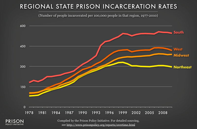
Data Source: For detailed sourcing, see http://www.prisonpolicy.org/reports/overtime.html#regional. (Graph: Peter Wagner, 2014)
This graph originally appeared in Tracking State Prison Growth in 50 States.
Stay Informed
Get the latest updates:

Data Source: For detailed sourcing, see http://www.prisonpolicy.org/reports/overtime.html#regional. (Graph: Peter Wagner, 2014)
This graph originally appeared in Tracking State Prison Growth in 50 States.
Get the latest updates: