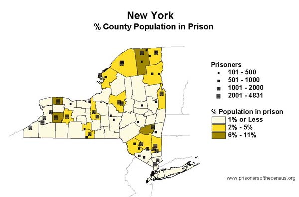
Data Source: New York Department of Correctional Services and U.S. Census, 2000. (Map: Rose Heyer, 2003)
This map originally appeared in Impact in New York.

Data Source: New York Department of Correctional Services and U.S. Census, 2000. (Map: Rose Heyer, 2003)
This map originally appeared in Impact in New York.