Stay Informed
Get the latest updates:

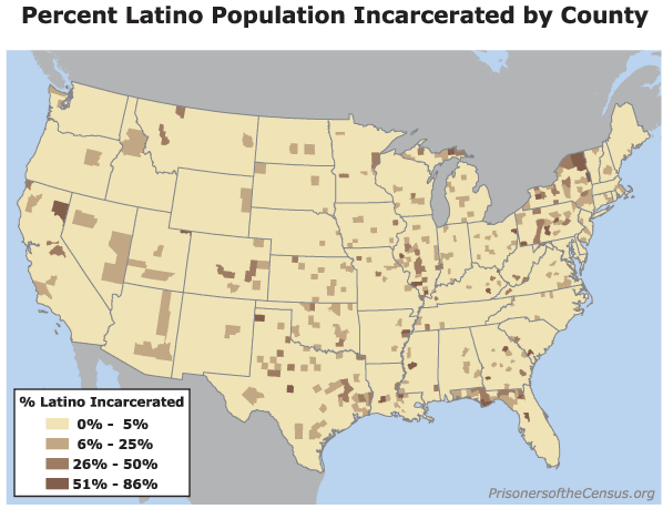
Data Source: U.S. Census 2000. (Map: Rose Heyer, 2004)
This map originally appeared in Too big to ignore: How counting people in prisons distorted Census 2000.
Get the latest updates:

Data Source: U.S. Census 2000. (Map: Rose Heyer, 2004)
This map originally appeared in Too big to ignore: How counting people in prisons distorted Census 2000.