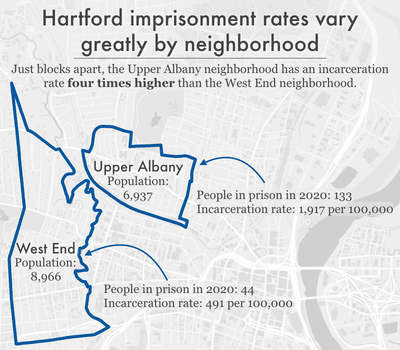
Data Source: Connecticut state redistricting data and U.S. Census Bureau P.L. 94-171 redistricting data processed by Peter Horton at Redistricting Data Hub. See report for full methodology. (Graph: Emily Widra, 2022)
This graph originally appeared in Where people in prison come from: The geography of mass incarceration in Connecticut.
The underlying data can be found in the report’s appendix tables.
