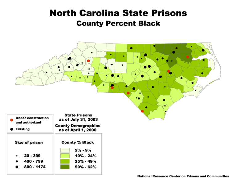
Data Source: North Carolina Department of Corrections and U.S. Census 2000. (Map: Rose Heyer, 2003)
This map originally appeared in North Carolina prison construction.
Stay Informed
Get the latest updates:

Data Source: North Carolina Department of Corrections and U.S. Census 2000. (Map: Rose Heyer, 2003)
This map originally appeared in North Carolina prison construction.
Get the latest updates: