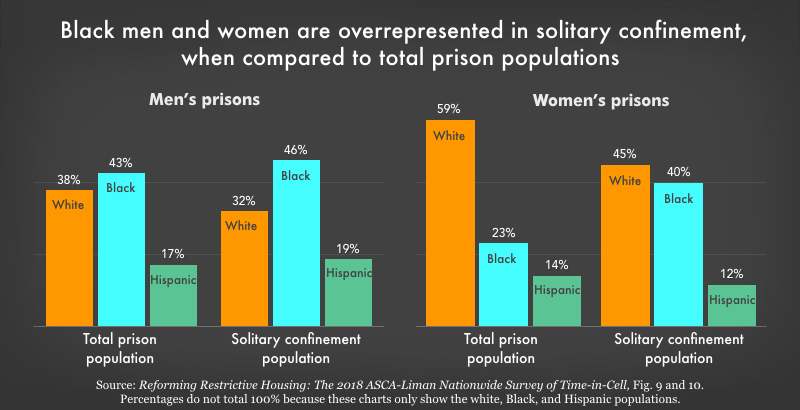
Data Source: Reforming Restrictive Housing: The 2018 ASCA-Liman Nationwide Survey of Time-in-Cell, Fig. 9 and 10. Percentages do not total 100% because these charts only show the white, Black, and Hispanic populations. (Graph: Wendy Sawyer, 2020)
This graph originally appeared in Visualizing the racial disparities in mass incarceration.


