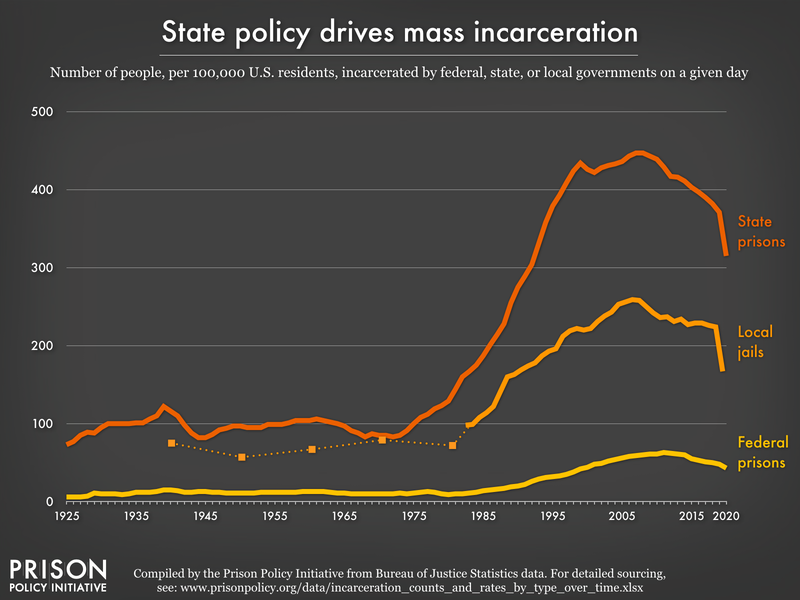
Data Source: Compiled from multiple Bureau of Justice Statistics data sets. See our blog post about the data. (Graph: Joshua Aiken and Peter Wagner, 2022)
This graph originally appeared in Updated charts provide insights on racial disparities, correctional control, jail suicides, and more.
The original version of the charts showing how state policy drives mass incarceration was published in Tracking State Prison Growth in 50 States. The raw numbers were updated through 2015 in Data update: Incarcerated population inching down with the sources listed at the bottom of that post. The total population figures necessary to calculate the incarceration rates are described in the methodology section of Tracking State Prison Growth in 50 States, with recent years added from the U.S. Census Bureau's population estimates


