Correctional Control:
Incarceration and supervision by state
By Bernadette Rabuy and Peter Wagner
June 1, 2016
Press release
This report is old. See our new version.
Prisons are just one piece of the correctional pie. When states are judged solely on their incarceration rates, we are ignoring the leading type of correctional control: probation. In fact, some of the states that appear to be least punitive are the most likely to put their residents under some other form of correctional control. Other states are making changes to their criminal justice systems that shift large numbers of people from one part of the correctional pie to another.
For the first time, this report aggregates data on all of the kinds of correctional control: federal prisons, state prisons, local jails, juvenile incarceration, civil commitment, Indian Country jails, parole and, lastly but importantly, probation. We make the data accessible in one nationwide chart and 100 state-specific pie charts.
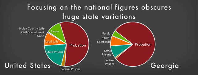 Figure 1. Thinking of the U.S. criminal justice system as one system can be a mistake. There are 50 state systems, plus one in each of the approximately 3,000 counties and often separate systems in the approximately 30,000 municipalities. These differences matter a great deal.
Incarceration rates do not always tell the complete story of the criminal justice system in each state. Notably, some of the states that are the least likely to send people to prison, such as Rhode Island and Minnesota, are among the most punitive when other methods of correctional control are taken into account. Other states that rank in the bottom half of incarceration rates nationwide, such as Ohio and Idaho, end up surpassing Louisiana1 — the state notorious for being the global leader in incarceration — in rates of correctional control. Georgia is punitive from any angle, as the only state that is both a top jailer and leader in probation.
Figure 2. “Correctional control” includes federal prisons, state prisons, local jails, juvenile incarceration, civil commitment, Indian Country jails, parole and probation. Rates are per 100,000 total population in that state, D.C., or, for the United States overall.
We find that this tremendous variation between the states is largely driven by differences in the use of probation, which is the leading form of correctional control nationally. A majority (56%) of people under the control of the American criminal justice system are on probation. Despite receiving little public attention, probation is a significant component of each state’s criminal justice system.2 While states vary when it comes to their use of prisons and jails, there is far greater variation in their use of probation. For example, in Nevada, 31% of the people under correctional control are on probation whereas in Georgia, a whopping 78% of people under correctional control are on probation.
Georgia’s rate of probation is more than double every other states’ rate of probation and greater than every other states’ total rates of correctional control.3 One reason why Georgia’s use of probation has ballooned to these levels is that the state uses privatized probation, which unnecessarily puts Georgia residents with extremely minor offenses on probation.4
Parole (a type of conditional release from prison) makes up 11% of the correctional population nationally and also varies widely between states, sometimes in ways unrelated to the size of the state prison population. We find that for every 100 people incarcerated in a state prison in that state:
- Maine has 1 person on parole.
- Florida has 4 people on parole.
- Arkansas has 117 people on parole.
- Pennsylvania has 198 people on parole.
Looking at correctional control rather than incarceration alone provides other surprises:
- A resident of Oregon is far less likely to be sent to state prison than a resident of Tennessee. But, overall, Oregon’s criminal justice system controls a larger share of its population than Tennessee’s does, even though Oregon has far less crime.5
- Pennsylvania residents are more than twice as likely to be under correctional control as Massachusetts residents, despite the two northeastern states’ similar crime rates.
- New Jersey, which has both one of the lowest crime rates and incarceration rates nationally, actually has a larger share of its population under correctional control than Virginia6 because of its higher than average use of probation.
- The capital of the “free world,” D.C., has a higher incarceration rate than any U.S. state and any nation on the planet.7
The data also establishes that the criminal justice system’s reach in this country is far more expansive than usually assumed, no matter what area of the country you look at. The Northeast has consistently incarcerated fewer people than other regions of the U.S. (although still more than most other countries). But this report reveals that those rates belie high levels of other correctional control; northeastern states such as Rhode Island and Pennsylvania have extremely high rates of probation.
Those interested in justice reform must pay attention to our systems of probation and parole because community supervision can either be a powerful tool for reform or a serious hindrance.8 States should ensure that probation is used as a true alternative to incarceration rather than as a net-widener that unnecessarily expands the criminal justice system’s reach to low-level crimes.9 Reforms should aim to reduce the number of people under correctional control rather than simply transfer people to other pieces of the correctional pie.10
This report provides another metric for understanding where your state falls within the national landscape of mass incarceration and shows that some states like Rhode Island and Minnesota still have plenty of room for improvement. The state-specific breakdowns suggest where state advocates and policymakers might start when developing proposals for reform. And surely the data makes clear that — no matter what the state — it would be wise to address the large number of people on probation.
Additional graphs
The graphs made for this briefing are included in our profiles for each state:
and are available individually from this list:
- District of Columbia incarceration pie chart 2016
- District of Columbia correctional control pie chart 2016
Acknowledgments
This report was made possible thanks to the generous support of the Public Welfare Foundation and the contributions of individuals across the country who support justice reform. The authors would like to thank Jo Balme of the organization’s Young Professionals Network for making the interactive chart possible and Bob Machuga for creating the covers. Jacob Mitchell of the Young Professionals Network and Jordan Miner provided invaluable assistance with the 50 state pie charts. The authors would also like to thank the rest of the Prison Policy Initiative staff who helped the authors gather research.
About the authors
Bernadette Rabuy is the Senior Policy Analyst at the Prison Policy Initiative. Bernadette produced the first comprehensive national report on the video visitation industry, Screening Out Family Time: The for-profit video visitation industry in prisons and jails, finding that 74% of local jails that adopt video visitation eliminate traditional in-person visits. Her research has played a key role in protecting in-person family visits in jails in Portland, Oregon and the state of Texas. In her other work with the Prison Policy Initiative, Bernadette has worked to empower the criminal justice reform movement with key but missing data through the annual Mass Incarceration: The Whole Pie reports and, most recently, Detaining the Poor: How money bail perpetuates an endless cycle of poverty and jail time.
Bernadette is on Twitter at @BRabuy
Peter Wagner is an attorney and the Executive Director of the Prison Policy Initiative. He co-founded the Prison Policy Initiative in 2001 in order to spark a national discussion about the negative side effects of mass incarceration. His research and advocacy on the issue of prison gerrymandering have led four states and more than 200 local governments to end prison gerrymandering.
Some of his most recent work include exposing the entire mass incarceration pie, uncovering that prisons are disproportionately built in White areas, and working with Josh Begley to put each state’s overuse of incarceration into the international context.
He is @PWPolicy on Twitter.
Background and recommended reading
The inspiration for this report came from the many requests we receive for state-by-state versions of our popular report, Mass Incarceration: The Whole Pie, that shows how many people are locked up in the U.S., in which type of correctional facilities, and for what offenses. This is the first report we are aware of to aggregate all the various forms of correctional control, but others have done groundbreaking research on probation and parole that is worth reading if you want to learn more about correctional supervision and the role that it has played in criminal justice expansion and — rarely — contraction. We recommend the following groundbreaking research:
- For more on how the use of probation varies by state, see: Michelle S. Phelps, “Mass probation: Toward a more robust theory of state variation in punishment,” Punishment & Society (2016).
- For more on the relationship between incarceration and probation, see: Michelle S. Phelps, “The Paradox of Probation: Community Supervision in the Age of Mass Incarceration,” Law & Policy Vol. 35(1-2): 51-80 (2013).
- For more on parole release and revocation in each state, see: Mariel E. Alper, By the Numbers: Parole Release and Revocation Across 50 States (Minneapolis, MN: University of Minnesota Robina Institute of Criminal Law and Criminal Justice, 2016).
- For more on probation revocation, see the University of Minnesota’s Robina Institute of Criminal Law and Criminal Justice’s Probation Revocation Project.
Data sources and process
For all the data we use in this report, the interactive chart, and the 100+ pie charts, see our data appendix and read below for more information about how this data was collected and prepared.
Federal prisons: While federal prosecutions are nominally the result of federal policy, we attributed federal convictions to individual states in part because federal prosecutions are of state residents and in part because federal prosecutions are often coordinated with state prosecutors and state law enforcement.
This data — which has never been published before — has been years in the making. We developed a ratio of the state of legal residence for the Bureau of Prisons population as of April 3, 2010 and applied it to the total Bureau of Prisons population as provided on the Bureau of Prisons population statistics website on April 26, 2016. The raw data behind our ratio of the state of legal residence is from April 3, 2010 because we originally collected this data in the context of our research on prison gerrymandering. The data was received from the Bureau of Prisons via a Freedom of Information Act request made with the assistance of U.S. Senator Roland Burris. When developing the ratio of state of legal residence, we ignored those convicted in U.S. territories such as Puerto Rico, and we applied the known state and D.C. ratios to the group of defendants for whom the state of legal residence was unknown. For the total Bureau of Prisons population, we included those under BOP custody and those in privately managed facilities and excluded those in “other types of facilities.” We used January 1, 2016 population estimates for calculating the rates.
State prisons: Prisoners in 2014, Table 2 reporting data for December 31, 2014. We used January 1, 2015 population estimates for calculating the rates.
Local jails: We used the sum of the confined population from the Annual Survey of Jails reporting data for June 30, 2014. We used July 1, 2014 population estimates for calculating the rates. To avoid double counting people held in local jails on behalf of state and federal prison systems, we removed state and federal prisoners being held in local jails using Prisoners in 2014, Table 9 reporting data for December 31, 2014.
Juveniles: Easy Access to the Census of Juveniles in Residential Placement: 1997-2013, “Placement Status by State, 2013” table reporting data for October 23, 2013. For this report, we used the sum of the “committed” and “detained” columns, but not the “diversion” column. This is a definition of juvenile incarceration that is more expansive than the one used for Mass Incarceration: The Whole Pie, where we only included youth detained in detention centers, long-term secure facilities, and reception/diagnostic centers and did not include youth held in various other types of facilities away from home. Unfortunately, the necessary state-specific data does not exist to allow us to make this more nuanced distinction for each state. We also caution other users of this data that while the 2013 data used in this report is the most recent available, some states and D.C. are making big changes to their juvenile justice systems so this data may not reflect some important reforms in some places.
In contrast with other researchers who need to only compare juvenile incarceration between states, we needed to compare juvenile incarceration to the rates of correctional control in each state. We therefore had to calculate incarceration rates not per 100,000 people age 17 or younger, but per 100,000 in the overall population. We used January 1, 2014 population estimates for calculating the rates. Note that people age 17 or younger who were prosecuted in criminal court as if they were adults are included in the prison, probation, and parole counts and rates provided in this report. However, people age 17 or younger who were under the jurisdiction of a juvenile court or agency and on probation or parole are not included in the probation and parole counts and rates provided in this report because that data was not available.
Civil commitment: (At least 16 states and the federal government operate facilities for the purposes of detaining people convicted of sexual crimes after their sentences are complete. These facilities and the confinement there are technically civil, but in reality are quite like prisons. They are often run by state prison systems, are often located on prison grounds, and most importantly, the people confined there are not allowed to leave.): Deidre D’Orazio, Ph.D., Sex Offender Civil Commitment Programs Network Annual Survey of Sex Offender Civil Commitment Programs, 2014. Because this report is state-based, our data and calculations do not include the 62 people in federal civil commitment. We used July 1, 2014 population estimates for calculating the rates.
Indian Country Jails (correctional facilities operated by tribal authorities or the U.S. Department of the Interior’s Bureau of Indian Affairs): We used the average daily population in June 2014 as reported in Jails in Indian Country, 2014. We chose to use average daily population because of the large difference between the population on the survey date and the peak date in June suggested a lot of day-to-day variability. We used July 1, 2014 population estimates for calculating the rates.
Parole: Probation and Parole in the United States, 2014, Appendix Table 5 reporting data for December 31, 2014. To avoid double counting people on parole who are also in jail or prison, we removed parolees who are in jail and parolees who are in prison by using the national ratio of people with multiple correctional statuses from Correctional Populations in the United States, 2014, Tables 1 and 6 reporting data for December 31, 2014. Using Tables 1 and 6, we find that 96.1% of parolees are only on parole and not also in jail or prison. Parolees who were also on probation are shown under parole, not probation. We used January 1, 2015 population estimates for calculating the rates.
The federal government and D.C. have largely eliminated parole. Parole is not used for individuals who commit D.C. code offenses on or after August 5, 2000, the year that parole was eliminated for D.C. Instead, people who commit D.C. code offenses have determinate sentences with a period of “supervised release” to follow. The number and rate for D.C. parole in this report are for supervised release. Federal “supervised release” is not included in this report. We summed the number of people under parole supervision in each state and D.C. and used a population estimate for the entire U.S. population to calculate the parole rate provided for “United States (overall)” shown in the interactive chart. People age 17 or younger who were prosecuted in criminal court as if they were adults are included in the parole counts and rates provided in this report.
To compare each state’s use of parole against their state prison population, we divided the parole population by the state prison population and multiplied the result by 100 so the comparison would be the number of people on parole per 100 people in state prison. The results for each state is in the data appendix.
Probation: Probation and Parole in the United States, 2014, Appendix Table 4 reporting data for December 31, 2014. According to the “Probation: Explanatory notes” from Probation and Parole in the United States, 2014, Georgia and Maryland report the number of probation cases rather than the number of individuals on probation so the Georgia and Maryland probation counts and rates provided in this report might be overestimates.
To avoid double counting people on probation who are also in jail, in prison, or on parole in more than one category, we removed probationers who are in jail, probationers who are in prison, and probationers on parole by using the national ratio of people with multiple correctional statuses from Correctional Populations in the United States, 2014, Tables 1 and 6 reporting data for December 31, 2014. Using Tables 1 and 6, we find that 98.42% of probationers are only on probation and not also in jail or prison or on parole. Probationers who were also on probation are shown under parole, not probation. People age 17 or younger who were prosecuted in criminal court as if they were adults are included in the probation counts and rates provided in this report. We used January 1, 2015 population estimates for calculating the rates.
Population data: In order to calculate rates per 100,000 total population — and note, our data will be different than other calculations that are per 100,00 adults or per 100,000 youth — we used or made population estimates that were as close to the date of our source data as possible. For example, for June 30 correctional population figures, we used July 1 Census Bureau estimates. For December 31 correctional population figures, we created January 1 estimates by averaging the nearest July 1 estimates, and for January 1, 2016 estimates, we added the population change during 2014 to our January 1, 2015 population estimate. As a benefit to other researchers, we have made this data available in a population appendix .
On definitions
Several data definitions and clarifications may be helpful to researchers reusing this data in new ways:
- Community supervision: We refer to probation and parole as community supervision.
- Parole: Parole includes supervised release so, for example, those convicted of D.C. offenses on or after August 5, 2000 and serving terms of supervised release are included in this report under D.C. parole. For more extensive definitions of probation and parole, see page 2 of Probation and Parole in the United States, 2014.
- Incarceration rate: In the report text, when we say “incarceration rate,” we are including state prison incarceration, federal prison incarceration of people who are legal residents of that state or D.C., and local jail incarceration. We did not include juvenile incarceration so when we say, for example, that D.C. has a higher incarceration rate than all 50 states, we are including their rate of federal prison and local jail incarceration and are excluding juvenile incarceration in D.C. Juvenile incarceration is included in the interactive chart.
Footnotes
University of Minnesota Sociology professor Michelle S. Phelps finds that one explanation for why Louisiana appears to have a relatively lower probation rate may be due to underreporting of misdemeanor probation. In fact, Phelps finds that Louisiana ranks higher in its rate of probation relative to other states if only felony probationers are compared. Phelps contacted states that have high incarceration rates but low probation rates by phone, and many said that misdemeanants were not included in the probation counts provided to the Bureau of Justice Statistics (BJS). Both the probation data in this report and in Phelps’ article are from BJS. See pages 11-13 of Michelle S. Phelps, “Mass probation: Toward a more robust theory of state variation in punishment,” Punishment & Society (2016). ↩
The relationship between incarceration and probation is complicated. With mass incarceration, we might have expected the probation rate to decrease with more states opting for prison time rather than probation, what is typically an alternative to incarceration and might be seen as a lenient approach. Instead, Sociology professor Michelle S. Phelps finds from 1980 to 2010, both the probation and incarcerated populations increased, regardless of trends in crime. See pages 63-64 of Michelle S. Phelps, “The Paradox of Probation: Community Supervision in the Age of Mass Incarceration,” Law & Policy Vol. 35(1-2): 51-80 (2013). Phelps’ analysis suggests that generally, expanding probation rates leads to slightly greater incarceration rates, but that this relationship varies substantially by state. See pages 53 and 66-69 of “The Paradox of Probation.” ↩
To be sure, according to the Bureau of Justice Statistics, Georgia probation counts keep track of the number of probation cases rather than the number of individuals on probation, which could be causing some over-counting. While probation in Georgia has been dropping, Georgia’s probation rate is still extreme in comparison to every other state’s probation rate. ↩
For example, people convicted of misdemeanor traffic offenses can be put on probation in Georgia. ↩
Oregon had a crime rate of 3,111 per 100,000 people in 2014, much lower than Tennessee’s crime rate of 3,669 per 100,000 people in the same year. See Table 5 of the Federal Bureau of Investigation’s Crime in the United States 2014. ↩
Similarly to her findings in Louisiana, Sociology professor Michelle S. Phelps finds that one explanation for why Virginia appears to have a relatively lower probation rate may be due to underreporting of misdemeanor probation. In fact, Phelps finds that Virginia ranks higher in its rate of probation relative to other states if only felony probationers are compared. Phelps contacted states that have high incarceration rates but low probation rates by phone, and many said that misdemeanants were not included in the probation counts provided to the Bureau of Justice Statistics (BJS). Both the probation data in this report and in Phelps’ work are from BJS. See pages 11-13 of Michelle S. Phelps, “Mass probation: Toward a more robust theory of state variation in punishment,” Punishment & Society (2016). ↩
According to the Institute for Criminal Policy Research’s World Prison Brief, Seychelles has an incarceration rate of 799 per 100,000. Even D.C.’s federal prison incarceration rate (820 per 100,000) alone is higher than Seychelle’s incarceration rate. See the Prison Policy Initiative 2014 report, States of Incarceration: The Global Context to see how each U.S. state’s incarceration rate compares to the rates of every country with a total population of at least 500,000 people. See the following Politifact article for why excluding extremely small countries provides for a more meaningful comparison: Jon Greenberg, “Bernie Sanders: The United States has ‘more people in jail than any other country on Earth’,” Tampa Bay Times Politifact, October 13, 2015. ↩
Unnecessarily onerous probation and parole conditions can funnel more people into incarceration. National statistics show that among those exiting probation and parole in 2014, over a third failed to successfully complete their supervision. See tables 3 and 5 of Probation and Parole in the United States, 2014 for probation and parole exit and completion rates. According to the Bureau of Justice Statistics, 9% of federal prison admissions were for parole violations and 28% of state prison admissions were for parole violations. See Table 7 of Prisoners in 2014. Some states are able to differentiate between people who have their probation or parole revoked for a new crime versus a technical violation of the conditions of their supervision whereas other states can’t provide this critical data. The Urban Institute’s state prison population forecaster allows you to see the impact of reducing prison admissions and length of stay for revocations for 15 states. ↩
Sociology Professor Phelps finds probation is more of a net-widener than an alternative to incarceration when it is frequently used for misdemeanors and where there are high rates of revocation. See page 4 of Michelle S. Phelps, “Mass probation: Toward a more robust theory of state variation in punishment,” Punishment & Society (2016). ↩
Sociology Professor Phelps analyzes reforms in Kansas (Senate Bill 123 in 2003) and Michigan (Michigan Community Corrections Act) in her article, The Paradox of Probation, to show how probation can be used to effectively reduce the prison population as well as, in unsuccessful reform efforts, to expand it. See pages 70-71 of Michelle S. Phelps, “The Paradox of Probation: Community Supervision in the Age of Mass Incarceration,” Law & Policy Vol. 35(1-2): 51-80 (2013). ↩
Recommended Reading:

50 state incarceration profiles
All of our recent reports about prison/jail growth, racial disparities, and more, re-organized by state.

The rapid & unregulated growth of e-messaging in prisons
It can strengthen connections, but instead has been used to sap money from incarcerated people.

Incarceration and supervision by states
Probation and parole are the leading forms of mass punishment in America.

Prison Gerrymandering Project
We are leading the movement to protect our democracy from the Census Bureau's prison miscount.