Our best data visualizations in 2015
2015 was another big year for ground-breaking data visualizations from the Prison Policy Initiative. These are our 10 favorites.
by Peter Wagner and Bernadette Rabuy, December 29, 2015
2015 was another big year for ground-breaking data visualizations from the Prison Policy Initiative. These are our 10 favorites:
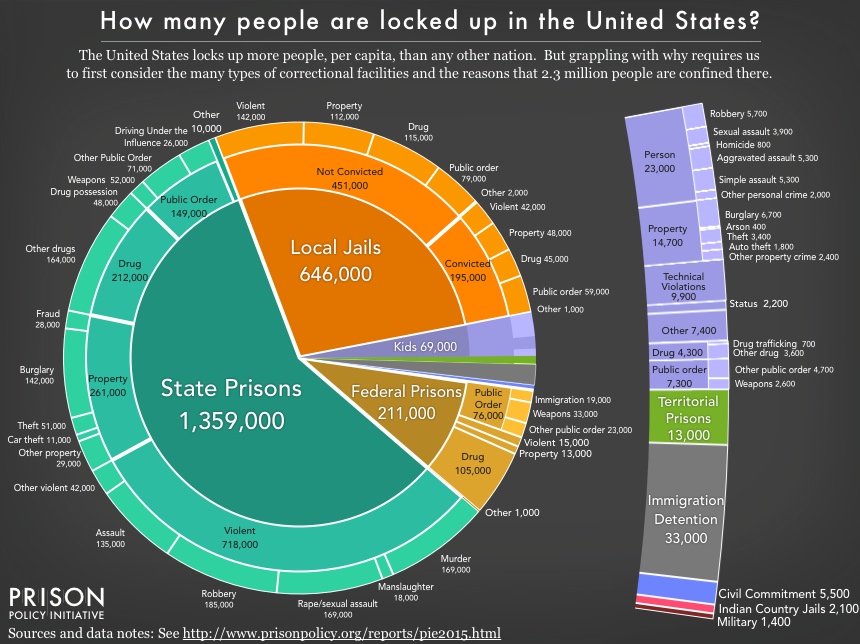
From: Mass Incarceration: The Whole Pie 2015 where we offer some much needed clarity on the size and scope of mass incarceration by piecing together this country’s disparate systems of confinement.
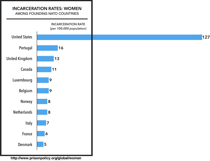
We made this graph comparing the United States’ use of prisons and jails for women with its international peers for our report States of Women’s Incarceration: The Global Context.
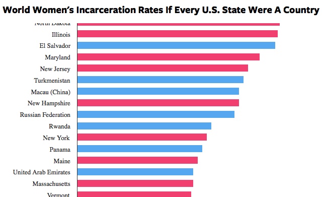
We made this interactive graphic of “World Women’s Incarceration Rates If Every U.S. State Were A Country” for our collaboration States of Women’s Incarceration: The Global Context with Russ Immarigeon. See also, in the full report, our graph of the growth in women’s incarceration in prisons and jails from 1910 to last year.
As part of our collaboration with the Justice Policy Institute on The Right Investment? Corrections Spending in Baltimore City we made an interactive map showing how much the state of Maryland spends each year to lock up residents of each community in Baltimore and suggesting better investments.
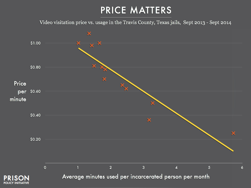
That price-gouging of families of incarcerated people reduces use of video visitation is just one of the findings from Screening Out Family Time: The for-profit video visitation industry in prisons and jails. (And don’t miss the full report for graphical illustrations of how video visitation works and why grainy video chats are not the same as in-person visitation.)
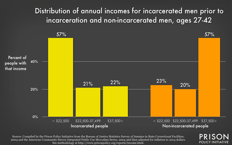
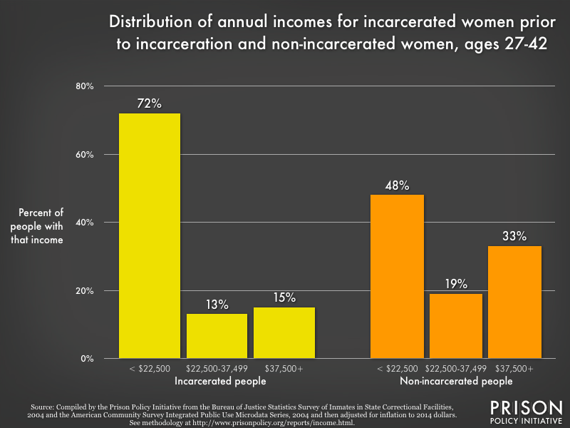
These two graphs were produced for our report uncovering the pre-incarceration incomes of the imprisoned by gender, race, and ethnicity and comparing them to people of similar ages of people on the outside. For the whole report, see Prisons of Poverty: Uncovering the pre-incarceration incomes of the imprisoned
So how large is 1,500 feet? That distance isn’t just a number; it’s taller than the Eiffel Tower, longer than 5 football fields, and it’s more than enough to blanket all of Connecticut’s urban areas in overlapping sentencing enhancement zones. With the help of two of our interns, Elydah Joyce and Arielle Sharma, and a member of our Young Professionals Network, Jacob Mitchell, we produced an animation that we expect will help other states follow Connecticut’s lead in rolling back the worst laws passed at the height of the anti-drug hysteria of the 1980s.
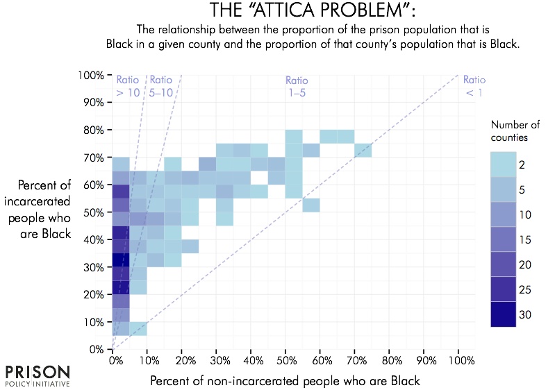
This chart from The Racial Geography of Mass Incarceration shows that in many counties Black people in prison are overrepresented compared to the portion of Black people in the free population. Notably, many of these counties are concentrated in the far left of the graph, where Blacks make up 20% to 60% of the prison populations yet less than 5% of the free population.
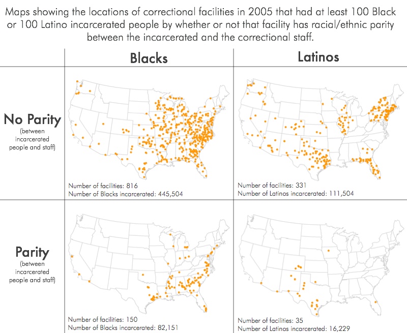
These maps from In prisons, Blacks and Latinos do the time while Whites get the jobs show that most correctional facilities with more than 100 incarcerated Blacks or Latinos are located in places where hiring Black and Latino staff in proportional numbers to the incarcerated population is extremely difficult. The small number of facilities that have such parity are, unsurprisingly, located in parts of the country with large populations of Black or Latino residents.


