Our best data visualizations in 2016
2016 was another big year for powerful data visualizations from the Prison Policy Initiative. These are our 10 favorites.
by Peter Wagner and Wendy Sawyer, December 30, 2016
2016 was another big year for powerful data visualizations from the Prison Policy Initiative. These are 10 of our favorites:
1. The “whole pie”
We updated our most famous data visualization for 2016, Mass Incarceration: The Whole Pie:
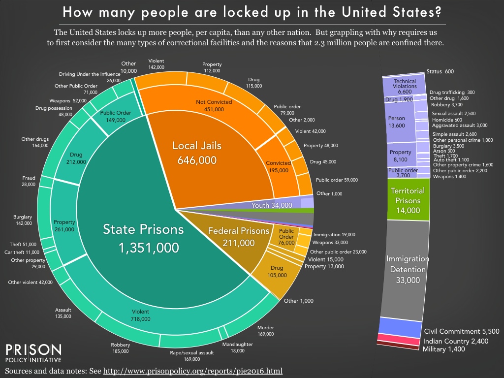
This year’s report included four slideshows of additional detail on different parts of the carceral system and some of the state-to-state comparisons.
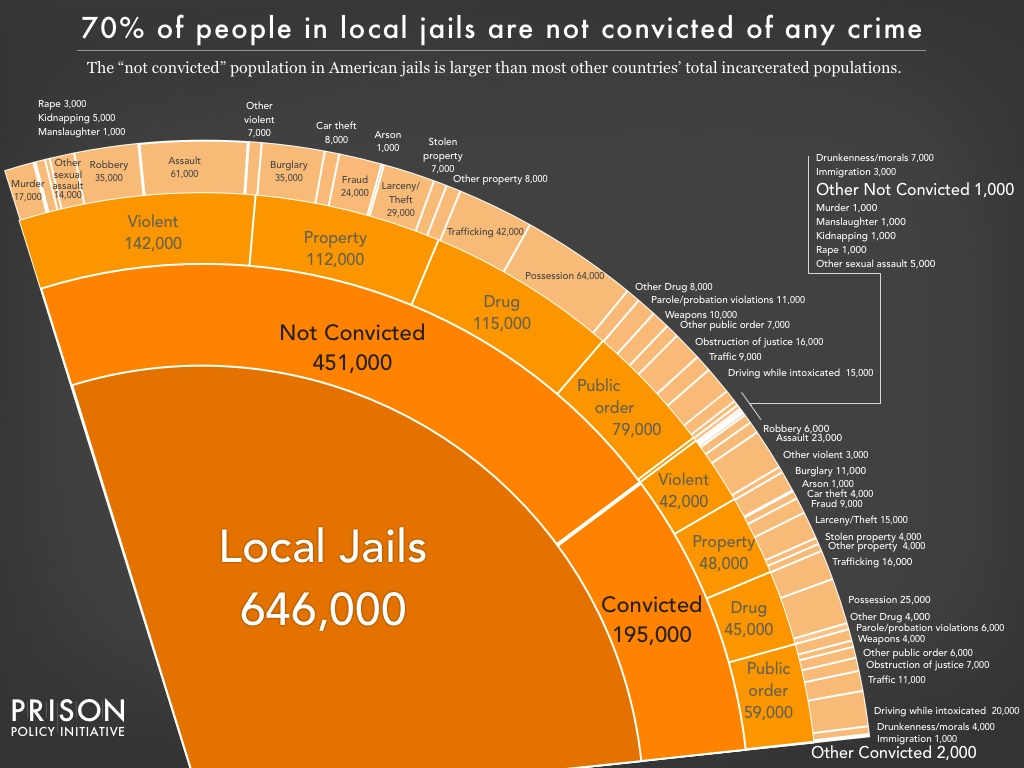
Perhaps the most exciting addition was the report’s detailed dive into the population of people confined in jails, most of whom are legally innocent:
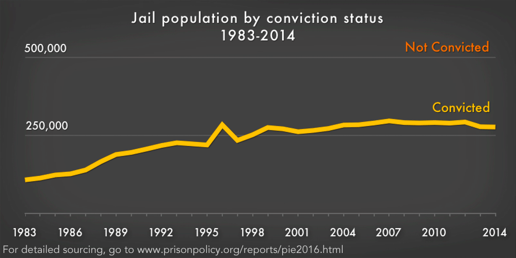
In a major update to our graph first produced last year, we powerfully illustrated that virtually all of the growth in the jail population has been in the number of legally innocent people who are detained in jails:
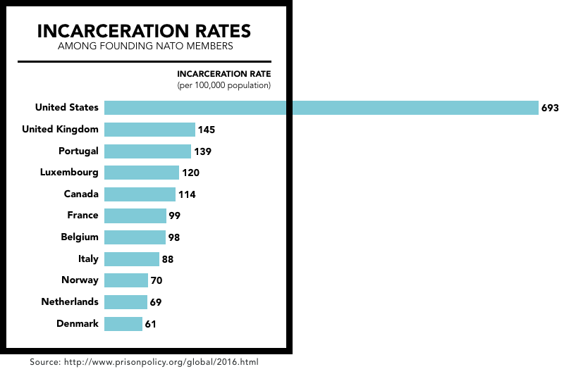
2. Every U.S. state is out step with the rest of the world
The Governors of 49 states can look at Louisiana and feel like their state is an enlightened bastion of moderation, at least on incarceration. But how do each of the 50 states compare to the countries of the world? Badly.

On the theory that comparing Iowa to El Salvador (a country that recently endured a civil war and now has one of the highest homicide rates in the world) might not be fair, the report includes a graphical comparison of the U.S. incarceration rate to that of its closest allies, the founding members of NATO:
3. Looking at probation
Some of the seemingly less punitive states are actually the most likely to put their residents under some other form of correctional control, finds our report Correctional Control: Incarceration and supervision by state. The report builds off Mass Incarceration: The Whole Pie, to provide the big picture of mass incarceration to produce versions of the pie chart for each state.
The centerpiece of the report is an interactive chart that ranks each state and D.C. by rate of total correctional control, which includes incarceration, probation, and parole.
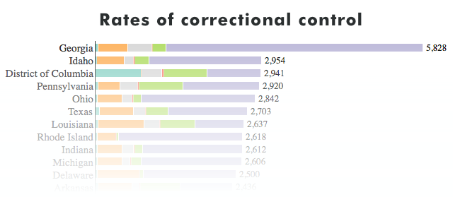
The report also includes an animation that illustrates just how dramatic the differences are between the states:
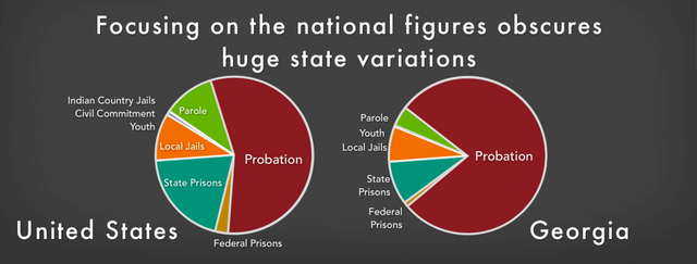 Thinking of the U.S. criminal justice system as one system can be a mistake. There are 50 state systems, plus one in each of the approximately 3,000 counties and often separate systems in the approximately 30,000 municipalities. These differences matter a great deal.
4. Bail perpetuates poverty
In May, Bernadette and Dan unlocked rare government data to show that the ability to pay money bail is impossible for too many defendants because it represents eight months of a typical defendant’s income. Detaining the Poor also showed how much harder it is for women and people of color to afford bail.
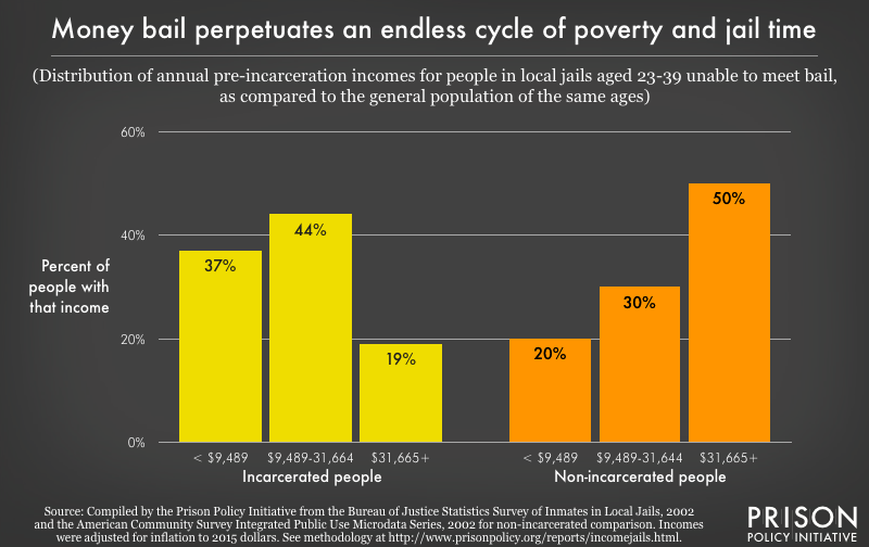 People in local jails unable to meet bail are concentrated at the lowest ends of the national income distribution, especially in comparison to non-incarcerated people. As this graph shows, 37% had no chance of being able to afford the typical amount of money bail ($10,000) since their annual income is less than the median bail amount.
The report also includes a very helpful illustration of the path from arrest to pretrial detention:
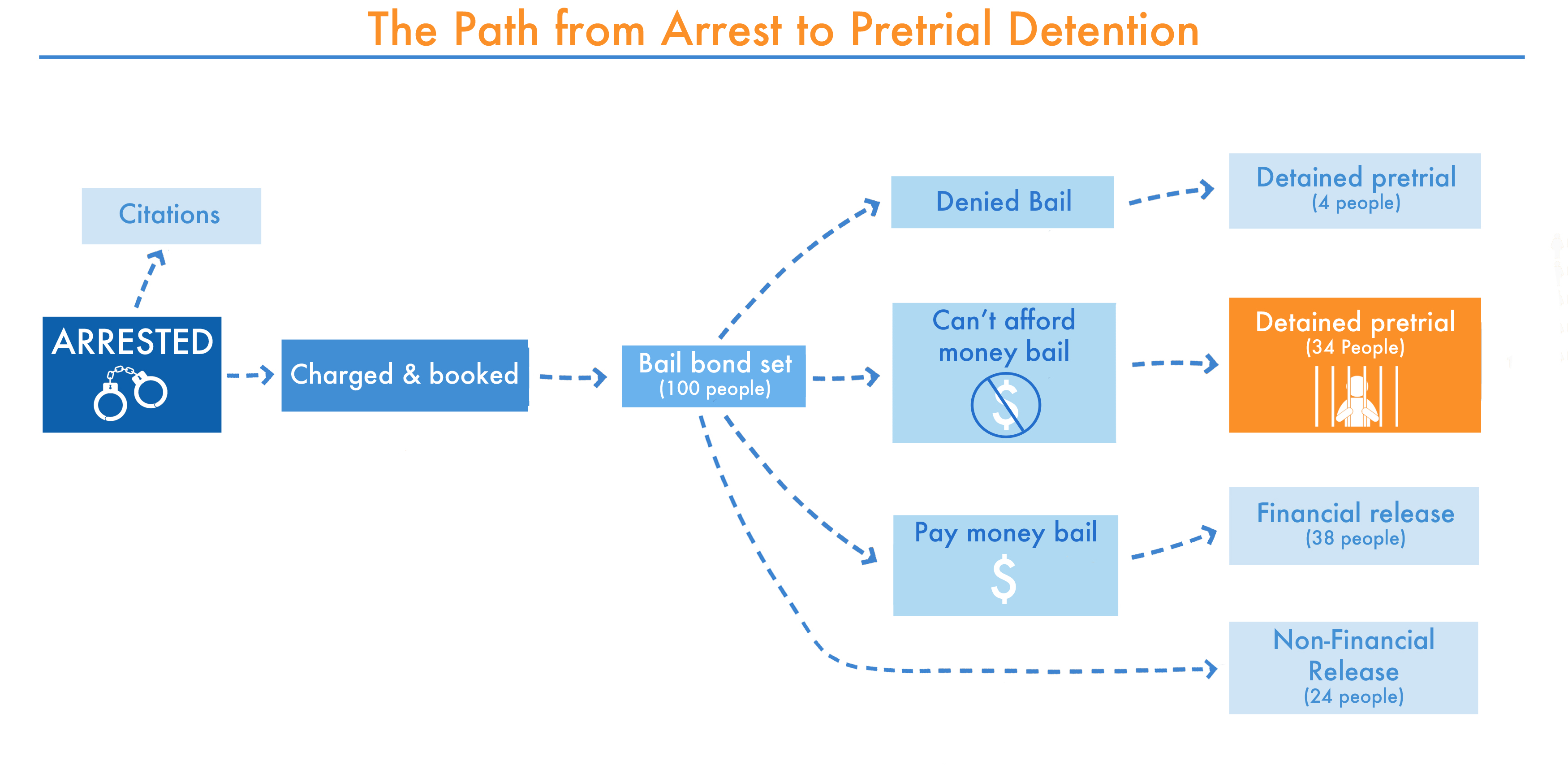 Since the 1980s, there has been a significant, nationwide move away from courts allowing non-financial forms of pretrial release (such as release on own recognizance) to money bail, although this does vary substantially depending on jurisdiction. This chart illustrates the possible paths from arrest to pretrial detention. Almost all defendants will have the opportunity to be released pretrial if they meet certain conditions, and only a very small number of defendants will be denied a bail bond, mainly because a court finds that individual to be dangerous or a flight risk. The only national data on pretrial detention that we are aware of comes from the Bureau of Justice Statistics’ Felony Defendants in Large Urban Counties series. Nationally, in 2009, 34% of defendants were detained pretrial for the inability to post money bail. This report focuses on this important population: those who are detained pretrial because they could not afford money bail.
5. Probation fees
Court-ordered fines and fees have expanded dramatically as states have realized their revenue potential. But for the low-income people who are caught up in the system, these costs mean a greater risk of financial strain and even incarceration. In December, Wendy compared probation rates and incomes across Massachusetts and found that low-income communities are hit hardest by probation fees:
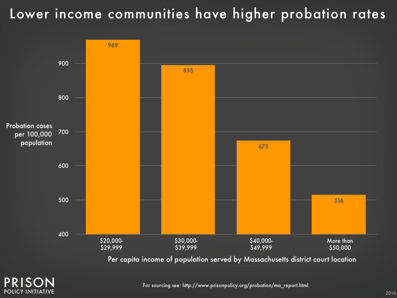 The District Court locations were grouped by the per capita income of the towns and cities they each serve. Probation rates are higher in court locations that serve populations with lower incomes.
In the appendix of the report, we created a interactive scatterplot comparing each District Court’s probation caseloads and per capita income:

6. Shining a light on jail suicides
To cast light on the avoidable epidemic of jail suicides, we updated last year’s graph with a new article:

Bernadette’s article on the life-threatening reality of short jail stays also includes a graph illustrating groundbreaking data collected by the Huffington Post showing that most suicides occur in just the first few days of detention in jail.
7. A crime wave?
The President-elect says there is a crime wave. Is there? We looked:
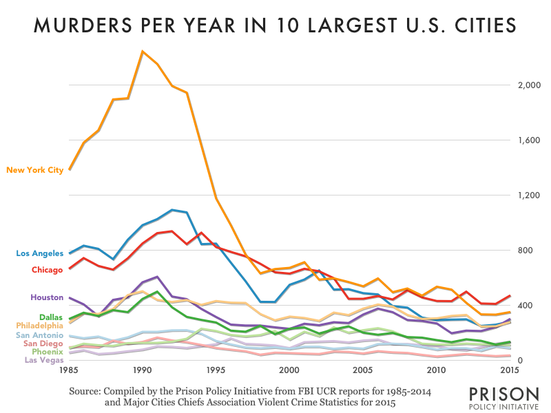 For most cities, murder is much lower now than during the 1980s or 1990s. The data for 1985-2014 comes from the FBI. The FBI has not published the 2015 full year data yet, so we relied on data from the Major Cities Chiefs Association, which historically is very similar if slightly higher than the FBI’s figures. For that reason, this graph may overstate the increase in murder in 2015 in these cities.
For more on the need for city-specific crime data, see Wendy Sawyer’s analysis Making a mountain out of a molehill.
8. Public vs. private prisons
We’ve long argued that prisons owned and run by corporations that contract with state governments get far more attention than they deserve. But another huge provider of contractual prison services gets almost no attention whatsoever: local jails.
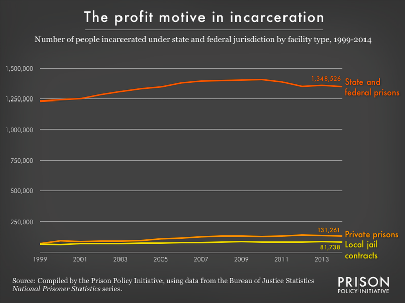 Since 1999, private prisons and local jails have housed roughly the same number of those serving state and federal prison sentences. But when those interested in justice reform talk about profiting off of mass incarceration, they almost always leave local jails out of the conversation.
For more on this topic, see our article: Some private prisons are, um, public.
9. Beyond the crime bill
During the Democratic primary, many people blamed the Clintons for mass incarceration by pointing to the 1994 crime bill. But that was perhaps the least important of seven major bills. One of the most harmful, and the least discussed, was the Antiterrorism and Effective Death Penalty Act. In May, we made this data visualization of data collected by law professor Margo Schlanger for her article Trends in Prisoner Litigation, as the PLRA Enters Adulthood to make the magnitude of this change clear:
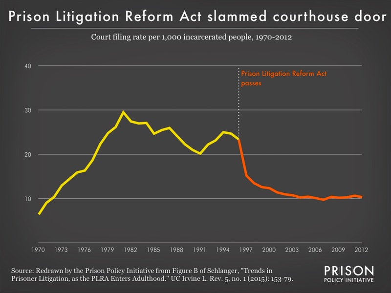
The filing rate by incarcerated people dropped significantly after the passage of the Prison Litigation Reform Act. And ironically, despite Congress’ fears of a prison lawsuits flooding the courts, this data that controls for the size of the prison population shows that in 1996, when the Prison Litigation Reform Act was passed, fewer lawsuits per 1,000 incarcerated people were being filed than during the ten year period of 1979-1988.
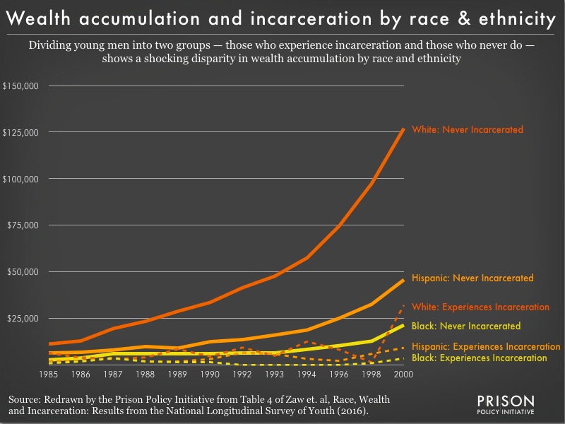
10. The Crippling Effect of Incarceration on Wealth
A fascinating study by Khaing Zaw, Darrick Hamilton, and William Darity Jr. shows that incarceration has a staggering effect on the accumulation of wealth over the course of a lifetime. To accompany our blog post on the original article, we made a data visualization of the data — including detail by racial group — published in the original article: