The Racial Geography of Mass Incarceration
by Peter Wagner and Daniel Kopf
July, 2015
Key findings
- Entirely separate from the more commonly discussed problem of racial disparities in who goes to prison, this data addresses a distressing racial and ethnic disparity in where prisons have been built.
- Stark racial and ethnic disparities exist between incarcerated people and the people in the county outside the prison's walls.
- The transfer of Black and Latino incarcerated people to communities very different than their own is a national problem not confined to select states.
- Hundreds of counties have a 10-to-1 “ratio of over-representation” between incarcerated Blacks and Blacks in the surrounding county — meaning that the portion of the prison that is Black is at least 10 times larger than the portion of the surrounding county that is Black.
- Table of contents
- Introduction
- The racial geography of mass incarceration for Blacks
- The racial geography of mass incarceration for Latinos
- Conclusion
- About the Prison Policy Initiative and the authors
- Methodology
- Recommended readings
- Footnotes
Introduction
The racial disparities underlying the United States’ record growth in imprisonment are well documented, as is the fact that the prison construction boom was disproportionately a rural prison construction boom. While these two characteristics have been studied separately, there has been, until now, no national effort to analyze each state’s decision to engage in mass incarceration through a racial geography lens.
This report fills a critical gap in understanding the mass incarceration phenomenon: it offers a way to quantify the degree to which in each state mass incarceration is about sending Blacks and Latinos to communities with very different racial/ethnic make-ups than their own. We use data from the 2010 Census to compare the race and ethnicity of incarcerated people to that of the people in the surrounding county, finding that, for many counties, the racial and ethnic make-up of these populations is very different.
This analysis addresses the degree to which each state’s use of the prison is about transferring people of color to communities that are very different from the communities that people in prison come from. This data does not address the bias in policing or sentencing found in individual counties; instead it reflects each state’s political decision to build prisons in particular locations.
We anticipate this analysis will be most useful to answer two questions:
- Why do some states struggle to hire sufficient Black and Latino correctional staff?
- To what degree does prison gerrymandering — the practice of using U.S. Census counts of incarcerated people as residents of the prison location for legislative districting purposes — have a disproportionate racial impact in particular states?
In addition, definitively showing that the people incarcerated in some states and counties are very different demographically from the surrounding community is powerful evidence that the people incarcerated there are from somewhere else.1 This has immediate and profound implications for a number of issues from prison gerrymandering to the need for programs that make it easier for families to visit incarcerated loved ones.
The racial geography of mass incarceration for Blacks
Blacks are incarcerated at a rate about 5 times higher than whites, but prisons are disproportionately located in majority-white areas. This combination has tremendous implications for the prison system’s ability to hire appropriate numbers of Black staff, and it gives the problem of prison gerrymandering a distinct veneer of racial discrimination.2
Policymakers have been aware of the problem of racial disparities between staff and incarcerated people at least since the infamous Attica prison rebellion in 1971. Incarcerated people seized the prison, held it for four days, and invited the media in to document their grievances before the state police assaulted the prison, killing 43, all filmed on national television. The striking racial imbalance between the incarcerated people and the guards garnered national attention: the people incarcerated were 63% Black or Latino but at that time there were no Blacks and only one Latino serving as guards. Increasing staff diversity was widely considered important, but progress was very slow because Attica and the hundreds of new prisons built in the subsequent decades were built in rural, disproportionately White, areas of states.
Our national analysis of counties finds that Wyoming County — where Attica and another large New York state prison are located — is not alone. We find that in 2010 there were 161 counties spread across 31 states where the incarcerated Black population outnumbers the number of free Blacks.3
We find a substantial number of counties where the incarcerated populations are largely Black but where Blacks are only a tiny portion of the county’s non-incarcerated population:
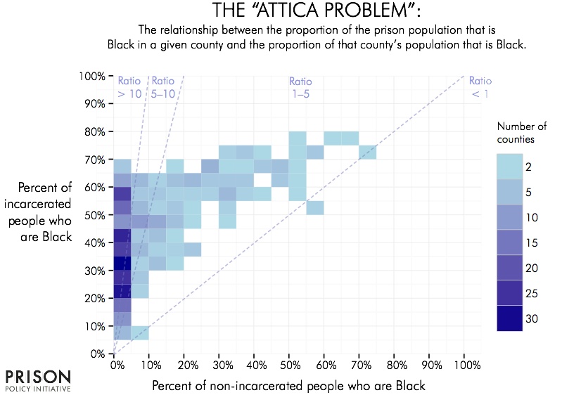 Figure 1. This chart shows that in many counties Black people in prison are overrepresented compared to the portion of Black people in the free population. Notably, many of these counties are concentrated in the far left of the graph; where Blacks make up 20% to 60% of the prison populations yet less than 5% of the free population.
Analysis of the graph reveals two conclusions:
- The vast majority of counties are in the top left half of the graph, all reflecting that the prisons have proportionately larger Black populations than the surrounding county does.
- There is a huge concentration of counties with prisons along the left edge of the graph, reflecting that many counties have only very small Black populations while their prisons have much larger Black populations.
To further quantify this distribution, we calculated the degree of racial difference between the incarcerated and non-incarcerated populations in each county. We calculated the ratio of the percentage of each county’s incarcerated population that is Black to the percentage of each county’s non-incarcerated population that is Black. Higher numbers mean a much larger difference between the two populations. In the 15 counties where the ratio is less than 1, the county’s non-incarcerated Black population is proportionately larger than the incarcerated Black population in the county. But the table below quantifies what is seen in the above chart: most counties have a ratio over 1, and 208 counties have ratios of over 10. A ratio of at least 10 means that the portion of the prison that is Black is at least 10 times larger than the portion of the surrounding county that is Black. For example, Martin County, Kentucky has a ratio of 529, because the 884 incarcerated Blacks make up 56% of the incarcerated population but the 12 Blacks freely living in the county make up only about 0.1% of the county’s free population.
| Ratio Category | Number of counties | Number of states containing those counties |
|---|---|---|
| 0-1 | 15 | 8 |
| 1.01-5 | 194 | 26 |
| 5.01-10 | 55 | 23 |
| More than 10 | 208 | 34 |
It is these high-ratio counties — and clusters of high-ratio counties — that make prison gerrymandering such a significant problem for racial justice. This large scale census inaccuracy labels these counties as diverse when they are anything but. When state legislatures use that flawed data to draw legislative districts, they transfer Black political clout to districts where Blacks have little to no voice.
To allow readers and other researchers to explore the details of individual counties, we created this interactive version that allows for looking up individual counties and their respective incarcerated and non-incarcerated Black populations:
Percent of incarcerated population that is Black
by percent of county free population that is Black.
Figure 3. This interactive chart shows the percentage of each county’s incarcerated and free populations that are Black. Click on a dot for the name of the county and the total numbers.
To explore whether the counties with the most dramatic racial disparities between the prison and free populations are concentrated in particular states, we calculated the median ratio of all our analyzed counties by state. We found that Blacks are more likely to be locked up in communities very different than their homes in states such as Michigan or Wisconsin, and least likely in states such as Mississippi:
| State (Number of Counties Analyzed) | Median Ratio of the percentage of each county’s incarcerated population that is Black to the percentage of each county’s free population that is Black. |
|---|---|
| Michigan (16) | 120.0 |
| Wisconsin (10) | 78.5 |
| Pennsylvania (15) | 38.7 |
| New York (16) | 32.0 |
| Illinois (23) | 31.5 |
| Ohio (13) | 24.8 |
| Kentucky (15) | 24.2 |
| Indiana (11) | 23.2 |
| California (12) | 19.8 |
| Missouri (16) | 14.2 |
| Oklahoma (17) | 13.4 |
| Texas (50) | 4.5 |
| Florida (30) | 4.4 |
| Virginia (24) | 3.0 |
| Alabama (10) | 2.6 |
| Louisiana (24) | 2.2 |
| North Carolina (22) | 2.0 |
| Georgia (41) | 2.0 |
| South Carolina (11) | 1.4 |
| Mississippi (17) | 1.4 |
The racial geography of mass incarceration for Latinos
Latinos are incarcerated at a rate about 2 times higher than non-Latino whites, but prisons are disproportionately located in non-Latino areas. This combination has tremendous implications for the prison system’s ability to hire appropriate numbers of Latino staff, and it gives the problem of prison gerrymandering a distinct veneer of ethnic discrimination.4
We find that in 2010 there were 20 counties spread across 10 states where the Latino population that is incarcerated outnumbers those who are free.10 We also found a substantial number of counties where the incarcerated populations are largely Latino but where Latinos are only a very small portion of the county’s non-incarcerated population:
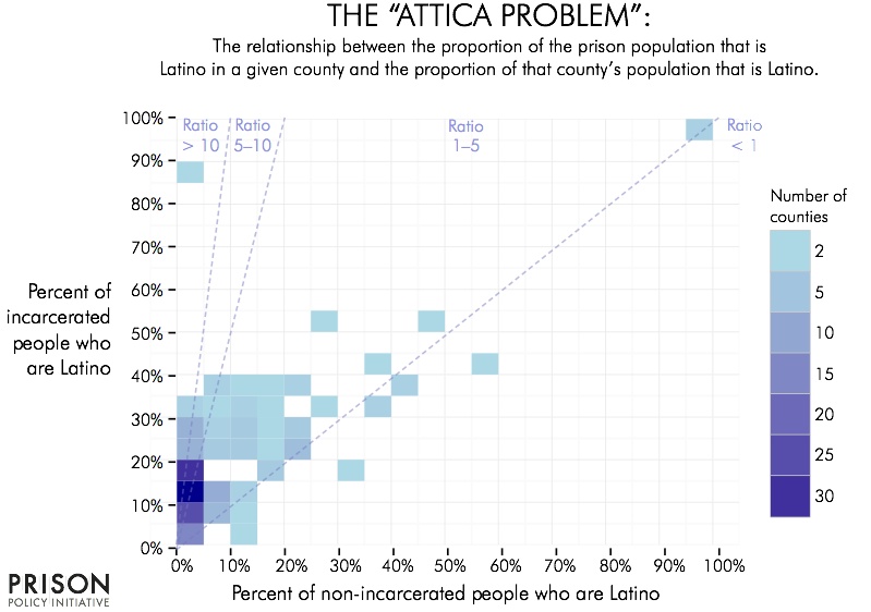 Figure 5. This chart shows that in many counties Latino people in prison are overrepresented compared to the portion of Latino people in the free population. (The outliers on the top right are a Municipality (county) in Puerto Rico and two in Texas, and the outlier counties on the top left are Stewart County, Georgia and Adams County, Mississippi, both of which host large federal immigraton detention facilities.
Analysis of the graph reveals two conclusions:
- The vast majority of counties are in the top left half of the graph, reflecting that the prisons have proportionately larger Latino populations than the surrounding county does.
- There is a huge concentration of counties with prisons along the left edge of the graph, reflecting that many counties have only very small Latino populations while their prisons have much larger Latino populations.
To further quantify this distribution, we calculated the degree of ethnic difference between the incarcerated and non-incarcerated populations in each county. We calculated the ratio of the percentage of each county’s incarcerated population that is Latino to the percentage of each county’s non-incarcerated population that is Latino. Higher numbers mean a much larger difference between the two populations. In the 50 counties where the ratio is less than 1, the county’s non-incarcerated Latino population is proportionately larger than the incarcerated Latino population in the county. But the table below quantifies what is seen in the above chart: most counties in this study have a ratio over 1, and there are many counties such as Georgia's Stewart County, Illinois' Brown County, or West Virginia's Gilmer County where virtually the entire Latino population is incarcerated.
| Ratio Category | Number of counties | Number of states containing those counties |
|---|---|---|
| 0-1 | 50 | 17 |
| 1.01-5 | 141 | 31 |
| 5.01-10 | 39 | 16 |
| Over 10 | 41 | 16 |
It is these high-ratio counties — and clusters of high-ratio counties — that make prison gerrymandering such a significant problem for ethnic justice. This large scale census inaccuracy labels these counties as diverse when they are anything but. When state legislatures use that flawed data to draw legislative districts, they transfer Latino political clout to districts where Latinos have little to no voice.
To allow readers and other researchers to explore the details of individual counties, we created this interactive version that allows for looking up individual counties and their respective incarcerated and non-incarcerated Latino populations.
Percent of incarcerated population that is Latino
by percent of county free population that is Latino.
Figure 7. This interactive chart shows the percentage of each county’s incarcerated and free populations that are Latino. Click on a dot for the name of the county and the total numbers.
To explore whether the counties with the most dramatic ethnic disparities between the prison and free populations are concentrated in particular states, we calculated the median ratio of all our analyzed counties by state. We found that Latinos are more likely to be locked up in communities different than their homes in states such as Pennsylvania or New York, and least likely in states such as California:
| State (Number of Counties Meeting Filters) | Median Ratio of Counties |
|---|---|
| Pennsylvania (14) | 12.5 |
| New York (16) | 7.6 |
| Illinois (20) | 7.0 |
| Georgia (10) | 3.4 |
| Florida (26) | 2.2 |
| Texas (59) | 1.2 |
| California (12) | 1.2 |
Conclusion
One of the defining characteristics of mass incarceration in the United States is the racial disparity in who goes to prison. Less discussed but just as important is the shocking racial disparity in where those prisons are built.
Sadly, as Rachel Gandy recently reviewed in her analysis of the racial and ethnic disparities between incarcerated people and the people who staff the prisons, the fact that building prisons in rural areas makes it difficult to recruit appropriate numbers of Black and Latino staff has been well known — and entirely ignored — since long before the prison boom began.
This report reviews the magnitude of the gulf between the incarcerated population and the surrounding counties; finding 161 counties where incarcerated Blacks outnumber free Blacks, and 20 counties where incarcerated Latinos outnumber free Latinos. In many counties, the disparity is particularly stark. We found 208 counties where the portion of the county that was Black was at least 10 times smaller than the portion of the prison that was Black. For Latinos, we found 41 counties where the portion of the county that was Latino was at least 10 times smaller than the portion of the prison that was Latino. These counties are spread throughout a majority of the states:
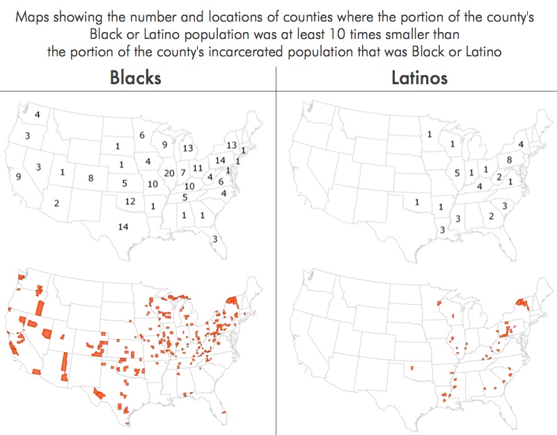 Figure 9. These maps shows where Blacks or Latinos are over-represented at least 10 times in the prison population compared to the surrounding county. Many of the states without any counties marked on this map are states where counties are less relevant as a unit of analysis (ie. Massachusetts and Rhode Island) or where the Black or Latino population is very small and therefore excluded from our analysis (ie. Montana). For Latinos, the over-representation is significant in most states but is less dramatic than for Blacks.
In short, one of the reasons many states struggle to hire sufficient numbers of Black and Latino staff is because the prisons themselves were built in places that Blacks and Latinos do not live.
But this large-scale transfer of Black and Latino people to areas demographically very different than their homes has even larger effects thanks to a unique quirk in the federal Census that counts incarcerated people as if they were willing residents of the county that contains the correctional facility for redistricting purposes.
The racial inequities that result from the practice of prison gerrymandering have been well documented in states like New York and Wisconsin, but as this report makes clear, they are not alone. The transfer of Black and Latino incarcerated people to communities very different than their own is a national problem with implications for prison gerrymandering as well as family visitation policies and reentry.
About the Prison Policy Initiative and the authors
The non-profit, non-partisan Prison Policy Initiative produces cutting edge research to expose the broader harm of mass criminalization, and then sparks advocacy campaigns to create a more just society. In 2002, the organization launched the national movement against prison gerrymandering with the publication of Importing Constituents: Prisoners and Political Clout in New York addressing how using Census Bureau counts of incarcerated people as residents of the prison location diluted the votes of state residents who did not live next to prisons in violation of the state constitutional definition of residence.
Peter Wagner is an attorney and Executive Director of the Prison Policy Initiative.
Daniel Kopf is a data scientist in California who volunteers with the Prison Policy Initiative through our Young Professionals Network. He has a Masters in Economics from the London School of Economics.
Methodology
This goal of this report was to quantify the magnitude of the difference of the racial and ethnic makeup between the people incarcerated in a given county and the actual residents of that county.
For this data, we took advantage of a unique quirk in Census Bureau methodology that counts incarcerated people as residents of the county that contains the correctional facilities.
Filters:
While we make all of our data available in an appendix, we applied two filters to the county graphs and tables above to remove from the data what we considered noise:
- Counties where the percentage of the total population that was incarcerated was less than 1.5%. The Prison Policy Initiative discovered for our 2004 report, Too big to ignore: How counting people in prisons distorted Census 2000 that this was an effective filter to remove counties that contained very large jails but no significant state or federal prisons. We wanted to separate out jails because jails tend to confine people for short periods very close to home so these facilities will have much smaller and much less relevant disparities between the facility and the surrounding county. This initial filtering process reduced the number of analyzed counties to 539. (Note the unit of analysis in this analysis was counties, not facilities. We estimate that these counties contained 1,037 prisons.5)
- Our analyses of Black disparities remove any county where there were less than 100 incarcerated Blacks, and we used a similar filter in the Latino disparities section. In both cases, we wanted to avoid highlighting counties with small populations of non-incarcerated people of color and only slightly larger numbers of incarcerated people of color. While this analysis removes many counties from our analysis — and in particular removes many counties in western states where the Black population is relatively small — it allows us to clearly show that there is a very large number of counties where substantial numbers of people of color are being moved by the prison system to communities very different from their homes.
Additionally, in order to make the distribution pattern in figures 1 and 5 clear, we chose not to show the handful of counties where there was only 1 county in that particular “bin”. These handful of outliers were generally the product of unique facilities, such as a private federal immigration prison that was 92% Latino in majority-Black Adams County, Mississippi.
On race and ethnicity definitions
For this project we used the Census Bureau’s conception of race and ethnicity that has two main characteristics:
- Hispanic/Latino origin is an ethnicity separate from race; so people may or may not be Hispanic/Latino in addition to being Black, White, Asian, etc.
- People may be of more than one race, of an “other” race, or of a combination of an “other” race with one or more other races.
The resulting number of possible combinations is quite high6, but as the Census Bureau publishes very few data tables that allow one to easily access the race and ethnicity of the incarcerated population, the choices available for use were actually quite limited. We used data that provided for 9 combinations, of which we used only 3 (marked in bold):
- White alone
- Black alone7
- American Indian or Alaska Native alone
- Asian alone
- Native Hawaiian or other Pacific Islander alone
- Some other race alone
- Two or more races
- Hispanic or Latinos8
- White alone not Hispanic or Latino9
Limited in this way by the types of data available for the incarcerated population, we chose to use Census tables that reflected the non-incarcerated population in exactly the same way.
Data sources
We used the following data tables from the U.S. Census in our analysis:
- Population: 2010 Census, Summary File 1, Table P1.
- White population (White alone non-Hispanic population): 2010 Census, Summary File 1, Table P5.
- Black population (Black alone population): 2010 Census, Summary File 1, Table P3.
- Hispanic/Latino population: 2010 Census, Summary File 1, Table P4.
- Incarcerated population: 2010 Census, Summary File 1, Table P42.
- Incarcerated White population (White alone, not-Hispanic): 2010 Census, Summary File 1, Table PCT20I.
- Incarcerated Black population (Black alone): 2010 Census, Summary File 1, Table PCT20B.
- Incarcerated Hispanic/Latino population: 2010 Census, Summary File 1, Table PCT20H.
For the non-incarcerated populations, we simply subtracted the incarcerated populations from the total populations of the same race/ethnicity groupings.
For the ratios, we simply found the portion of the incarcerated population that was of a given race or ethnicity and divided this by the portion of a county that was of a given race or ethnicity. For example, if Black people made up of 20% of the incarcerated population, and 40% of the non-incarcerated population. The ratio of over-representation of Black people in prison would be 0.5. By contrast, if Black people made up of 80% of the incarcerated population, and 20% of the non-incarcerated population, the ratio of over-representation of Black people in prison would be 4. Recognizing that other researchers may have alternative ideas on the best way to rank and filter counties and states, we’ve made all of this county-level data available so that others may use this data in new ways.
Recommended readings
This report is far from the first or last word on the topic of the political, racial and economic geography of mass incarceration. Some of our favorite articles on these topics are:
- William Nagel, The New Red Barn: A Critical Look at the Modern American Prison (New York: The American Foundation, Inc., 1973).
- Calvin Beale, “Prisons, Population, and Jobs in Nonmetro America,” Rural Development Perspectives 8, no. 4 (1993): 16-19.
- Calvin Beale, “Rural Prisons: An Update,” Rural Development Perspectives 11, no. 2 (1996): 25-27.
- Tracy Huling, “Building a Prison Economy in Rural America” in Invisible Punishment: The Collateral Consequences of Mass Imprisonment, ed. Marc Mauer and Meda Chesney-Lind (New York: The New Press, 2002).
- Ruth Wilson Gilmore, Golden Gulag: Prisons, Surplus, Crisis, and Opposition in Globalizing California, (Berkeley: University of California Press, 2007).
- Gregory Hooks, Clayton Mosher, Shaun Genter, Thomas Rotolo, and Linda Lobao, “Revisiting the Impact of Prison Building on Job Growth: Education, Incarceration, and County-Level Employment, 1976-2004,” Social Science Quarterly 91, no. 1 (2010): 228-244.
Footnotes
The inverse, however, is not true. Zoe Gottlieb, a law student at the New York University School of Law, showed that the pattern of shifting prisoners from Black urban cities to rural White towns does not hold in some southern states. The movement of the incarcerated in North Carolina and Georgia does not involve a clear cross-race transfer. Black populations can be found in both rural and urban areas in these states, making the racial geography problem in these states less important than it is elsewhere in the United States. ↩
For example, in New York, 98% of prison cells are located in state Senate districts that are disproportionately white. Counting incarcerated people as residents of correctional facilities thus increases the influence of nearby, largely white, residents. ↩
Without the filters described in the methodology that removed some counties with smaller facilities and smaller incarcerated Black populations from the analysis, we would have reported 184 counties where incarcerated Blacks outnumber non-incarcerated Blacks. The 161 counties are in these 31 states: Arizona, Arkansas, California, Colorado, Florida, Illinois, Indiana, Iowa, Kansas, Kentucky, Louisiana, Maryland, Michigan, Minnesota, Mississippi, Missouri, Nebraska, Nevada, New York, North Carolina, Ohio, Oklahoma, Oregon, Pennsylvania, South Dakota, Tennessee, Texas, Virginia, Washington, West Virginia, and Wisconsin. ↩
Earlier Prison Policy Initiative research shows that 7 State House districts in Connecticut were granted significantly more representation in the state legislature because the majority of Connecticut’s prison cells (which disproportionately held Latino and Black residents) were located in these areas. The incarcerated people counted here, however, were from other parts of Connecticut. For example, in State House District 59, 60% of the Latinos counted as constituents were actually incarcerated residents of other parts of the state. ↩
To estimate prisons, we counted the number of Census blocks within these counties that contain a correctional facility of at least 100 people. This methodology excluded 360 census blocks that are likely either jails or small parts of the facilities already included in our estimate. ↩
Without the filters described in the methodology that removed some counties with smaller facilities and smaller incarcerated Latino populations from the analysis, we would have reported 33 counties where incarcerated Latinos outnumber non-incarcerated Latinos. The 20 counties are in these 10 states: California, Colorado, Florida, Illinois, Kentucky, Missouri, New York, Pennsylvania, Virginia, and West Virginia. ↩
There are 126 possible combinations of race and ethnicity. ↩
This category would include Latinos who said they were of just one race, “Black”. ↩
This category includes Latinos of any race or races. ↩
This category includes people who said they were of just one race, “white” but who said they were not of the ethnicity Latino. ↩
Recommended Reading:

50 state incarceration profiles
All of our recent reports about prison/jail growth, racial disparities, and more, re-organized by state.

Research Library
We curate a searchable database of 4,000+ original research reports, organizing each entry by topic and adding brief summaries.

Mass Incarceration: The Whole Pie
The U.S. incarcerates nearly 2 million people. Where are they locked up and why? Read our report.

Bad Behavior
This national report explains how prison disciplinary policies manufacture misconduct and severly punish incarcerated people.