The early arrival of COVID-19 in counties and regions with large prison and jail populations
A companion study to “Mass Incarceration, COVID-19, and Community Spread” focused on the relationship between mass incarceration and the locations and severity of early COVID-19 outbreaks in the U.S.
by Gregory Hooks
December 2020
Knowing that jails and prisons have become COVID-19 hotspots - and that the virus can spread from correctional institutions to the community via staff, vendors, and visitors - I set out to determine whether counties with more incarceration experienced earlier and more severe COVID-19 outbreaks. In a related analysis (presented in Mass Incarceration, COVID-19, and Community Spread), I also sought to quantify how many additional cases were linked to mass incarceration in the summer of 2020.
While the two lines of inquiry discussed in these reports are based on different measures of incarceration and employ different methods of statistical analysis, they rely on the same data and come to the same alarming conclusion: The twin policy failures of mass incarceration and the mismanagement of the COVID-19 pandemic collided in 2020 in ways that contributed to viral spread both within prisons and jails and in the communities that surround them. This report offers two major findings:
- Confirmed cases of COVID-19 arrived sooner and outbreaks were more severe in counties with larger incarcerated populations.
- COVID-19 arrived sooner and outbreaks were more severe in counties located within “BEA economic areas”1 with larger incarcerated populations. This is true regardless of the size of the county’s own incarcerated population, pointing much more directly to “community spread” from prisons and jails to surrounding areas.
County-level analysis
Overall, the United States holds an extraordinarily high number of people in jails and prisons. There is tremendous variation, however, in incarceration at the county level. For these analyses, I divided counties into categories based on the number of incarcerated people held there. These categories included:
- 0 people incarcerated in the county
- 1st - 24th percentile (1-11 people incarcerated in the county)
- 25th - 49th percentile (12 - 99 people incarcerated)
- 50th - 74th percentile (100 - 624 people incarcerated)
- 75th - 89th percentile (625 - 2,032 people incarcerated)
- 90th percentile and higher (2,033 or more people incarcerated)
In other words, a quarter of all counties (that is, those at or below the 25th percentile) held fewer than 12 incarcerated people, and half of all counties held fewer than 100. Continuing down the list, we see that 75% of counties held fewer than 625 incarcerated people — a large jump in incarceration from the 50th percentile. There is an even bigger jump when looking at counties at the 90th percentile: in these 10% of all counties that had the largest incarcerated populations, there were 2,033or more incarcerated people. That means that their incarcerated populations were more than three times larger than those at the 75th percentile (2,033 versus 625 people).
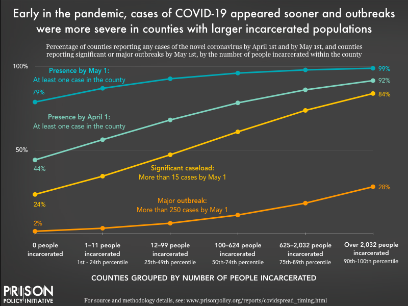
I employed logistic regression to evaluate the possibility that mass incarceration placed counties at heightened risk. Figure 1 displays the impact of mass incarceration in a given county on four unwanted COVID-19 milestones:
- Presence: at least one case in the county by April 1;
- Presence: at least one case in the county by May 1;
- Significant caseload: more than 15 cases by May 1;
- Major outbreak: more than 250 cases by May 1.

As the chart above shows, each of the four adverse COVID-19 events were more likely in counties with large numbers of incarcerated people, after holding all other variables constant. For example, while just over half (56%) of counties with only 1 to 11 incarcerated people (below the 25th percentile) had at least one confirmed case of COVID-19 by April 1, more than 90% of counties with more than 2,032 incarcerated people (the 90th percentile) had a confirmed case by that date. And one month later, on May 1, the virus’ presence was confirmed in 87% of counties below the 25th percentile, and 99% of counties at or above the 90th percentile.
Mass incarceration also contributed to more serious outbreaks. Among counties with no incarcerated population, only 24% had a “significant caseload” of more than 15 confirmed cases by May 1, compared to 35% of counties below the 25th percentile (1 to 11 incarcerated people). The odds jumped quickly as mass incarceration grew — roughly 84% of counties above the 90th percentile were dealing with a significant caseload by May 1. This heightened risk extended to “major outbreaks” of more than 250 confirmed cases as well: By May 1, only 2% of counties without incarcerated populations experienced a major outbreak, compared to 28% of counties at or above the 90th percentile.
Multicounty BEA economic area analysis
The virus causing the COVID-19 pandemic does not respect prison walls, nor does it respect county borders. An outbreak in one county spills over into nearby counties. Prison staff, vendors, contractors and visitors carry the virus with them as they travel between counties. In addition to analyzing the county-level trends discussed above, I also relied on logistic regression to examine links between COVID-19 outbreaks and mass incarceration across larger BEA economic areas (see “the current study” for an explanation of BEA areas).
Although the county-level analysis outlined above provides important insight into the relationship between incarceration and COVID-19, it does not allow us to reliably separate county cases that are within correctional facilities and those outside of the facility. Depending on local reporting policies, some of the county-level case numbers used in these analyses likely included incarcerated people who tested positive for the disease. The inclusion of a county’s incarcerated people within its county case total may distort the true picture of how incarceration contributed to spread in the outside community. It’s possible, for example, that most of a county’s reported cases could be contained within a single facility.
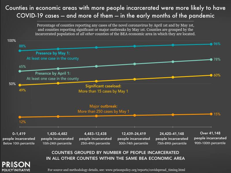
By contrast, the BEA area-level analyses are focused entirely on community spread. Again, the BEA economic area measure includes the number of people incarcerated in nearby counties, while the people incarcerated in the county itself are excluded. In this way, the BEA area-level trends are focused solely on community spread and do not overlap with COVID-19 cases inside of jails and prisons. The findings at the BEA area level, shown in Figure 2 below, demonstrate a pattern of heightened risk as mass incarceration in the BEA area increases.

While higher incarceration numbers in the greater BEA area did heighten the risk of COVID-19 arrival and spread in a given county, the increases are more modest than in the county-level analysis. For example, counties in a BEA area with fewer than 1,420 incarcerated people faced a 65% chance (all else being equal) of having at least one confirmed case by April 1. That likelihood goes up steadily — but modestly — as the number of incarcerated people across the multicounty BEA area increases:
- With 1,420 to 4,482 incarcerated people, the likelihood of a confirmed case by April 1 is 68%;
- With 4,483 to 12,438 incarcerated people, the likelihood increases to 70%;
- With 12,439 to 24,419 incarcerated people, the likelihood reaches 73%;
- With 24,240 to 41,148 incarcerated people, the likelihood is 76%;
- And with 41,148 or more incarcerated people, the likelihood is 78%.
A similar pattern emerges for the three May 1 milestones: confirming at least one case, experiencing a “significant caseload” of more than 15 cases, and having a “severe outbreak” of more than 250 cases.
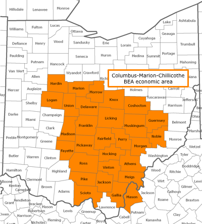
It should not be surprising that increased COVID-19 risks associated with incarceration were higher in the county-level analyses than the BEA-level analyses. For example, consider Marion County, Ohio, home to the Marion Correctional Institution (MCI) and where more than 4,700 people were incarcerated as of 2010. For the county-level analyses of Marion County (the trends outlined in Figure 1), the goal was to estimate the impact of Marion County’s high incarceration on the county’s exposure to COVID-19. For the analyses summarized in Figure 2, however, the focus is not the effect that MCI and the other facilities in the county had on Marion County, but the effect that incarceration in Marion County has on the other 28 other, nearby counties (that share the same BEA area). This impact is not as dramatic, but it is felt across many more counties and a much larger population.
In this way, the BEA economic area analysis offers compelling and disturbing evidence that the U.S. commitment to incarceration exposed the entire population of the United States to a heightened risk of COVID-19 infection.
Conclusions
The U.S.’s heavy reliance on mass incarceration has been a chronic policy failure. For years, the United States has ignored the advice of experts and has displayed a callous disregard for the safety, health and dignity of the people it incarcerates. In the spring of 2020, the chronic failure of mass incarceration intersected with a new, acute policy failure - and the results were catastrophic.
This examination of the spread of COVID-19 related to prisons and jails confirms prior accounts and our worst fears. As documented here, COVID-19 outbreaks came sooner to counties and BEA economic areas with larger incarcerated populations. Moreover, as the number of people incarcerated in a county or multicounty area increases, so did the number of new COVID-19 infections in the early months of the pandemic. In a related analysis, Mass Incarceration, COVID-19, and Community Spread, I estimate how many additional cases a county, BEA area, or state experienced over the summer of 2020 based on the population density of prisons and jails in the area. These two studies confirm that the role of mass incarceration in the COVID-19 pandemic - and in public health more broadly - is significant and demands attention and appropriate action. In particular, these findings suggest that depopulating prisons and jails would be an effective strategy in reducing the spread of COVID-19 (and other highly contagious diseases), especially in high-incarceration areas.
Read more about the data
For details about the data sources and methodology, see Mass Incarceration, COVID-19, and Community Spread: Methodological Appendix [PDF] by Gregory Hooks.
About the Prison Policy Initiative
The non-profit non-partisan Prison Policy Initiative was founded in 2001 to expose the broader harm of mass criminalization and spark advocacy campaigns to create a more just society. It sounded the national alarm about the threat of coronavirus to jails and prisons with its March 2020 report No need to wait for pandemics: The public health case for criminal justice reform. The organization’s data-driven coverage of the pandemic behind bars continues to advance the national movement to protect incarcerated people from COVID-19.
About the author
Gregory Hooks is Professor of Sociology at McMaster University. In several prior works, he has examined the impact of prisons on local employment trends. This research raised doubts about the purported economic benefits of prisons. In fact, this research suggested that prison towns are at risk of ending up with a net decrease in jobs. For details on this line of research, see:
- Genter, Shaun, Gregory Hooks, and Clayton Mosher. 2013. Prisons, Jobs and Privatization: The Impact of Prisons on Employment Growth in Rural U.S. Counties, 1997-2004.
- Hooks, Gregory, Clayton Mosher, Shaun Genter, Thomas Rotolo and Linda Lobao. 2010. Revisiting the Impact of Prison-Building on Job Growth: Education, Incarceration and County-Level Employment, 1976-2004.
- Gregory Hooks, Linda Lobao, Clay Mosher, and Thomas Rotolo. 2004. The Prison Industry: Carceral Expansion and Employment in U.S. Counties, 1969-1994.
His research program examines spatial inequality broadly, including research into inequality and social policy, environmental inequality (from both military and civilian sources), and peace, war and development.
Footnotes
These multicounty areas, defined by the Bureau of Economic Analysis, are determined by economic ties, particularly commuting patterns and media markets. The emphasis that BEA economic areas place on commuting makes these geographies well-suited for this analysis of “community spread” related to prisons and jails across a multicounty area. Those who work in one county but live in another county are exposed to the novel coronavirus in more than one county, and if they become infected, they can infect people in more than one county. See the BEA’s 2004 Redefinition of the BEA Economic Areas for more information. ↩
The total incarcerated population, nationwide, peaked in 2008. Between 2010 (when the Census data used in this analysis were collected) and 2018 (the most recent year for which the Bureau of Justice Statistics has published data), the total prison and jail population has fallen by 6.8%, with a more noticeable reduction in the prison population (down 7.7%) than in local jails (down 1.4%). The rate of incarceration (the number of incarcerated adults per 100,000 U.S. residents) likewise fell by 11% between 2010-2018; this may be a more useful comparison because it also accounts for the change in the total U.S. population over those years. ↩
The emphasis that BEA economic areas place on commuting makes these geographies well-suited for this analysis of “community spread” related to prisons and jails across a multicounty area. Those who work in one county but live in another county are exposed to the novel coronavirus in more than one county, and if they become infected, they can infect people in more than one county. ↩
For details on data sources and model specification, see Mass Incarceration, COVID-19, and Community Spread: Methodological Appendix [PDF] by Gregory Hooks. ↩


