Mass Incarceration, COVID-19, and Community Spread
by Gregory Hooks and Wendy Sawyer
December 2020
Press release
- Table of Contents
- Overview of findings
- A brief methodology
- Finding: 1:Caseloads grew faster in nonmetro counties with more incarceration
- Finding 2:Caseloads grew much faster in economic areas with more incarceration
- Finding 3:At the state and BEA area levels, mass incarceration added thousands of cases over the summer of 2020; nationally, it added over 500,000 cases in the summer alone.
- Conclusions
- Appendices
In 2020, a decades-long American policy failure — mass incarceration — collided with a brand new American policy failure: the mismanagement of the COVID-19 pandemic. After decades of needlessly locking up ever more people in jails and prisons, state and federal lawmakers now faced a public health disaster if they were unable to decarcerate quickly. In this report, we show that the persistent overuse of incarceration — despite decades of evidence of its inefficacy and harms — has had serious consequences. Mass incarceration and the failure to reduce prison and jail populations quickly led directly to an increase in COVID-19 cases, not just inside correctional facilities, but in the communities and counties that surround them.
Since the beginning of the pandemic, it was abundantly clear that the crowded and unsanitary conditions in American prisons and jails would facilitate the rapid spread of the virus, putting incarcerated people and staff at serious risk once the novel coronavirus entered facilities. Officials across the country ignored the threat for too long, perhaps imagining that confined populations would be too isolated from the outside world to contract the virus. But the boundaries between life “inside” and surrounding communities are actually quite porous, with staff, vendors, volunteers, and visitors constantly flowing in and out of correctional facilities — not to mention the frequent turnover and transfers of incarcerated people themselves.
Because policymakers failed to take steps to prevent the spread of the virus in prisons and jails, correctional facilities have topped The New York Times’ list of largest outbreaks for months. Not only did officials do little to prevent the spread of COVID-19 within correctional facilities, but they also did little to prevent the transmission of the virus from prison and jail hotspots to nearby surrounding communities. As a consequence, and as our analyses show, ignoring, downplaying, and distorting this systematic failure left communities exposed.
These findings underscore the connection between mass incarceration and public health: At both the local (county) and broader community (areas that share a local economy) levels, larger incarcerated populations were associated with earlier reported cases of COVID-19 in the spring of 2020 and with a spike in confirmed cases over the summer of 2020.
This report outlines our initial findings so that they may be immediately useful to policymakers and advocates; the full study, which includes an analysis of nursing homes and ICE facilities, will be published by co-author Gregory Hooks separately. In addition, we have compiled Appendix tables with more detailed state and local data. In brief, however, we find that:
- COVID-19 caseloads grew more quickly over the summer of 2020 in nonmetro counties with more people incarcerated.
- COVID-19 caseloads grew much more quickly over the summer of 2020 among counties in multicounty economic areas with more people incarcerated.
- Mass incarceration added to COVID-19 caseloads in multicounty economic areas and states. Nationally, this impact reached a tragic scale: Mass incarceration added more than a half million cases in just three months.
Throughout the pandemic, repeated outbreaks in and around correctional facilities have shown that prisons and jails provide ideal conditions for viral spread. But just how much of an impact did incarceration have on COVID-19 caseloads as the pandemic spread over the summer of 2020? How many additional cases could a county expect to have, given the number of people incarcerated within its borders — and given the number of people incarcerated in the other counties in the larger (multicounty) BEA economic area?
County-level analysis
At the county level, as the concentration of incarcerated people increases, so did the severity of the county’s COVID-19 outbreak. However, this finding is specific to nonmetro counties — rural areas or those with small cities that are not part of a larger metropolitan area. In counties comprising metropolitan areas, the relationship between incarcerated people per square mile and growth in the COVID-19 caseload did not attain statistical significance.
The impact of mass incarceration on COVID-19 caseload growth among nonmetro counties is most pronounced where mass incarceration is concentrated (see Figure 1 below). For counties with less incarceration, such as those at the 25th percentile (0.004 incarcerated persons per square mile) and 50th percentile (0.059 per square mile), the estimated number of additional cases of COVID-19 is modest — less than two additional cases per 100,000 residents. For a county at the 75th percentile for incarcerated population density (0.31 incarcerated persons per square mile), mass incarceration contributed an additional 10 cases per 100,000 residents on top of the baseline caseload of 794 new cases between May 1st and August 1st.6
Where incarcerated populations are highly concentrated (for example, in a county containing a large prison), the impact is much greater. In counties at the 90th percentile (1.8 incarcerated persons per square mile) and 95th percentile (3.44 per square mile), the caseload growth was significantly higher, adding 117 and 281 additional cases, respectively, per 100,000 residents.
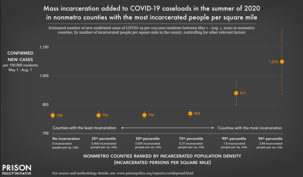
This chart shows that, all else being equal, nonmetro counties with high incarcerated population densities (such as rural counties with large prisons) had more new cases of the novel coronavirus than nonmetro counties with less incarceration did between May 1 and August 1, 2020. In counties with incarcerated population densities placing them in the top 10% of all nonmetro counties, the case rate per 100,000 residents was at least about 15% higher (90th percentile) and even over 35% higher (95th percentile) than those with little to no incarceration.
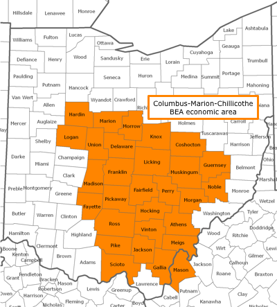
Marion County, Ohio — the site of one of the largest outbreaks related to a correctional facility (Marion Correctional Institution) — is an example of a nonmetro county with a very high concentration of incarcerated people, with 11.75 incarcerated persons per square mile (placing it above the 95th percentile). According to this analysis, Marion County had an estimated additional 402 cases of COVID-19 per 100,000 residents between May 1st and August 1st that were linked to mass incarceration within the county.
Multicounty BEA economic area analysis
At first glance, the county-level analyses above might suggest that mass incarceration made only a modest contribution to the spread of COVID-19 over the summer of 2020. After all, we found no significant relationship for metro counties, and the impact of mass incarceration on caseloads in nonmetro counties is concentrated among those counties with the highest number of incarcerated persons per square mile. However, our analyses at the larger BEA area level suggest that these county-level effects only tell a small part of the story.
The failure of correctional authorities to respond swiftly and proportionally to the threat of the pandemic allowed COVID-19 to sweep through prisons and jails in the spring of 2020, resulting in COVID-19 coming earlier to counties and BEA areas with high levels of incarceration (see this companion report for that analysis). Given the severity and breadth of the initial wave of infection in prisons and jails prior to the summer, it is possible that the county-level dynamics had largely played out before May 1st. But over time, those cases may have contributed to further community spread of the disease to nearby counties. Indeed, this is what our analyses at the BEA economic area level shows.
As explained above (see “The current study”), in the BEA area-level analyses, the population incarcerated within the county itself was not included; instead, this measure only includes the number of incarcerated people across all other counties in the same BEA economic area (see the example of Marion County, Ohio, for more details). This offers a more direct measure of community spread across multiple counties that are economically linked to one another, especially through commuting patterns.
At the level of the BEA economic area, we find that the concentration of incarcerated people increased the severity of each constituent county’s COVID-19 outbreak. This relationship was significant in both metro and nonmetro counties, but the impact of mass incarceration was more pronounced in metro counties:
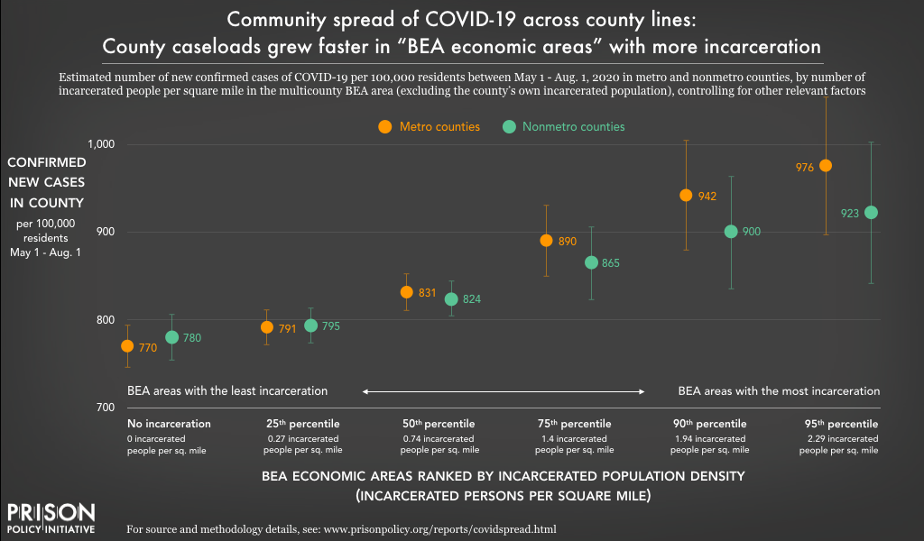
This chart shows that for both metro and nonmetro counties, being located within a multicounty BEA economic area with a higher incarcerated population density (such as an area with multiple large prisons or jails) was associated with more new cases of the novel coronavirus from May 1 to August 1, 2020 — even when completely disregarding the county’s own incarcerated population. The effect of being located in a high-incarceration economic area was stronger for metro counties (shown in orange) than for nonmetro counties (shown in green).
For both nonmetro and metro counties, the impact of mass incarceration on COVID-19 caseloads is most dramatic in economic areas with highly concentrated prison and jail populations. Nonmetro counties in BEA economic areas at the 75th percentile for incarceration (with 1.4 incarcerated persons per square mile) saw an estimated 94 additional cases of COVID-19 per 100,000 residents from May to August. The number of additional cases rises higher still for nonmetro counties at the 90th (1.94 incarcerated persons per square mile) and 95th (2.29 per square mile), with 129 and 152 additional COVID-19 cases per 100,000 respectively. Clearly, in the context of the COVID-19 pandemic, mass incarceration created public health challenges for nonmetro counties.
For metro counties, the impacts of mass incarceration on COVID-19 caseloads were greater still:
- 50th percentile (0.74)*: increase of 61 cases per 100,000 residents
- 75th percentile (1.40)*: increase of 120 cases per 100,000 residents
- 90th percentile (1.94)*: increase of 171 cases per 100,000 residents
- 95th percentile (2.29)*: increase of 206 cases per 100,000 residents
*The number in parentheses refers to incarcerated people per square mile across the multicounty BEA economic area. The increase in COVID-19 cases is net of the baseline of 770 new cases per 100,000 population.
The trends in metro counties, on their face, are very concerning. Additional infections climbed steeply as the intensity of mass incarceration in the BEA area increased. But these concerns are amplified when we consider that these are metro counties and these results refer to cases per 100,000 residents. Many of these counties are home to several hundred thousand residents; in a handful of counties, the population exceeds one million. For highly populated metro counties in a BEA economic area with high levels of incarceration, the additional caseload could be in the thousands.
These analyses — focused on BEA area-level trends — shed light on the role of mass incarceration on community spread of COVID-19. And the results are troubling. Recall that the BEA area-level measure of mass incarceration is distinct from county-level incarceration. It is based on the total number of people incarcerated and the total area (in square miles) of the multicounty BEA economic area — except for the county’s own incarcerated population (and area). In the introduction to this section, we raised the possibility that the rapid spread of COVID-19 in prisons and jails during the spring may have set the stage for further spread of the disease across the broader BEA areas in the summer. In this way, uncontrolled outbreaks in facilities in the spring were akin to “super spreader” events. As these BEA area analyses reveal, the consequences were tragic: Infection spread far beyond the walls and fences that confine incarcerated people, and COVID-19 surged across the interconnected counties of the larger BEA areas.
Aggregate impacts at the state, BEA economic area, and national levels
State and BEA area-level impacts
Once we estimated the impact of local levels of incarceration on the number of COVID-19 cases (both inside and outside correctional facilities) per 100,000 residents in the county and BEA area analyses described above, we calculated the number of additional cases for each county based on its actual population.7 In turn, we were able to aggregate (add together) these county estimates to calculate the total impact of mass incarceration on caseloads across larger geographical areas — namely states, BEA areas, and finally the nation as a whole. (Again, our estimates include cases both inside and outside correctional facilities.) The results were staggering.
For state-level estimates of cases linked to mass incarceration over the summer of 2020, we added up the estimates for all counties in each state. Table 1, below, shows the dramatic effects across the 25 states in which mass incarceration contributed the most additional cases of COVID-19. Between California, Florida, and Texas alone, mass incarceration contributed to over a quarter-million new cases of COVID-19 — about 20% of new cases in those states — between May 1st and August 1st.
Impact of mass incarceration on states:
Additional cases of COVID-19 linked to mass incarceration
(May 1 - August 1, 2020)
| State | Net additional cases | Total population | Net additional cases per 100,000 residents |
|---|---|---|---|
| California | 113,969 | 39,148,760 | 291.1 |
| Florida | 92,981 | 20,598,140 | 451.4 |
| Texas | 55,017 | 27,885,196 | 197.3 |
| Illinois | 47,298 | 12,821,497 | 368.9 |
| New York | 38,915 | 19,618,452 | 198.4 |
| Georgia | 24,951 | 10,297,484 | 242.3 |
| Pennsylvania | 20,166 | 12,791,181 | 157.7 |
| North Carolina | 13,277 | 10,155,624 | 130.7 |
| Maryland | 12,513 | 6,003,435 | 208.4 |
| Virginia | 12,040 | 8,413,774 | 143.1 |
| Louisiana | 10,685 | 4,663,616 | 229.1 |
| Ohio | 9,583 | 11,641,879 | 82.3 |
| Arizona | 8,755 | 6,946,685 | 126.0 |
| Tennessee | 7,867 | 6,651,089 | 118.3 |
| South Carolina | 7,716 | 4,955,925 | 155.7 |
| Indiana | 6,879 | 6,637,426 | 103.6 |
| Alabama | 6,722 | 4,864,680 | 138.6 |
| Massachusetts | 6,682 | 6,830,193 | 97.8 |
| Connecticut | 6,583 | 3,581,504 | 183.8 |
| Michigan | 4,787 | 9,957,488 | 48.0 |
| Mississippi | 4,545 | 2,988,762 | 152.8 |
| District of Columbia | 3,607 | 684,498 | 526.9 |
| Wisconsin | 3,454 | 5,778,394 | 59.8 |
| Missouri | 3,381 | 6,090,062 | 55.5 |
It comes as no surprise that this list, based on total additional cases, is dominated by the most populous states. Among the states ranked in the top ten for total additional cases, only New Jersey and Maryland have fewer than 10 million people, and the population of California is approaching 40 million. California and Florida were especially hard hit: California exceeded 100,000 additional cases; Florida was slightly below the 100,000 mark. Texas and Illinois were left to grapple with roughly 50,000 additional cases of COVID-19. For 12 states, mass incarceration was linked to more than 10,000 additional cases.
While the number of cases of COVID-19 linked to incarceration in these states is sobering, the rate at which mass incarceration contributed to caseloads is another critical point of comparison (the rightmost column in Table 1). If ranked according to the number of additional cases per 100,000 residents, Washington, D.C. would be first — and by a wide margin: its estimated 526.9 additional cases per 100,000 was eleven times that of Michigan (with 48), which had more additional cases simply because of its much larger population. Besides D.C., seven states were forced to deal with more than 200 additional cases per 100,000 residents: California, Florida, Georgia, Illinois, Louisiana, Maryland, and New Jersey.
Adopting a similar approach, we also calculated the total impact of local incarceration on COVID-19 caseloads in multicounty BEA economic areas. Table 2 shows the 25 economic areas with the most additional cases linked to mass incarceration:
Impact of mass incarceration on BEA areas:
Additional cases of COVID-19 linked to mass incarceration
(May 1 - August 1, 2020)
| BEA Economic Area | Net additional cases | Total population | Net additional cases per 100,000 residents |
|---|---|---|---|
| Los Angeles-Long Beach-Riverside, CA | 94,222 | 20,678,296 | 455.66 |
| New York-Newark-Bridgeport, NY-NJ-CT-PA | 64,000 | 23,602,788 | 271.16 |
| Chicago-Naperville-Michigan City, IL-IN-WI | 47,691 | 10,457,692 | 456.03 |
| Miami-Fort Lauderdale-Miami Beach, FL | 40,823 | 6,855,487 | 595.48 |
| Houston-Baytown-Huntsville, TX | 26,006 | 7,809,735 | 332.99 |
| Orlando-The Villages, FL | 25,108 | 5,072,299 | 495.00 |
| Philadelphia-Camden-Vineland, PA-NJ-DE-MD | 23,701 | 7,145,289 | 331.70 |
| Washington-Baltimore-Northern Virginia, DC-MD-VA- WV | 21,581 | 10,040,033 | 214.94 |
| Atlanta-Sandy Springs-Gainesville, GA-AL | 19,340 | 8,014,119 | 241.32 |
| Dallas-Fort Worth, TX | 14,526 | 8,892,231 | 163.36 |
| San Jose-San Francisco-Oakland, CA | 14,280 | 10,432,077 | 136.89 |
| Tampa-St. Petersburg-Clearwater, FL | 12,453 | 23,030,047 | 410.97 |
| Raleigh-Durham-Cary, NC | 6,903 | 3,512,772 | 196.51 |
| Phoenix-Mesa-Scottsdale, AZ | 6,895 | 5,260,048 | 131.08 |
| Boston-Worcester-Manchester, MA-NH | 6,372 | 8,594,883 | 74.14 |
| McAllen-Edinburg-Pharr, TX | 5,715 | 1,356,787 | 421.25 |
| Fresno-Madera, CA | 5,298 | 1,761,235 | 300.83 |
| Charlotte-Gastonia-Salisbury, NC-SC | 4,845 | 3,179,708 | 152.38 |
| Baton Rouge-Pierre Part, LA | 4,549 | 861,346 | 528.12 |
| Cleveland-Akron-Elyria, OH | 4,448 | 4,533,215 | 98.12 |
| Memphis, TN-MS-AR | 4,357 | 2,047,494 | 212.78 |
| Indianapolis-Anderson-Columbus, IN | 4,323 | 3,556,695 | 121.56 |
| Sarasota-Bradenton-Venice, FL | 4,080 | 2,081,951 | 195.99 |
| Detroit-Warren-Flint, MI | 3,717 | 6,837,098 | 54.36 |
| Jacksonville, FL | 3,665 | 1,884,231 | 194.51 |
Similar to our analysis of states, our estimates of net additional cases in BEA areas are based on the total population and additional cases per 100,000 residents in each county within the BEA area (which were then combined for the BEA area total). The population of the two BEA areas with the most additional cases — those containing Los Angeles and New York City — exceeds 20 million. Mass incarceration contributed roughly 94,000 additional cases in the Los Angeles economic area and 64,000 cases in the New York City area. In the Chicago and Miami BEA areas, mass incarceration exacerbated the COVID-19 crisis by adding more than 40,000 additional cases. The BEA areas based around Houston, Orlando, Philadelphia, and Washington, D.C. were left to deal with an additional 20,000 cases — and the impact on the Atlanta area barely missed the 20,000 mark.
Again, the total population was the strongest determinant of which areas experienced the most additional cases of COVID-19 linked to mass incarceration. But wide variation in the additional cases per 100,000 residents highlights the uneven distribution and impact of mass incarceration. Two BEA areas (Miami and Baton Rouge, La.) had experienced more than 500 additional confirmed cases of COVID-19 per 100,000 residents due to mass incarceration. We calculated over 400 additional cases per 100,000 for five BEA areas: Los Angeles, Chicago, Orlando, Tampa, and McAllen, Texas. In this list of the hardest hit BEA areas, the majority had more than 200 additional cases per 100,000 residents; only three (Boston, Cleveland, and Detroit) had fewer than 100 additional cases per 100,000 residents.
A national tragedy
Nationally, the impact of mass incarceration on the spread of COVID-19 is significant. Just as we aggregated county-level impacts to the state and BEA area levels, we also aggregated impacts of all the counties in the nation. For the entire United States, we estimate that mass incarceration was linked to an additional 566,804 cases — or roughly 13% of all new cases — from May 1st to August 1st alone.
When the total number of confirmed cases of COVID-19 linked to mass incarceration is compared to national caseloads around the world, the impact is even more apparent. In Table 3, we list all countries with at least 100,000 confirmed cases as of August 1st — and include the cases attributable to mass incarceration in this ranking. If the cases linked to mass incarceration over the summer of 2020 were the reported caseload of a country, that country would rank 5th in the world.
Comparing U.S. COVID-19 cases linked to mass incarceration to global caseloads as of August 1, 2020
| Country | Confirmed cases as of August 1, 2020 | Cases per 100,000 residents (August) |
|---|---|---|
| USA | 4,456,389 | 1,588.7 |
| Brazil | 2,610,102 | 1,541.0 |
| India | 1,695,988 | 187.7 |
| Russia | 845,443 | 632.4 |
| Additional cases attributable to mass incarceration | 566,804 | n/a |
| South Africa | 493,183 | 984.1 |
| Mexico | 416,179 | 396.6 |
| Peru | 407,492 | 1,565.9 |
| Chile | 355,667 | 2,008.3 |
| Iran | 304,204 | 406.1 |
| United Kingdom | 303,185 | 466.0 |
| Spain | 288,522 | 733.2 |
| Colombia | 286,020 | 874.8 |
| Pakistan | 278,305 | 130.7 |
| Saudi Arabia | 275,905 | 854.0 |
| Italy | 247,537 | 419.2 |
| Bangladesh | 237,661 | 166.7 |
| Turkey | 230,873 | 294.2 |
| Germany | 209,653 | 266.7 |
| Argentina | 185,373 | 624.9 |
| France | 175,920 | 419.2 |
| Iraq | 124,609 | 429.1 |
| Canada | 115,799 | 322.3 |
| Qatar | 110,695 | 3,985.0 |
| Indonesia | 108,376 | 50.3 |
To be clear, mass incarceration is not solely responsible for these 567,000 cases of the novel coronavirus. And it should go without saying that incarcerated people and correctional staff are not to blame for these additional cases linked to mass incarceration. Rather, the complete mismanagement of the pandemic explains the large number of cases linked to mass incarceration. With nearly 1,589 cases per 100,000 residents, the United States reported one of the highest infection rates in the world; only Qatar’s and Chile’s rates were higher.
These international comparisons make clear how many cases could have been avoided if the U.S. had effectively managed the pandemic. If we compare the U.S. to other high-income countries — that is, those with resources to handle the pandemic — the U.S. infection rate is off the charts: The infection rate in Spain was roughly half of the U.S. rate; the rates in the United Kingdom and Italy were less than a third of the U.S.’s; and in Canada and Germany, infection rates were lower still. If the U.S. had maintained an infection rate comparable to Germany’s or Canada’s, cases linked to mass incarceration might have been fewer than 100,000 for the entire country over the summer of 2020.
Korea and Japan — two countries that didn’t make the list above because their caseloads were well below our 100,000 case threshold in August — show that it was possible to maintain much lower infection rates, even with sizable populations. Both of these countries boasted rates below 50 per 100,000 residents; if the U.S. had maintained an infection rate that low, there might have been fewer than 20,000 cases linked to mass incarceration. Instead, mass incarceration exacerbated the COVID-19 crisis across the United States by adding more than 560,000 cases to an already overburdened health system.
Conclusions
From the beginning of the pandemic, it was clear that densely packed prisons and jails offered ideal conditions for the transmission of the COVID-19 virus. In April, a team of epidemiologists predicted that mass incarceration would lead to hundreds of thousands of additional cases in the U.S. In June, the Prison Policy Initiative released a report with the ACLU showing that states were failing at the one effort likely to prevent such a tragedy: the safe reduction of prison and jail populations.
This analysis, conducted several months later, confirms our worst fears: The number of people in prisons and jails has led to more COVID-19 cases, among those working or confined in these facilities and among those who simply live near them. As documented here, the number of new COVID-19 infections over the summer of 2020 was greater in counties and multicounty areas with larger and more concentrated incarcerated populations. In total, we estimate that mass incarceration led to 560,000 additional COVID-19 cases nationwide in just three months.
State and local leaders should be held accountable for dragging their feet when it came to reducing prison and jail populations. But their inaction is part of a larger problem: our country’s inability to move away from mass incarceration, which leaders insist is necessary for public safety. Our criminal justice system is riddled with policies making it difficult to free people from prison (such as mandatory minimums and Truth in Sentencing), so it is no surprise that states were paralyzed when faced with the task of quickly reducing the large prison populations they have allowed to pile up. Meanwhile, cities and counties have grown accustomed to using jails to manage social problems, so it is unsurprising that they struggle to keep jail admissions down during the pandemic, even with the knowledge that jails are essentially “super spreaders” of the novel coronavirus.
What is needed immediately, at the policy level, is an increased use of clemency, parole expansion, and other legal mechanisms to depopulate prisons and stop the virus from spreading behind bars. But there is a greater need over the long term: a profound rethinking of how we use incarceration in this country. It has never been more obvious that locking up millions of people in crowded and unsanitary conditions is harmful — not only for those who are locked up, but for people outside prisons as well. With the pandemic dragging on, our ability to radically reduce our use of incarceration is now a life or death matter. If lawmakers cannot make swift changes to reduce correctional populations and keep them low, we should expect that more COVID-19 outbreaks — and more deaths — in prisons and the communities that surround them are still to come.
Appendices
- Table 1. Impact of mass incarceration on all 50 states and D.C.
- Table 2. Impact of mass incarceration on all 179 BEA economic areas
- Table 3. Impact of mass incarceration on every U.S. county
- Mass Incarceration, COVID-19, and Community Spread: Methodological Appendix [PDF] (a detailed methodology by Gregory Hooks)
How to link to specific images and sections
To help readers link to specific images in this report, we created these special urls:
- The current study: An overview of the methodology, including the measures of local incarceration and COVID-19 cases, geographical levels of analysis, statistical analysis, and control variables.
- https://www.prisonpolicy.org/reports/covidspread.html#currentstudy
- Finding 1: COVID-19 caseloads grew more quickly over the summer of 2020 in nonmetro counties with more people incarcerated
- https://www.prisonpolicy.org/reports/covidspread.html#nonmetro
- Figure 1: Mass incarceration added to COVID-19 caseloads in the summaer of 2020 in nonmetro counties with the most incarcerated people per square mile
- https://www.prisonpolicy.org/reports/covidspread.html#figure1
- Finding 2: COVID-19 caseloads grew much more quickly over the summer of 2020 among counties in multicounty economic areas with more people incarcerated
- https://www.prisonpolicy.org/reports/covidspread.html#
- Figure 2: Community spread of COVID-19 across county lines: County caseloads grew faster in “BEA economic areas” with more incarceration
- https://www.prisonpolicy.org/reports/covidspread.html#figure2
- Finding 3: Mass incarceration impacted COVID-19 caseloads in multicounty economic areas and states. Nationally, this impact reached a tragic scale: mass incarceration contributed to more than a half million cases over the summer of 2020.
- https://www.prisonpolicy.org/reports/covidspread.html#
- Table 1: Impact of Mass Incarceration on States (25 states experiencing highest impact) Net Additional Cases of COVID-19 Confirmed (May 1- August 1)
- https://www.prisonpolicy.org/reports/covidspread.html#table1
- Table 2: Impact of Mass Incarceration on BEA Areas (25 areas experiencing highest impact) Net Additional Cases of COVID-19 Confirmed (May 1- August 1)
- https://www.prisonpolicy.org/reports/covidspread.html#table2
- Table 3: Net Additional Cases of COVID-19 Linked to Mass Incarceration (May 1- August 1) Compared to Countries with 100,000 or More Confirmed Cases (as of August 1, 2020)
- https://www.prisonpolicy.org/reports/covidspread.html#table3
- Conclusions
- https://www.prisonpolicy.org/reports/covidspread.html#conclusions
Acknowledgements
The authors thank their academic and Prison Policy Initiative colleagues for their feedback and assistance putting together this report. In particular, we are grateful to Wanda Bertram, Katie Rose Quandt, and Peter Wagner for their edits, and to Elle Hamson, Tiana Herring, and Emily Widra for their technical assistance.
We thank Arnold Ventures, the Art for Justice Fund, the Chan Zuckerberg Initiative, and the Ford Foundation for supporting the Prison Policy Initiative’s work in response to the COVID-19 pandemic. We are also grateful to our individual donors, who choose to invest in research that gives voice to the 2.3 million Americans behind bars, and who make quick-response reports like this one possible. Of course, the views expressed herein are the authors’ alone and do not necessarily represent the opinions or positions of any of our supporters.
About the Prison Policy Initiative
The non-profit non-partisan Prison Policy Initiative was founded in 2001 to expose the broader harm of mass criminalization and spark advocacy campaigns to create a more just society. It sounded the national alarm about the threat of coronavirus to jails and prisons with its March 2020 report No need to wait for pandemics: The public health case for criminal justice reform. The organization’s data-driven coverage of the pandemic behind bars continues to advance the national movement to protect incarcerated people from COVID-19.
About the authors
Gregory Hooks is Professor of Sociology at McMaster University. In several prior works, he has examined the impact of prisons on local employment trends. This research raised doubts about the purported economic benefits of prisons. In fact, this research suggested that prison towns are at risk of ending up with a net decrease in jobs. For details on this line of research, see:
- Genter, Shaun, Gregory Hooks, and Clayton Mosher. 2013. Prisons, Jobs and Privatization: The Impact of Prisons on Employment Growth in Rural U.S. Counties, 1997-2004.
- Hooks, Gregory, Clayton Mosher, Shaun Genter, Thomas Rotolo and Linda Lobao. 2010. Revisiting the Impact of Prison-Building on Job Growth: Education, Incarceration and County-Level Employment, 1976-2004.
- Gregory Hooks, Linda Lobao, Clay Mosher, and Thomas Rotolo. 2004. The Prison Industry: Carceral Expansion and Employment in U.S. Counties, 1969-1994.
His research program examines spatial inequality broadly, including research into inequality and social policy, environmental inequality (from both military and civilian sources), and peace, war and development.
Wendy Sawyer is the Research Director at the Prison Policy Initiative. She is the author of Youth Confinement: The Whole Pie, The Gender Divide: Tracking women’s state prison growth, and the 2016 report Punishing Poverty: The high cost of probation fees in Massachusetts. She recently co-authored Mass Incarceration: The Whole Pie with Peter Wagner. In addition to these reports, Wendy frequently contributes briefings on recent data releases, academic research, women’s incarceration, pretrial detention, probation, and more.
Footnotes
- In our preliminary models, we employed alternative measures of mass incarceration (including total number of people incarcerated and incarcerated persons per 100,000 residents). These alternative measures showed evidence of relationships between mass incarceration and increased COVID-19 caseloads. However, measuring mass incarceration in terms of incarcerated persons per square mile yielded results that were more robust and more consistent, so these results are presented and discussed in this report.
- The total incarcerated population, nationwide, peaked in 2008. Between 2010 (when the Census data used in this analysis were collected) and 2018 (the most recent year for which the Bureau of Justice Statistics has published data), the total prison and jail population has fallen by 6.8%, with a more noticeable reduction in the prison population (down 7.7%) than in local jails (down 1.4%). The rate of incarceration (the number of incarcerated adults per 100,000 U.S. residents) likewise fell by 11% between 2010-2018; this may be a more useful comparison because it also accounts for the change in the total U.S. population over those years.
- Because it controls for the total population in a county, this a common approach for presenting and analyzing the incidence of a disease. See, for example, the CDC’s COVID Data Tracker county map.
- The emphasis that BEA economic areas place on commuting makes these geographies well-suited for this analysis of “community spread” related to prisons and jails across a multicounty area. Those who work in one county but live in another county are exposed to the novel coronavirus in more than one county, and if they become infected, they can infect people in more than one county.
- Additional control variables were included in preliminary models. However, due to collinearity, several variables were dropped. For details on data sources, model specification and related details, see Mass Incarceration, COVID-19, and Community Spread: Methodological Appendix [PDF].
- The “baseline” represents an “average” county’s estimated number of new confirmed cases between May 1st and August 1st if there was no incarceration (that is, when the incarcerated population is zero). More precisely, the baselines and other estimates presented in this report are based on scenarios — not actual examples — in which all control variables are held at their respective means (averages), and only the measure of incarceration (the independent variable) and the estimated number of new cases (the dependent variable) change. In all likelihood, there is no county that actually has the mean value for all of these variables.
The baselines for the different analyses in this report (i.e. metro versus nonmetro counties, or BEA area-level vs. county-level analyses) vary slightly because each model includes different measures of incarceration and/or different applicable control variables. See “The current study” section and the Methodological Appendix [PDF] for further details. - For details and examples of these calculations, see Mass Incarceration, COVID-19, and Community Spread: Methodological Appendix [PDF], especially Table 9.
