Our favorite data visualizations of 2018
2018 was another big year for powerful data visualizations from the Prison Policy Initiative. These are our 11 favorites.
by Wendy Sawyer, December 28, 2018
2018 was another big year for powerful data visualizations from the Prison Policy Initiative. These are 11 of our favorites, in the order they appeared this year:
1. The Gender Divide
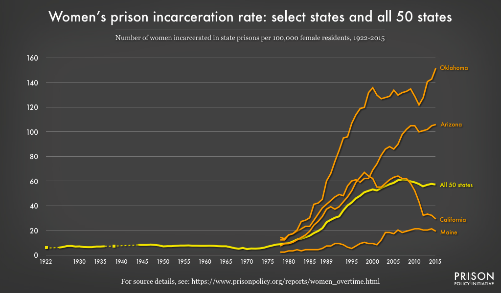
In January, we tracked women’s state prison growth as far back as 1922 to show that women’s incarceration today is historically unprecedented. Our report also shows that the national trend obscures even more dramatic state variation. For example, in 2016, Oklahoma’s female prison incarceration rate was more than double the national average, and six times the rate in Maine. We illustrated the scale of these variations by charting four disparate state trends alongside the national trend:
2. Youth Confinement: The Whole Pie
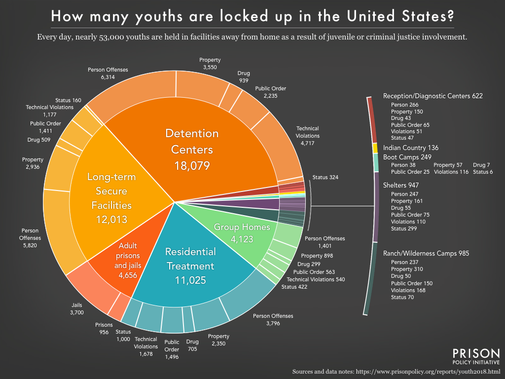
For the first time, we compiled data on youth confinement in both adult and youth facilities — using our “whole pie” approach — to show what happens when justice-involved youth are held by the state: where they are held, under what conditions, and for what offenses. We found that nearly one in ten of these youth are held in an adult prison or jail, and that most in juvenile “residential placement” are held in similarly restrictive, correctional-style facilities.
Other graphics in this report highlighted some of the problems of the adult criminal justice system that are mirrored in the juvenile justice system, including punitive conditions, pretrial detention, and overcriminalization.
3. Mass Incarceration: The Whole Pie 2018
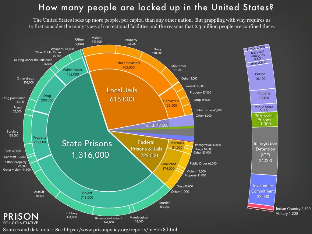
Our fifth edition of our “Whole Pie” report — and our most widely-referenced data visualization — offers the most comprehensive view of U.S. criminal justice confinement to date.
This year, we were able to include the 51,000 individuals held by the U.S. Marshals Service in the federal “slice,” as well as over 15,000 people held in state psychiatric hospitals due to justice system involvement. In addition to refining our methodology, we created four slideshows with detailed views of parts of the “pie” that are often misunderstood or overlooked, including federal detention and incarceration, jails and pretrial detention, drug offenses, and more.
4. Artist collaboration: Visualizing 10.6 million annual jail admissions
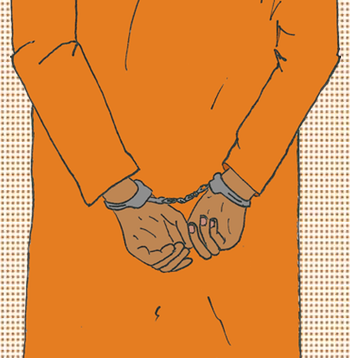
Following closely on the heels of the “Whole Pie” report, we collaborated with data journalist and illustrator Mona Chalabi to visualize how much greater the impact of jails is than the daily population suggests. While 731,000 people are held in jails on a given day, people actually go to jail 10.6 million times each year in the U.S.
What do 10.6 million jail admissions look like? To show us, Mona drew one person in handcuffs to represent one jail admission. She then repeated the image, much smaller, 10.6 million times:
To get the full effect, click through to the original post and start scrolling.
5. Showing that incarcerated people are buying necessities, not luxuries, in prison commissaries
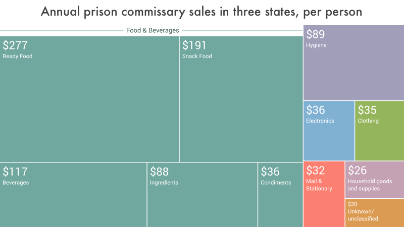
Prison commissaries are an essential part of prison life, but until this year, we didn’t have good data about how much items generally cost or what incarcerated people are buying. For the report The Company Store, Prison Policy Initiative volunteer Stephen Raher pored over commissary sales records from Illinois, Massachusetts, and Washington to find that incarcerated people in these states spent an average of $947 per person, per year, and that most of that money goes to food and hygiene products. We illustrated the breakdown of per capita commissary sales with a tree map for each state, and one showing the averages of all three states:
6. Putting state incarceration rates in the global context
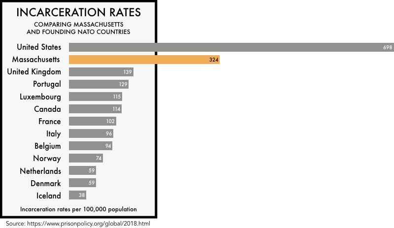
In our 2018 updates to States of Incarceration: The Global Context and its companion report focused on women’s incarceration, we compared each state’s rate of incarceration to those of 166 other countries, revealing that about half of all U.S. states have higher incarceration rates than any independent country on earth. Even states that have embraced “progressive” criminal justice reforms (like Massachusetts, below) incarcerate people at far higher rates than other Western democracies. To illustrate this point, we also created individual state graphs comparing states to founding NATO countries:
7. Showing the hidden costs in “free” tablet contracts
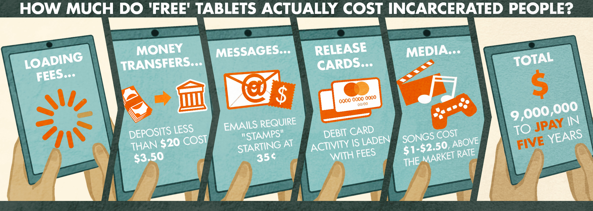
Illustrator Elydah Joyce artfully explained almost every scam we’ve documented in previous reports and how they were hidden within a “no cost” tablet contract between the New York State Department of Corrections and private company JPay:
8. Comparing unemployment among formerly incarcerated people to the Great Depression
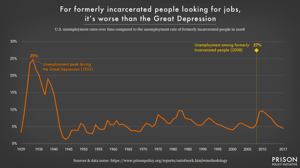
In Out of Prison & Out of Work, we calculated the first-ever national unemployment rate for formerly incarcerated people: a staggering 27 percent. To put that in perspective, we charted the U.S. unemployment rate since 1929 to show that, for the 5 million formerly incarcerated people in the U.S., the odds of finding employment are worse than they were even at the peak of the Great Depression:
9. Explaining the links between education, the labor market, and unemployment among formerly incarcerated people
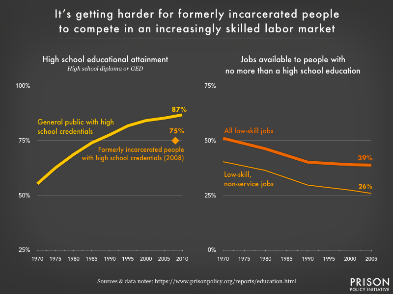
We connected the dots to show that changes in the labor market, combined with lagging educational attainment, have made it harder for formerly incarcerated people to compete for a dwindling number of low-skill jobs. This graphic from Getting Back on Course helps explain why unemployment rates are so high & and the need for educational opportunities is so great & for formerly incarcerated people:
10. The “Whole Pie” for women’s incarceration
This year, we went deeper with our analysis of women’s incarceration in our update to Women’s Mass Incarceration: The Whole Pie, produced in collaboration with the ACLU’s Campaign for Smart Justice. Women remain an overlooked segment of the incarcerated population, despite the rapid growth of women’s prison and jail populations. This report offers a snapshot of how many women are locked up on a given day, where, and why. A new detailed view of the 102,000 women held in local jails reveals that over half are unconvicted and awaiting trial:
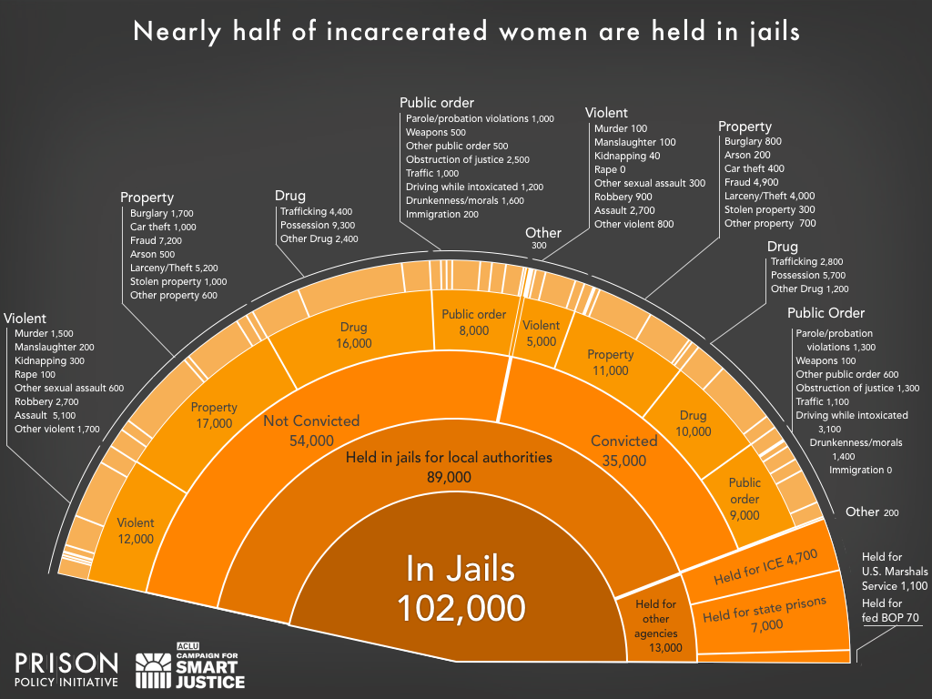
While we continue to be frustrated by the lack of gender-specific data reported by government agencies, this report compiles the best sources available to help ensure that women are not left behind in the effort to end mass incarceration.
11. The big picture: correctional control by state
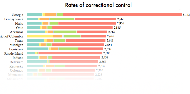
In our final report and infographic of the year, we compiled all of the state-level data available on various forms of state control — including incarceration in prisons and jails, probation, parole, youth confinement, involuntary commitment, and Indian Country jails — to give a more complete picture of correctional control. This broader view reveals that some states with comparatively low incarceration rates (like Rhode Island and Minnesota) have some of the highest rates of community supervision. Again, we are reminded that to end mass incarceration, every state will need to rethink its use of correctional control.
