Where people in prison come from:
The geography of mass incarceration
by Emily Widra
January 2023
One of the most important criminal legal system disparities in the United States has long been difficult to decipher: Which communities and neighborhoods throughout the state do incarcerated people come from? Anyone who lives in or works within heavily policed and incarcerated communities intuitively knows that certain neighborhoods disproportionately experience incarceration. But data have rarely been available to quantify how many people from each community are imprisoned with any real precision.1
But now, thanks to redistricting reforms that ensure incarcerated people are counted correctly in the legislative districts they come from, we can understand the geography of incarceration in twelve states with up-to-date data. These twelve states — California, Colorado, Connecticut, Delaware, Maryland, Montana, Nevada, New Jersey, New York, Pennsylvania, Virginia, and Washington — are among the states that have ended prison gerrymandering, and now count incarcerated people where they legally reside — at their home address — rather than in remote prison cells. This type of reform, as we often discuss, is crucial for ending the siphoning of political power from disproportionately Black and Latino communities to pad out the mostly rural, predominantly white regions where prisons are located. And when reforms like these are implemented, they bring along a convenient side effect: In order to correctly represent each community’s population counts, states must collect detailed state-wide data on where imprisoned people call home, which is otherwise impossible to access.
These data also allow us to better understand how incarceration rates2 correlate with other community problems related to poverty, employment, education, and health. While the data is not comparable between states, it does show us meaningful patterns in incarceration and researchers, scholars, advocates, and politicians can use the data in this report to advocate for programs and services housed outside the criminal legal system in the communities that need them most.
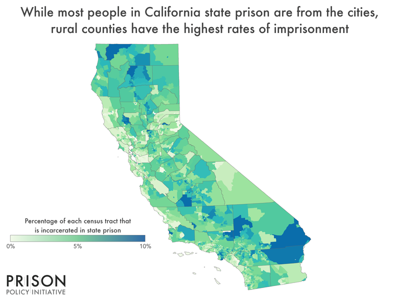
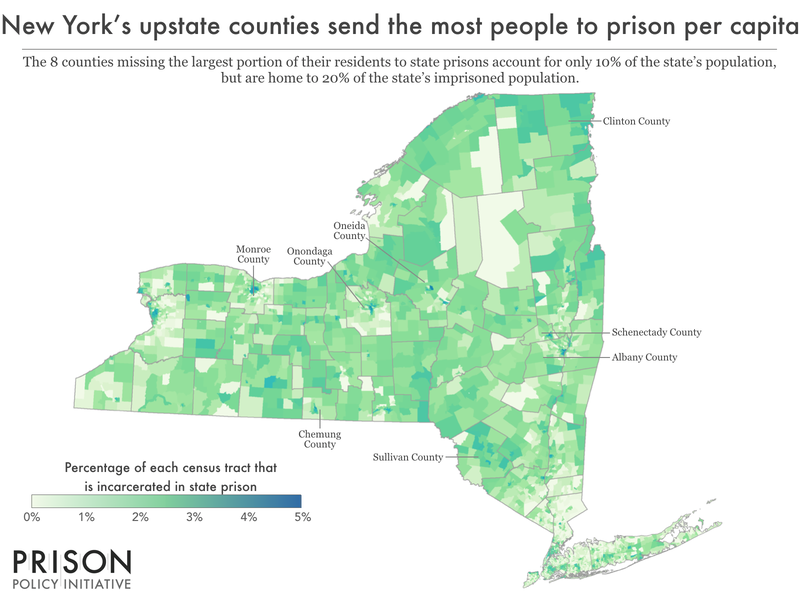
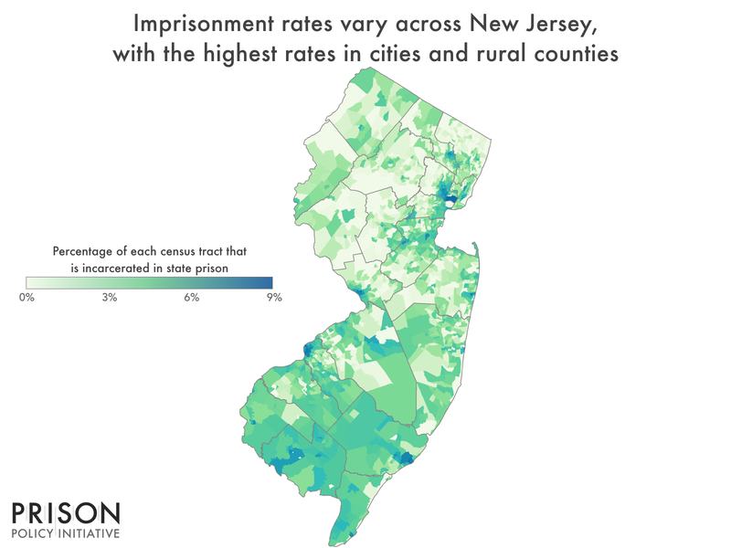
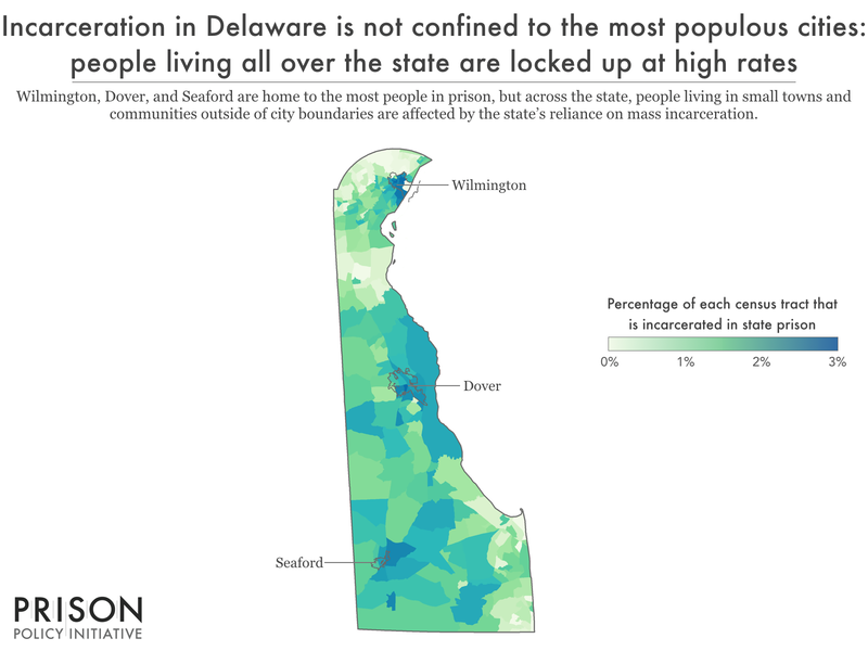
Mass incarceration isn’t just a problem in urban areas: people in prison come from all over, but disproportionately from some places more than others.
These residence data show that community leaders all over these states should be worried about incarceration and that the idea that incarceration is a problem unique to big cities is a myth.
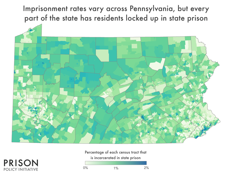
One Pennsylvania reporter succinctly explained how deeply this myth is ingrained in popular opinion and the hidden truths this data exposes:
“Like a lot of issues that come before the General Assembly, there’s a kind of legislative shorthand that takes hold when the conversation turns toward issues of crime, punishment, and imprisonment.
Namely, that the overwhelming majority of people serving time in the commonwealth’s sprawling, and hugely expensive, state prison system, come from the state’s two, largest cities.
But as newly released data make clear, while imprisonment rates vary statewide, every community — from Pittsburgh to Perkasie and from Aliquippa to Allentown — has residents behind bars.”
For example, in Pennsylvania, the county with the highest number of imprisoned residents (7,019)3 is, unsurprisingly, the most populous county, Philadelphia County (which is the entirety of the city of Philadelphia), with over 1.6 million residents. Philadelphia County also has the second-highest county imprisonment rate in the Commonwealth: 436 imprisoned people per 100,000 county residents. But out of Pennsylvania’s top five highest imprisonment counties, three — Venango, Jefferson, and Warren — are rural counties in the western part of the state with significantly higher poverty rates than most of the state. This fits with nationwide trends: people in prison tend to have been among the poorest people in the country before their incarceration.
In addition, western Pennsylvania communities have faced high rates of opioid use over the past decade.4 We know that people who use opioids are at heightened risk for arrest and criminal-legal system involvement. In fact, 21% of 2020 court commitments to Pennsylvania state prisons were for “narcotic drug offenses,” suggesting that communities with high rates of opioid use are particularly vulnerable to arrest, conviction, and imprisonment. Nationally, 20% of people in state prisons report that they have used heroin at some point, and half of people in state prisons meet criteria for a substance use disorder. Because we know people are at heightened risk for returning to drug use and overdosing upon release from prison, and that incarceration fuels the cycle of poverty, these findings suggest that poor, rural communities in western Pennsylvania are in need of focused resources and support to reduce the risk of criminal legal system involvement and break the cycle of poverty.
The patterns revealed in Pennsylvania were not unique to the Keystone state, but were true in every one of the twelve states we looked at. Poverty, substance use, and inadequate mental health care the primary drivers of criminal-legal involvement across the country, and communities in every state — not just in the nation’s largest cities — need to make front-end investments to address these concerns and reduce prison populations, curtail excessive spending on the criminal-legal system, and build stronger, safer, and healthier communities.
Deep disparities exist within communities
While it is true that incarceration is a problem felt in all corners of these states, diving deeper into the data reveals that within cities and counties, imprisonment tends to be concentrated in a relatively small number of geographic areas and neighborhoods.
Our data collected in 12 state-specific reports emphasized what we already know: communities missing the most residents to incarceration are often disproportionately low-income, communities of color, under-resourced and overpoliced. For example, in Los Angeles, the largest city in California, the 14 neighborhoods with the highest imprisonment rates are all clustered in South Central Los Angeles — a predominately non-white region of the city, with median incomes far below the city average.
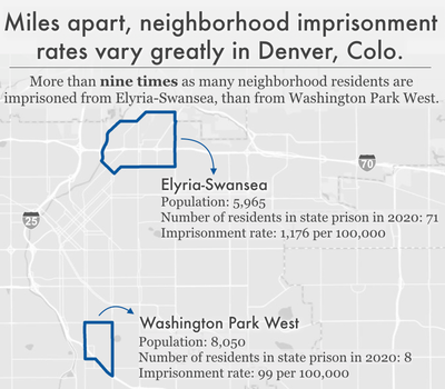
Similarly, the racial divide runs deep when it comes to incarceration rates in Denver. In neighborhoods with high concentrations of people of color, primarily Black and Latino, larger portions of the populations are imprisoned. For example, in Elyria-Swansea — the Denver neighborhood with the third-highest incarceration rate of 1,176 per 100,000 — residents are more than 80% Latino and approximately 33% live in poverty. High rates of imprisonment in these areas, like high rates of poverty, are likely — at least in part — a symptom of the historical divestment that left residents with limited access to crucial community resources — including community health services, grocery stores, housing support, job training services, and immigration resources.
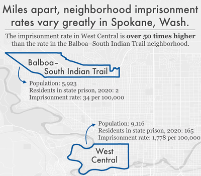
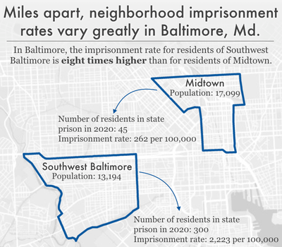
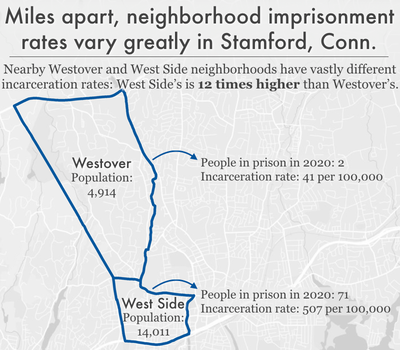
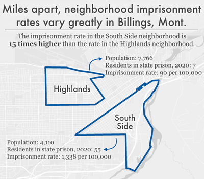
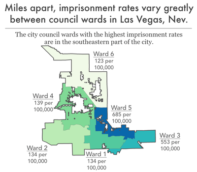
These patterns are not unique to California and Colorado. The data consistently show dramatic neighborhood-level differences meaning a few miles of separation can mean a dramatically different experience of mass incarceration.
In many of the states, we found that neighborhoods with high incarceration rates are usually facing the modern-day repercussions of the mid-20th century’s racist redlining and blockbusting policies and practices. In the 1930s, “redlining” involved the federal government rating the “riskiness” of real estate investment in different neighborhoods, resulting in rating non-white neighborhoods as “hazardous” and beginning a cycle of disinvestment in these predominantly Black and immigrant neighborhoods. A 2019 study of formerly redlined neighborhoods in over 100 cities found that these neighborhoods are lower-income and are more likely to be home to Black and Hispanic or Latino residents.
Similarly, in the 1950s, blockbusting was a state-sanctioned predatory real estate practice, in which brokers “intentionally stoked fears of racial integration and declining property values to push white homeowners to sell at a loss,” and then resold the properties to Black families at above-market rates. Black families seeking the “American dream” found themselves owning declining-value homes in a city that was experiencing rapid divestment from industry and businesses — and therefore losing job opportunities and tax income.
The neighborhoods with the highest incarceration rates in 2020 are also the neighborhoods that were “redlined” or “blockbusted” in the mid-20th century: we found clear examples of the overlap between high incarceration rate neighborhoods and historically redlined and blockbusted neighborhoods in Richmond, Virginia, San Francisco, California, Compton, California, Hartford, Connecticut, and Philadelphia, Pennsylvania. Decades of systematic oppression and divestment from these poorer communities of color — which we know are overpoliced — have left these historically redlined communities particularly vulnerable to our modern-day reliance on mass incarceration.
What are the differences between high- and low-incarceration communities?
While all communities are missing some of their members to prisons, incarceration has its broadest community impact in the places where large numbers of adults — parents, workers, voters — are locked up. The large number of adults drained from these areas seriously impacts the health and stability of the families and communities left behind.5
Across the country, researchers have connected high local incarceration rates with a host of negative outcomes for the people who live there. In our previous analysis of 2010 Census examining where incarcerated people in Maryland are from, we found that Baltimore communities with high rates of incarceration were more likely to have high unemployment rates, long average commute times, low household income, a high percentage of residents with less than a high school diploma or GED, decreased life expectancy, high rates of vacant or abandoned properties, and higher rates of children with elevated blood-lead levels, compared to neighborhoods less impacted by incarceration.
Research has revealed similar correlations6 in communities around the country:
- Life expectancy: A 2021 analysis of New York State census tracts found that tracts with the highest incarceration rates had an average life expectancy more than two years shorter than tracts with the lowest incarceration rates, even when controlling for other population differences.7 And a 2019 analysis of counties across the country revealed that higher levels of incarceration are associated with both higher morbidity (poor or fair health) and mortality (shortened life expectancy).
- Community health: A nationwide study, published in 2019, found that rates of incarceration were associated with a more than 50% increase in drug-related deaths from county to county. And a 2018 study found that Black people living in Atlanta neighborhoods with high incarceration rates are more likely to have poor cardiometabolic health profiles.
An analysis of North Carolina data from 1995 to 2002 revealed that counties with increased incarceration rates had higher rates of both teenage pregnancy and sexually transmitted infections (STIs). A 2015 study of Atlanta also found that census tracts with higher rates of incarceration had higher rates of newly diagnosed STIs.8 - Mental health: A 2015 study found that people living in Detroit neighborhoods with high prison admission rates were more likely to be screened as having a current or lifetime major depressive disorder and generalized anxiety disorder.
- Exposure to environmental dangers: A 2021 study found that people who grew up in U.S. census tracts with higher levels of traffic-related air pollution and housing-derived lead risk were more likely to be incarcerated as adults, even when controlling for other factors.
In New York City, neighborhood incarceration rate is associated with asthma prevalence among adults. Similarly, in our 2020 analysis of New York City neighborhoods, we found higher rates of asthma among children in communities with high incarceration rates.9 - Education: In our 2020 analysis of incarcerated New Yorkers’ neighborhoods of origin, we found a strong correlation between neighborhood imprisonment rates and standardized test scores.10 And a 2017 report on incarceration in Worcester, Mass., found that schools in the city’s high-incarceration neighborhoods tended to be lower-performing. What’s more, students in those neighborhoods faced more disciplinary infractions.
- Community resources and engagement: A 2018 study found that throughout the country, formerly incarcerated people (as well as all people who have been arrested or convicted of a crime) are more likely than their non-justice-involved counterparts to live in a census tract with low access to healthy food retailers. And the 2017 report on Worcester, Mass., revealed that high-incarceration neighborhoods had lower voter turnout in municipal elections.
We already have this wealth of data showing that incarceration rates correlate with a variety of barriers and negative outcomes. The data in these twelve state-specific reports build on this work by helping identify which specific neighborhoods and communities are systematically disadvantaged and left behind.
Implications & uses of these data
First and most obviously, these data can be used to determine the best locations for community-based programs that help prevent involvement with the criminal legal system, such as offices of neighborhood safety and mental health response teams that work independently from police departments. The data can also help guide reentry services (which are typically provided by nonprofit community organizations) to areas of each state that need them most.
But even beyond the obvious need for reentry services and other programs to prevent criminal legal system involvement, our findings also point to geographic areas that deserve greater investment in programs and services that indirectly prevent criminal legal involvement or mitigate the harm of incarceration. After all, decades of research show that imprisonment leads to cascading collateral consequences, both for individuals and their loved ones. When large numbers of people disappear from a community, their absences are felt in countless ways. They leave behind loved ones, including children, who experience trauma, emotional distress, and financial strain. Simultaneously, the large numbers of people returning to these communities (since the vast majority of incarcerated people do return home) face a host of reentry challenges and collateral consequences of incarceration, including difficulty finding employment and a lack of housing. People impacted by the criminal legal system tend to have extremely diminished wealth accumulation. And those returning from prison and jail may carry back to their communities PTSD and other mental health issues from the trauma they’ve experienced and witnessed behind bars. Lastly, investing in core community resources to mitigate structural issues like poverty, such as housing and healthcare, will reduce vulnerabilities for criminal legal system contact.
And since we know place of origin correlates with so many other metrics of wellbeing, we can and should target these communities for support and resources beyond what we typically think of as interventions to prevent criminal legal system contact. In communities where the state or city has heavily invested in policing and incarceration (i.e. the high-incarceration neighborhoods we find in our analysis), our findings suggest that those resources would be better put toward reducing poverty and improving local health, education, and employment opportunities.
For example, we know that large numbers of children in high incarceration areas may be growing up with the trauma and lost resources that come along with having an incarcerated parent, and that these children are also more likely to experience incarceration. The information in this report can help with planning and targeting supports, resources, and programming designed to not only respond to the harms caused by incarceration, but disrupt the cycle of familial incarceration.
Since the publication of these twelve state reports, we’ve seen the data used in a variety of ways by researchers and media:
- San Francisco: The San Francisco Chronicle conducted their own analysis of the incarceration data for California compared with median income data and found that for every $10,000 increase in median income for a given place, there was an average of 43 fewer people incarcerated per 100,000 residents.
- Pennsylvania: The Philadelphia Inquirer used the incarceration data to show where reentry services are most needed and where they will be most effective for people returning to communities after incarceration.
- Nevada: The Nevada Independent published a story highlighting the historic and ongoing racialized overpolicing in the Black neighborhoods of North Las Vegas.
- Connecticut: In Connecticut, researchers report they are using the data to look at the relationship between neighborhood incarceration rates and educational outcomes.
Improving the data in the future
The goal of these twelve reports is not to have the final word on the geographic concentration of incarceration, but to empower researchers and advocates — both inside and outside of the field of criminal justice research — to use our dataset for their own purposes. The reports can also be seen as templates for other states because while not all states have ended prison gerrymandering, most state departments of corrections already have near-complete home residence records in an electronic format. Those states could be encouraged to continue improving their data collection, and to share the data (under appropriate privacy protections) so that similar analyses could be performed.
Our analyses only documented the home addresses of most people in each state’s prison system on Census Day 2020. From the perspective of improving democracy, the twelve states’ reallocation efforts were a success, reducing both the unearned enhancement of political representation in prison-hosting areas and reducing the dilution of representation in the highest-incarceration districts. There are a handful of reasons that we were not able to analyze address data for 100% of the state prison populations, including policy choices made when the legislation ending prison gerrymandering was created and others are just the practical outcome of valiant state efforts to improve federal census data, or the process of repurposing that dataset for this entirely different project.
From the perspective of using those data to discuss the concentration of incarceration, some readers may want to be aware of some of the reasons why we could not cover 100% of the state prison population:
- Some addresses were unknown or could not be located for reallocation. For example, some addresses on file may be incomplete or only contain the notation “homeless” which cannot be applied to a specific census block.
- Most states did not reallocate people incarcerated in a local jail in this state or elsewhere; because the efforts to remedy prison gerrymandering were primarily focused on state prisons. There are three exceptions: Connecticut, Delaware, and Virginia.11
- Pennsylvania did not reallocate people with more than 10 years left on their sentences; both Pennsylvania and Connecticut did not reallocate people serving sentences of life without parole.12
- No states were able to reallocate people incarcerated in federal prisons, as states do not have the power to require home address data from federal agencies.
- Not all people incarcerated in a state prison are residents of that state and they were subsequently not reallocated to a home address in the state in which they were incarcerated.
- No states were able to reallocate residents incarcerated in another state’s prison system. States cannot require other states to share this information, and the fact that so many states are ending prison gerrymandering is too new of a phenomenon for them to have had the chance to enter into inter-state data-sharing agreements.
Ultimately, though, the best way to improve and expand this dataset in future years is for the Census Bureau to change where it counts incarcerated people — to count them as residents of their homes instead of prison cells. The Bureau relies on an outdated understanding of the realities of incarceration to justify this flawed method. Counting incarcerated people as residents of their home communities would have the primary benefit of ending the practice of prison gerrymandering and ensuring some communities do not have a louder voice in government simply because they contain prisons. As a secondary benefit, the change would also create a nationwide dataset that would enable researchers to conduct new analyses on the geographic aspects of the harms of mass incarceration. The Prison Policy Initiative and other organizations have already urged the Bureau to make this change in the 2030 Census.
Methodology & data
This report is based on twelve previous reports published by the Prison Policy Initiative — concerning the states of California, Colorado, Connecticut, Delaware, Maryland, Montana, Nevada, New Jersey, New York, Pennsylvania, Virginia, and Washington — each of which capitalized on the unique opportunity presented by that state’s ending of prison gerrymandering to allow us to determine accurately for the first time where people incarcerated in state prisons come from. In each state report’s datasets, we aggregate these data by a number of useful state-wide geographies such as counties, state legislative districts, school districts, and cities, and in select urban areas some additional useful geographies like neighborhoods or city council districts.
These reports can also be seen as a template for other states because while not all states have ended prison gerrymandering, most state departments of corrections already have near-complete home residence records in an electronic format. States that have not yet ended prison gerrymandering should be encouraged to continue improving their data collection, and to share the data (under appropriate privacy protections) so that similar analyses can be performed.
Ideally, a report like this would have also included an analysis of imprisonment rates by gender, by race, and by ethnicity. Unfortunately, the redistricting dataset used for this series did not include gender or sex data, and often did not include race and ethnicity data. In the states where the race and ethnicity calculations were technically possible, we chose to invest our limited resources into emphasizing the correlations between clusters of incarceration and racial segregation patterns and, in four states — California, Montana, Nevada and Washington — analyzing the patterns of incarceration of Native lands.
How we processed the data
Each state’s law or commission action ending prison gerrymandering worked slightly differently, but generally speaking each state’s Department of Corrections shared the home addresses of people in state prisons on Census Day 2020 with redistricting officials, so that these officials could remove imprisoned people from the redistricting populations reported by the Census for the facilities’ locations and properly credit people to their home communities. The adjusted data was then made available for state and local officials to use to draw new legislative boundaries. As a side effect, this groundbreaking dataset allows researchers to talk in detail for the first time about where incarcerated people came from.
As we describe in more detail in the methodology section of each state report, producing the data tables for each of these state analyses required four general steps, each of were expertly performed by Peter Horton at Redistricting Data Hub:
- Downloading the state’s adjusted redistricting data, which contains the state’s entire population, with the people incarcerated in state prisons reallocated to their home addresses.
- Subtracting the state’s redistricting data from the original Census Bureau P.L. 94-171 redistricting data, to produce a file that represented the number of incarcerated people the state determined were from each census block state-wide. (Census blocks that showed a net gain of population following the reallocation were the Census blocks that incarcerated people were reallocated to, and the amount of that change was the number of people from that block who were incarcerated in a state prison on Census day. For a different analysis that focused on both the net gains and net decreases in individual census blocks and then aggregated to counties and the final redistricting plans, see Peter Horton’s reports on Redistricting Data Hub.
- Aggregating these block-level counts of incarcerated people to each of the geography types available in the report. In cases where a census block containing an incarcerated person’s home address straddles the boundary between two geographies, the incarcerated population was applied to the geography that contained the largest portion of the census block’s area.
- Calculating imprisonment rates for each geography, by first calculating a corrected population that shows the Census 2020 population plus the number of incarcerated people from that geography; and then dividing the number of incarcerated people by the corrected total population, and then multiplying it by 100,000 to get an imprisonment rate per 100,000.
Important context and limitations on this data
As we discuss in the methodology of each state report in more detail, there are some slight incompatibilities between each analysis of the redistricting data and the state’s other data on its criminal justice system, and there are some differences in goals and methodology between the states that make the data not directly comparable across states. Specifically, some states had some challenges accessing complete address data for certain portions of their prison populations, and more significantly, states differed in how they defined the populations they sought to reallocate back to their homes. From the perspective of improving democracy in a given state, each state’s reallocation efforts were a success, reducing both the unearned enhancement of political representation in prison-hosting areas and reducing the dilution of representation in the highest-incarceration districts. From the perspective of using that data to discuss the concentration of incarceration, there are some limitations to our data, and it is for that reason among others that this report does not attempt to, on a national basis, rank neighborhoods by incarceration rate, for example.
Footnotes
Criminal legal system data is often poorly tracked, meaning researchers must cobble together information from different sources. But by using complete data from state redistricting committees, this report (and a series of other state reports that the Prison Policy Initiative developed with state partners) are uniquely comprehensive and up-to-date. The series includes two previous reports on Maryland (published in 2015, in collaboration with the Justice Policy Institute) and New York (published in 2020, in collaboration with VOCAL-NY), and our newest reports on California, Colorado, Connecticut, Delaware, Maryland, Montana, Nevada, New Jersey, New York, Pennsylvania, Virginia, and Washington.
While these reports are the first to use redistricting data to provide detailed, local-level data on where incarcerated people come from state-wide, other organizations have previously published reports that focused on individual cities or that provided data across fewer types of geographic areas. For example, the Justice Mapping Center had a project that showed residence data for people admitted to or released from state prisons in a given year for almost two dozen states. That project made those states’ annual admission and release data available at the zip code and census tract levels, most recently mapping 2008-2010 data. Separately, it also mapped the residences of people admitted to state prisons from New York City down to the block level using 2009 data.
Another resource (particularly helpful for states that are not included in our series of reports) is Vera Institute for Justice’s Incarceration Trends project, which maps prison incarceration rates for 40 states at the county level, based on county of commitment (meaning where individuals were convicted and committed to serve a sentence, which is often but not necessarily where they lived). ↩These reports use incarceration rates expressed as a number of people in prison per 100,000 residents. The incarceration rates used throughout this report are necessary for comparisons between counties, cities, and neighborhoods within each city. For the purposes of comparing incarceration between states, other more common metrics would be more useful. For these other uses, we would recommend using other numbers for the state-wide incarceration rates, either as published by the Bureau of Justice Statistics in Prisoners in 2020 for the number of people in state prison per 100,000 residents, or our more holistic rates used in States of Incarceration: The Global Context 2021 that includes people in state prisons, federal prisons, local jails, youth confinement, and all other forms of incarceration. ↩
It is important to note that this is the number of Philadelphia residents reallocated by the Legislative Reapportionment Commission, and it omits people serving life sentences or terms of incarceration ending after April 1, 2030. At the end of 2019, almost 25% of the state prison population — or more than 11,000 people — were convicted and sentenced in Philadelphia, suggesting that the figure this report uses of 7,019 likely undercounts by several thousand the actual number of Philadelphians imprisoned across the state. For more information about the reallocation in Pennsylvania, please see the report: Where people in prison come from: The geography of mass incarceration in Pennsylvania. ↩
In 2020, Pennsylvania had the fourth highest number of opioid deaths across all 50 states (5,168 deaths). Because actual opioid use cannot be measured accurately on a large scale, opioid deaths and mortality rates are used to approximate opioid use trends. ↩
These impacts of incarceration on families and communities include higher rates of disease and infant mortality, housing instability, and financial burdens related to having an incarcerated loved one. For more detailed information on how incarceration impacts families and communities, see On life support: Public health in the age of mass incarceration from the Vera Institute of Justice. ↩
These various correlative findings are once again in line with previous research on health disparities across communities, which have been linked to neighborhood factors such as income inequality, exposure to violence, and environmental hazards that disproportionately affect communities of color. Public health experts consider community-level factors such as these — including incarceration — “social determinants of health.” To counteract these problems, they suggest taking a broad approach, addressing the “upstream” economic and social disparities through policy reforms, as well as by increasing access to services and supports, such as improving access to clinical health care. ↩
We also know that people who have been incarcerated have a shorter life expectancy than people who have not. ↩
There are many additional studies linking incarceration rates and high community rates of STIs, including gonorrhea and chlamydia in North Carolina. ↩
Asthma prevalence has been used as a tool to measure population health in both sociological and public health research because it is easily correlated with environmental factors, like air quality and triggers (i.e. second hand smoke, mold, dust, cockroaches, dust mites), access to appropriate healthcare, and healthcare literacy. See the American Lung Association’s Public Policy Position for a literature review of the relevant public health research. ↩
Again, this finding is consistent with previous research on the relationship between education and imprisonment rates. We previously reported that the high school educations of over half of all formerly incarcerated people were cut short. This is in line with earlier studies showing that people in prison have markedly lower educational attainment, literacy, and numeracy than the general public, and are more likely to have learning disabilities. We also know there are relationships between parental incarceration and educational performance. ↩
Connecticut and Delaware have integrated prison and jail systems, and therefore reallocated their respective Department of Corrections populations. Virginia’s law applies to both prisons and local jails, and therefore the state reallocated people in both types of facilities. ↩
According to Connecticut’s reallocation documentation, the population serving sentences of life without parole is small: 10 people, representing less than 1% of the prison population. In 2020, the Pennsylvania Department of Corrections reported 5,375 people serving sentences of life without parole, which accounted for about 12% of the state prison population. We do not know exactly how many people with more than 10 years left to serve on their sentences were excluded from reallocation in Pennsylvania. ↩
Acknowledgments
We would like to thank the Redistricting Data Hub, particularly Peter Horton, for providing valuable technical expertise and the key data in the appendix tables. Redistricting Data Hub’s assistance processing the redistricting data and connecting us with other demographic data enabled us to produce and distribute these reports faster and more affordably than would otherwise have been possible. We would also like to thank all of the partner organizations that we worked with to release this series of reports. They provided important insights on the unique aspects of each state’s geography.
About the author
Emily Widra is a Senior Research Analyst at the Prison Policy Initiative and is the co-author of States of Incarceration: The Global Context 2021. She is the organization’s expert on health and safety issues behind bars, including the coronavirus in prisons. Her previous research also includes analyses of mortality in prisons and the combined impact of HIV and incarceration on Black men and women.
About the organization
The non-profit, non-partisan Prison Policy Initiative produces cutting-edge research that exposes the broader harm of mass criminalization and sparks advocacy campaigns that create a more just society. In 2002, the organization launched the national movement against prison gerrymandering with the publication of Importing Constituents: Prisoners and Political Clout in New York. This report demonstrated how using Census Bureau counts of incarcerated people as residents of the prison location dilutes the votes of state residents who do not live next to prisons, in violation of the state constitutional definition of residence. Since then, over a dozen states that have used the Prison Policy Initiative’s research to end prison gerrymandering.
