Where people in prison come from: The geography of mass incarceration in Colorado
by Emily Widra and Christie Donner
July 2022
Press release
One of the most important criminal legal system disparities in Colorado has long been difficult to decipher: Which communities throughout the state do incarcerated people come from? Anyone who lives in or works within heavily policed and incarcerated communities intuitively knows that certain neighborhoods disproportionately experience incarceration. But data have never been available to quantify how many people from each community are imprisoned with any real precision.1
But now, thanks to redistricting reform that ensures incarcerated people are counted correctly in the legislative districts they come from, we can understand the geography of incarceration in Colorado. Colorado is one of over a dozen states that have ended prison gerrymandering, and now count incarcerated people where they legally reside — at their home address — rather than in remote prisons. This type of reform, as we often discuss, is crucial for ending the siphoning of political power from disproportionately Black and Latino communities to pad out the mostly rural, predominantly white regions where prisons are located. And when reforms like Colorado’s are implemented, they bring along a convenient side effect: In order to correctly represent each community’s population counts, states must collect detailed state-wide data on where imprisoned people call home, which is otherwise impossible to access.
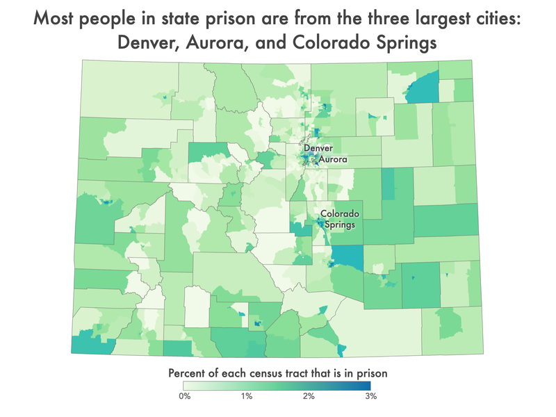
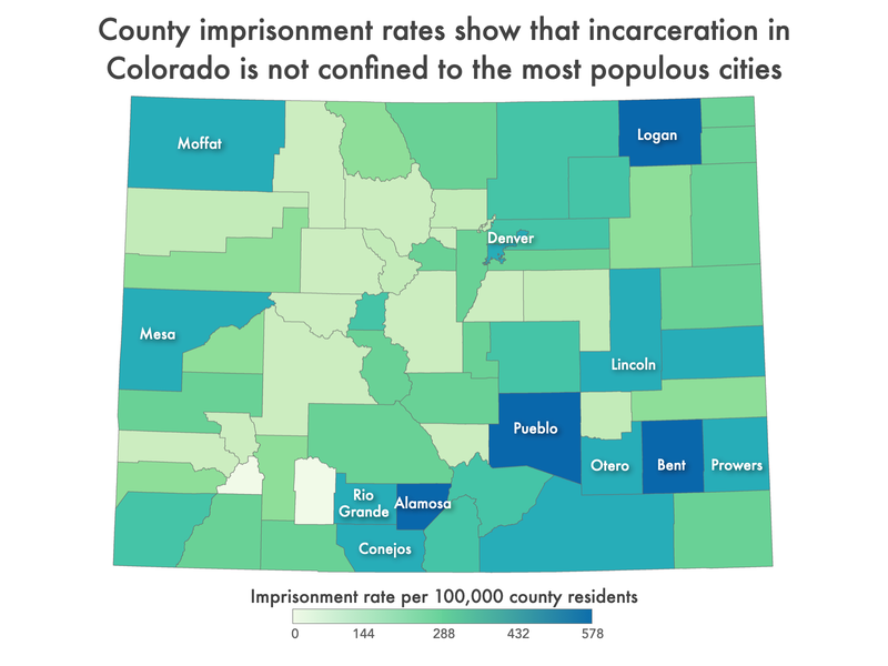
Using this redistricting data, we found that in Colorado, incarcerated people come from all over the state, but the largest number of imprisoned people are from the state’s large cities of Denver, Aurora, and Colorado Springs. Surprisingly, a handful of less populous and more rural counties — like Alamosa, Bent, and Logan counties — and smaller cities, including Alamosa, Sterling, and Pueblo, have high imprisonment rates as well, suggesting that people all over Colorado are affected by the state’s reliance on mass incarceration.
In addition to helping policymakers and advocates effectively bring reentry and diversion resources to these communities, this data has far-reaching implications. Around the country, high imprisonment rates are correlated with other community problems related to poverty, employment, education, and health. Researchers, scholars, advocates, and politicians can use the data in this report to advocate for bringing more resources to their communities.
Incarcerated people come from all over Colorado — but disproportionately from some places more than others
More than 14,000 Colorado residents are locked up in state prisons, leaving the state with an imprisonment rate of 245 per 100,000 Colorado residents.2 While no region of Colorado is immune to the consequences of the state’s reliance on mass incarceration, some communities are disproportionately impacted by imprisonment.
County trends
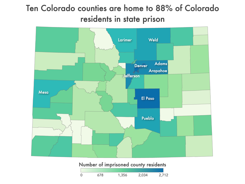
The most populated counties in Colorado send the most — and a disproportionately large number of — people to prison. The five most populous counties in the state — El Paso, Denver, Arapahoe, Jefferson, and Adams — are home to over 65% of the state’s imprisoned population (over 9,000 imprisoned people), but are home to only 55% of the state’s total population. Alone, Denver County — which consists primarily of the city of Denver — is home to 20% of the imprisoned population in the state (over 2,700 people) but only 12% of the state’s total population. Even compared to other counties with relatively high populations, this county is an outlier. For example, Denver County has two times as many residents as Douglas County — the neighboring county to the south — but is home to 14 times as many people in state prison.
In terms of imprisonment rates — the number of people in state prisons per 100,000 county residents3 — a handful of smaller, more rural counties appear to be imprisoning large portions of their populations as well. For example, Alamosa County has 95 of its 16,376 residents locked up in state prisons, giving us an imprisonment rate of 577 per 100,000. Similarly, while the county of Bent has 21 residents in state prison, because the county population is relatively small, the proportion of people incarcerated is high: the county imprisonment rate is 465 per 100,000. In the more populous counties, thousands of people are incarcerated, but because the county population is so large, the proportion of people incarcerated is slightly lower than in the less populated counties: Denver County has an imprisonment rate of 378 per 100,000 and El Paso County has an imprisonment rate of 325 per 100,000.
Those familiar with racial disparities in the criminal legal system may not find these high county imprisonment rates surprising, as we know that Latino and Hispanic communities, and Native American communities, are overrepresented in the state prison population. Members of these communities disproportionately call Alamosa and Bent counties home. For example, Alamosa County’s population is 48% Hispanic or Latino and Bent County’s population is 32% Hispanic or Latino, compared to the statewide population that is 22% Hispanic or Latino. In addition, these two counties have higher percentages of Native American and American Indian residents: 5.5% of Alamosa County residents and almost 4% of Bent County residents are Native American and American Indian, compared to 2% of the statewide Colorado population.
Not all small, rural counties are imprisoning residents at the high rates that we see in Alamosa and Bent. Twelve counties — all with populations less than 9,000 — have less than 10 residents in prisons.4 So while imprisonment rates vary across the state, it is clear that the counties locking up the most residents in state prison are the most populous counties, containing the largest cities.
City trends
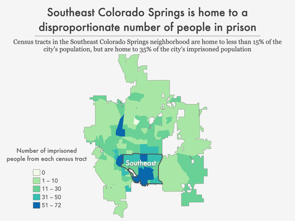
While incarceration affects every part of Colorado, it is particularly concentrated in the two largest Colorado cities: Denver and Colorado Springs, which respectively have 2,712 and 1,829 residents imprisoned. In addition, Aurora — the third largest city — has over 1,000 residents in state prisons. That means these three cities have imprisonment rates over 300 per 100,000 residents.
In addition to the most populous cities, a number of smaller cities have high imprisonment rates. Pueblo, with a population of almost 112,000, has 684 residents in prison and an imprisonment rate of 612 per 100,000 city residents. Grand Junction — a city with less than 70,000 residents — has 322 residents in state prisons and an imprisonment rate of 489 per 100,000. In addition to high rates of imprisonment, both Pueblo and Grand Junction have higher rates of poverty than the state at large, with 22% of Pueblo residents and 13.5% of Grand Junction residents living below the poverty line, compared to 9% statewide. We know that across the county, people in prison were — before they went to prison — some of the poorest people, and that incarceration fuels the cycle of poverty, suggesting that these smaller Colorado cities are also in need of focused resources and supports to reduce the reliance on the criminal legal system that perpetuates poverty.
Neighborhood trends
Denver
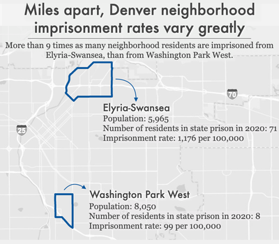
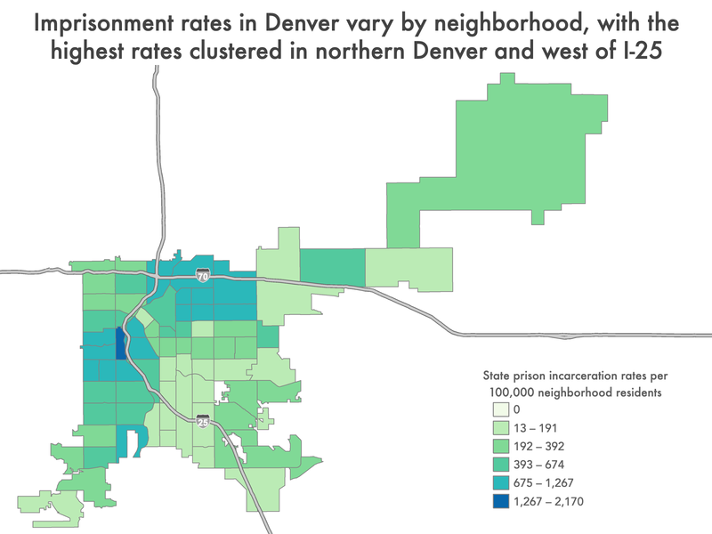
The racial divide runs deep when it comes to incarceration rates in Denver. In neighborhoods with high concentrations of people of color, primarily Black and Latino, larger portions of the populations are imprisoned. Several of these neighborhoods are clustered around Interstate 70 in northern Denver: Northeast Park Hill, Elyria-Swansea, Cole, and Globeville.5 These communities tend to have higher rates of poverty and a larger portion of residents who are Black or Latino than other Denver neighborhoods. For example, in Elyria-Swansea — the Denver neighborhood with the third-highest incarceration rate of 1,176 per 100,000 — residents are more than 80% Latino and approximately 33% live in poverty. High rates of imprisonment in these areas, like high rates of poverty, are likely — at least in part — a symptom of the historical divestment that left residents with limited access to crucial community resources — including community health services, grocery stores, housing support, job training services, and immigration resources.
There is another cluster of high-incarceration Denver neighborhoods in the western part of the city. Sun Valley, a small neighborhood on the west side of Interstate 25 has the highest neighborhood imprisonment rate in the city: 2,170 per 100,000 residents. Compared to neighborhoods on the eastern side of I-25, this high imprisonment rate is even more startling: in Washington Park West, the imprisonment rate is less than 100 per 100,000. This means that across the highway, residents of Sun Valley are over 20 times more likely to be imprisoned than residents of nearby Washington Park West.
Aurora
Aurora, the state’s third largest city, has a much larger population of Black residents than the state of Colorado as a whole. In 2021, Colorado’s residents were only 5% Black, while Aurora’s residents were 17% Black. And research has shown that policing tends to be concentrated in neighborhoods composed of people of color, in particular, Black people. This is true in Aurora, where 46% of Black residents have had at least one police interaction over the past 3 years, compared to less than 25% of white residents. A 2021 report from the Colorado Attorney General revealed that “observed law enforcement outcomes for people of color in Aurora differ significantly from those experienced by their white counterparts. These data — particularly for Black individuals — are deeply troubling.”
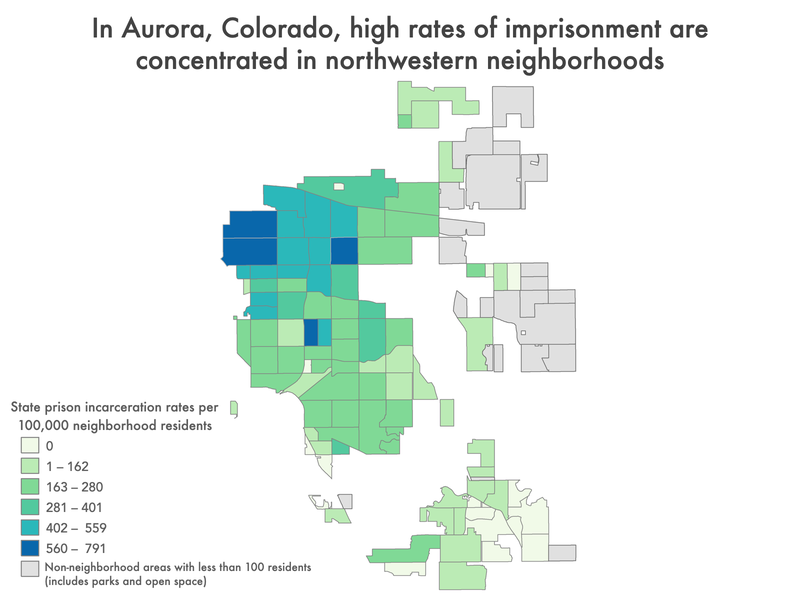
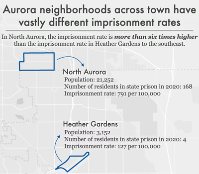
Incarceration rates also tend to follow neighborhood divisions in Aurora. Over one-third of Aurora residents in state prison, for example, hail from just five of the city’s more than 90 neighborhoods.6 All of those high-incarceration rate neighborhoods are located in the northwestern part of the city, are traditionally under-resourced, and have the largest populations of non-white residents in the city. The disparities between these four neighborhoods and other areas of the city are staggering: North Aurora has an imprisonment rate of 791 per 100,000 which is more than six times higher than the rate of imprisonment in the Heather Gardens neighborhood (127 per 100,000). And this is not just true when you compare North Aurora and Heather Gardens: North Aurora’s imprisonment rate is more than six times higher than the rate of 35 other Aurora neighborhoods. With this context, it’s clear that specific neighborhoods — like North Aurora — face the twin challenges of inadequate investment in essential quality of life services and infrastructure and are disproportionately affected by over-policing and mass incarceration in Aurora.
While all communities are missing some of their members to imprisonment, in places where large numbers of adults — parents, workers, voters — are locked up, incarceration has a broader community impact. The large number of adults drained from a relatively small number of geographical areas seriously impacts the health and stability of the families and communities left behind.7
What are the differences between high- and low-incarceration communities?
In Colorado, there is limited research on the relationship between local rates of imprisonment and community measures of health, income, access to services, and education. However, we know that nationally, researchers have connected high local incarceration rates with a host of compounding factors for the community. For example, in an analysis by the Prison Policy Initiative in 2015 of where incarcerated people in Maryland are from, we found that Baltimore communities with high rates of incarceration were more likely to have high unemployment rates, long average commute times, low household income, a high percentage of residents with less than a high school diploma or GED, decreased life expectancy, high rates of vacant or abandoned properties, and higher rates of children with elevated blood-lead levels, compared to neighborhoods less impacted by incarceration. Such results are strictly correlational, suggesting that communities that are heavily affected by incarceration are simultaneously facing a host of other challenges and systemic disadvantages that combine to make almost every aspect of life difficult. These geographic disparities are not an accident, but are the result of long-standing and race and class biased policies and decisions about where to invest resources by both the private and public sectors.
Across the country, research reveals the numerous correlations between imprisonment and other consequences of underinvestment in community wellbeing. These various correlative findings are once again in line with previous research on health disparities across communities, which have been linked to neighborhood factors such as income inequality, exposure to violence, and environmental hazards that disproportionately affect communities of color. Public health experts consider community-level factors such as these — including incarceration — “social determinants of health.” To counteract these problems, they suggest taking a broad approach, addressing the “upstream” economic and social disparities through policy reforms, as well as by increasing access to services and supports, such as improving access to clinical health care. Research has revealed such correlations in communities around the country:
- Life expectancy: A 2021 analysis of New York State census tracts found that tracts with the highest incarceration rates had an average life expectancy more than two years shorter than tracts with the lowest incarceration rates, even when controlling for other population differences.8 And a 2019 analysis of counties across the country revealed that higher levels of incarceration are associated with both higher morbidity (poor or fair health) and mortality (shortened life expectancy).
- Community health: A nationwide study, published in 2019, found that rates of incarceration were associated with a more than 50% increase in drug-related deaths from county to county. And, a 2018 study found that Black people living in Atlanta neighborhoods with high incarceration rates are more likely to have poor cardiometabolic health profiles.
An analysis of North Carolina data from 1995 to 2002 revealed that counties with increased incarceration rates had higher rates of both teenage pregnancy and sexually transmitted infections (STIs). A 2015 study of Atlanta also found that census tracts with higher rates of incarceration had higher rates of newly diagnosed STIs.9 - Mental health: A 2015 study found that people living in Detroit neighborhoods with high prison admission rates were more likely to be screened as having a current or lifetime major depressive disorder and generalized anxiety disorder.
- Exposure to environmental dangers: A 2021 study found that people who grew up in U.S. census tracts with higher levels of traffic-related air pollution and housing-derived lead risk were more likely to be incarcerated as adults, even when controlling for other factors.
In New York City, neighborhood incarceration rate is associated with asthma prevalence among adults. Similarly, our 2020 analysis of New York City neighborhoods found higher rates of asthma among children in communities with high incarceration rates.10 - Education: In our 2020 analysis of incarcerated New Yorkers’ neighborhoods of origin, we found a strong correlation between neighborhood imprisonment rates and standardized test scores.11 And a 2017 report on incarceration in Worcester, Massachusetts, found that schools in the city’s high-incarceration neighborhoods tended to be lower-performing. What’s more, students in those neighborhoods faced more disciplinary infractions.
- Community resources and engagement: A 2018 study found that, throughout the country, people who are formerly incarcerated (as well as people who have been arrested or convicted of a crime) are more likely than their non-justice-involved counterparts to live in a census tract with low access to healthy food retailers. And the 2017 report on Worcester, Mass., revealed that high-incarceration neighborhoods had lower voter turnout in municipal elections.
We already have this wealth of data showing that incarceration rates correlate with a variety of barriers and negative outcomes. The data in this report build upon this work by helping identify which specific neighborhoods throughout Colorado are systematically disadvantaged and left behind. Colorado residents can use the data in this report to examine granular local-level and state-wide correlations and choose to allocate needed resources to places hardest hit by incarceration.12
Implications & uses of these data
The 11 data tables provided here have great potential for community advocacy and future research.
First and most obviously, these data can be used to determine the best locations for community-based programs that help prevent involvement with the criminal legal system, such as offices of neighborhood safety and mental health response teams that work independently from police departments. The data can also help guide reentry services (which are typically provided by nonprofit community organizations) to areas of Colorado that need them most.
But even beyond the obvious need for reentry services and other programs to prevent criminal legal system involvement, our findings also point to geographic areas that deserve greater investment in programs and services that directly and indirectly prevent criminal legal involvement or mitigate the harm of incarceration. After all, decades of research show that imprisonment leads to cascading collateral consequences, both for individuals and their loved ones. When large numbers of people are taken out of a community, their absences are felt in countless ways. They leave behind loved ones, including children, who experience trauma, emotional distress, and financial strain. Simultaneously, the large numbers of people returning to these communities (since the vast majority of incarcerated people do return home) face a host of reentry challenges and collateral consequences of incarceration, including difficulty finding employment and a lack of housing. People impacted by the criminal legal system tend to have extremely diminished wealth accumulation. And those returning from prison and jail may carry back to their communities PTSD and other mental health issues from the trauma they’ve experienced and witnessed behind bars. Lastly, investing in core community resources to mitigate structural issues like poverty, such as housing and healthcare, will reduce vulnerabilities for criminal legal system contact.
And since we know place of origin correlates with so many other metrics of wellbeing, we can and should target these communities for support and resources beyond what we typically think of as interventions to prevent criminal legal system contact. In communities where the state or city has heavily invested in policing and incarceration (i.e. the high-incarceration neighborhoods we find in our analysis), our findings suggest that those resources would be better put toward reducing poverty and improving local health, education, and employment opportunities.
For example, we know that large numbers of children in high incarceration areas may be growing up with the trauma and lost resources that come along with having an incarcerated parent, and that these children are also more likely to experience incarceration. The information in this report can help with planning and targeting supports, resources, and programming designed to not only respond to the harms caused by incarceration, but disrupt the cycle of familial incarceration.
We invite community organizers, service providers, policymakers, and researchers to use the data tables made available in this report to make further connections between mass incarceration and various outcomes, to better understand the impact of incarceration on their communities.
Methodology & data
This report capitalizes on the unique opportunity presented by Colorado’s ending of prison gerrymandering, which allows us to determine accurately for the first time where people incarcerated in state prisons come from. In this report’s linked datasets, we aggregate these data by a number of useful state-wide geographies such as counties, state legislative districts, and public health regions, and for some urban geographies such as county commissioner districts in El Paso County and Denver neighborhoods.
This section of the report discusses how we processed the data, some important context and limitations on that data, and some additional context about the geographies we have chosen to include in this report and appendices. The goal of this report is not to have the final word on the geographic concentration of incarceration, but to empower researchers and advocates — both inside and outside of the field of criminal justice research — to use our dataset for their own purposes. For example, if you are an expert on a particular kind of social disadvantage and have some data organized by county, zip code, public health district, or other breakdown and want to add imprisonment data to your dataset, we probably have exactly what you need in a prepared appendix described below.
This report and its data are one in a series of similar reports we are releasing in the spring and summer of 2022, focusing on 13 states — California, Colorado, Connecticut, Delaware, Maryland, Montana, Nevada, New Jersey, New York, Pennsylvania, Rhode Island, Virginia, and Washington — which counted incarcerated people at home for redistricting purposes, and therefore also made this analysis possible. This report can also be seen as a template for other states because while not all states have ended prison gerrymandering, most state departments of corrections already have near-complete home residence records in an electronic format. States that have not yet ended prison gerrymandering should be encouraged to continue improving their data collection, and to share the data (under appropriate privacy protections) so that similar analyses could be performed.
How we processed the data
Colorado’s law ending prison gerrymandering required the Colorado Department of Corrections to share the home addresses of people in state prisons on Census Day 2020 with redistricting officials, so that these officials could remove imprisoned people from the redistricting populations reported by the Census for the facilities’ locations and properly credit people to their home communities. The adjusted data was then made available for state and local officials to use to draw new legislative boundaries. As a side effect, this groundbreaking dataset allows researchers to talk in detail for the first time about where incarcerated people came from.
Creating the tables in this report required several steps which were expertly performed by Peter Horton at Redistricting Data Hub:
- Downloading Colorado’s adjusted redistricting data, which contains the state’s entire population, with the people incarcerated in state prisons reallocated to their home addresses.
- Subtracting the state’s redistricting data from the original Census Bureau P.L. 94-171 redistricting data, to produce a file that represented the number of incarcerated people the state determined were from each census block state-wide. (Census blocks that showed a net gain of population following the reallocation were the Census blocks that incarcerated people were reallocated to, and the amount of that change was the number of people from that block who were incarcerated in a state prison on Census day. For a different analysis that focused on both the net gains and net decreases in individual census blocks and then aggregated to counties and the final redistricting plans, see Peter Horton’s report for Redistricting Data Hub on Colorado.
- Aggregating these block-level counts of incarcerated people to each of the geography types available in the report. In cases where a census block containing an incarcerated person’s home address straddles the boundary between two geographies, the incarcerated population was applied to the geography that contained the largest portion of the census block’s area.
- Calculating imprisonment rates for each geography, by first calculating a corrected population that shows the Census 2020 population plus the number of incarcerated people from that geography; and then dividing the number of incarcerated people by the corrected total population, and then multiplied it by 100,000 to get an imprisonment rate per 100,000.
Important context and limitations on this data
Our analysis in this report documents the home addresses of 14,364 people in state prisons, which is somewhat less than the state’s total prison population of 17,506 on Census day. These numbers are different for a variety of reasons, including policy choices made when the legislation ending prison gerrymandering was created and others are just the practical outcome of valiant state efforts to improve federal census data, or the process of repurposing that dataset for this entirely different project.
From the perspective of improving democracy in Colorado, the state’s reallocation efforts were a success, reducing both the unearned enhancement of political representation in prison-hosting areas and reducing the dilution of representation in the highest-incarceration districts. From the perspective of using that data to discuss the concentration of incarceration, some readers may want to be aware of some the reasons why our report discusses the home addresses of 14,364 people when they may be aware that the state prison system had 17,506 people on Census day:
- Some people in Colorado state prisons are from other states and therefore were not reallocated to homes in Colorado.
- Some addresses were unknown or could not be located for the reallocation. For example, an address on file may be incomplete or may contain only the notation “homeless” which of course cannot be applied to a specific home census block
- Anyone whose home address by coincidence happens to be in a census block that contains a correctional facility would have been properly reallocated for purposes of ending prison gerrymandering, but their presence at that location would not, because of how we created our dataset, be apparent in this report.
Similarly, this report doesn’t reflect the other groups of people incarcerated from particular communities who are not reflected in these data,14 because they were:
- Incarcerated in a federal prison, because states do not have the power to require home address data from federal agencies. The Colorado legislation requires the state to request this data from the federal Bureau of Prisons, but that federal agency refused to share it.
- Incarcerated in another state’s prison system. States cannot require other states to share this information, and the fact that so many states are ending prison gerrymandering is too new of a phenomenon for them to have had the chance to enter into inter-state data sharing agreements.
- Incarcerated in a local jail, in this state or elsewhere; because the state’s effort to remedy prison gerrymandering was focused on state prisons.
About the geographies
We’ve organized the data in this report around several popular geographies, as defined by the federal government, by the state, or by individual cities, with the idea that the reader can link our data to the wealth of existing social indicator data already available from other sources.
Unfortunately, the reader may desire data for a specific geography that we have not made available — for example, their own neighborhood, as they conceive of its boundaries. Often, there was not a readily accessible and official map that we could use that defined that boundary; so where the reader has this need, we urge the reader to look for other geographies in our datasets that can be easily adapted to their needs, either one that is similar enough to their preferred geography or by aggregating several smaller geographies together to match your preferred geography.
We also want to caution subsequent users of this data that some geographies change frequently and others change rarely, so they should note the vintage of the maps we used to produce each table. For example, county boundaries change very rarely, and when they do, it is often in extremely small ways. On the other hand, legislative districts may change frequently and significantly, so depending on your goals some specific tables may be more or less applicable for your future use.
Finally, readers should note that occasionally the incarcerated numbers in our tables for some geographies will not sum precisely to the total 15,242 home addresses used in this report. That discrepancy arises because of how census blocks — the basic building block of legislative districts — nest or fail to nest within geographies drawn by agencies other than the Census Bureau.
Footnotes
Criminal legal system data is often poorly tracked, meaning researchers must cobble together information from different sources. But by using complete data from state redistricting committees, this report (and a series of other state reports that the Prison Policy Initiative developed with state partners) are uniquely comprehensive and up-to-date. The series includes two previous reports on Maryland (published in 2015, in collaboration with the Justice Policy Institute) and New York (published in 2020, in collaboration with VOCAL-NY), and our newest reports on California, Connecticut, Delaware, Maryland, Montana, Nevada, New Jersey, New York, Pennsylvania, Virginia, and Washington.
While these reports are the first to use redistricting data to provide detailed, local-level data on where incarcerated people come from statewide, other organizations have previously published reports that focused on individual cities or that provided data across fewer types of geographic areas. For example, the Justice Mapping Center had a project that showed residence data for people admitted to or released from state prisons in a given year for almost two dozen states. That project made those states’ annual admission and release data available at the zip code and census tract levels, most recently mapping 2008-2010 data. Separately, it also mapped the residences of people admitted to state prisons from New York City down to the block level using 2009 data.
Another resource (particularly helpful for states that are not included in our series of reports) is Vera Institute for Justice’s Incarceration Trends project, which maps prison incarceration rates for 40 states at the county level, based on county of commitment (meaning where individuals were convicted and committed to serve a sentence, which is often but not necessarily where they lived). ↩As explained in the methodology, this report’s imprisonment rate is based on the number of people in state prison who were reallocated to individual communities as part of the state’s law ending prison gerrymandering. This number is necessary for making apples-to-apples comparisons of incarceration between specific communities and the state as a whole. For the purposes of comparing incarceration in Colorado with that of other states, other more common metrics would be more useful. For these other uses, we would recommend using other numbers for the statewide incarceration rate, likely either the 277 per 100,000 published by the Bureau of Justice Statistics in Prisoners in 2020 for the number of people in state prison per 100,000 residents, or our more holistic number of 614 per 100,000 residents used in States of Incarceration: The Global Context 2021 that includes people in state prisons, federal prisons, local jails, youth confinement, and all other forms of incarceration. ↩
Imprisonment rates per 100,000 are a useful tool for comparison between different geographic regions with varying population sizes. For example, using a rate per 100,000 allows us to compare the frequency of imprisonment between large Colorado counties like Denver County — with over 715,000 residents — to the smaller, less populated counties, like any one of the 53 Colorado counties with less than 100,000 residents. ↩
Two of those counties — Mineral and San Juan — had no residents in state prison at the time of the Census, although those counties have less than 900 residents each so the zero is likely more a result of the time the data was collected rather than a statement that people are not sent to prison from those counties. ↩
The fact that these neighborhoods are clustered around the extremely busy interstate is not insignificant. Residents of Elyria-Swansea argue that the interstate is an “injustice” that has split the community from the rest of Denver for 50 years. This highway isolated the community and likely contributed to the depreciation of the housing market and disincentivized businesses and essential services — like grocery stores — from moving into the community. In our 2020 analysis of New York City neighborhood rates of incarceration, we learned that high rates of asthma among youth is correlated with high neighborhood imprisonment rates, and the same appears to be true in Denver. The handful of neighborhoods clustered around I-70 have higher rates of childhood asthma-related urgent care visits than in the rest of the city. ↩
Among Aurora neighborhoods with more than 100 residents, North Aurora, Del Mar Park, Hoffman Heights — Jewell Heights, Laredo Highlight, and Sable-Altura Chambers are collectively home to 35% of the city’s imprisoned population, but are home to only 16% of all Aurora residents. ↩
These impacts of incarceration on families and communities include higher rates of disease and infant mortality, housing instability, and financial burdens related to having an incarcerated loved one. For more detailed information on how incarceration impacts families and communities, see On life support: Public health in the age of mass incarceration from the Vera Institute of Justice. ↩
We also know that people who have been incarcerated have a shorter life expectancy than people who have not. ↩
There are many additional studies linking incarceration rates and high community rates of STIs, including gonorrhea and chlamydia in North Carolina. ↩
Asthma prevalence has been used as a tool to measure population health in both sociological and public health research because it is easily correlated with environmental factors, like air quality and triggers (i.e. second hand smoke, mold, dust, cockroaches, dust mites), access to appropriate healthcare, and healthcare literacy. See the American Lung Association’s Public Policy Position for a literature review of the relevant public health research. ↩
Again, this finding is consistent with previous research on the relationship between education and imprisonment rates. We previously reported that the high school educations of over half of all formerly incarcerated people were cut short. This is in line with earlier studies showing that people in prison have markedly lower educational attainment, literacy, and numeracy than the general public, and are more likely to have learning disabilities. We also know there are relationships between parental incarceration and educational performance. ↩
For example, studies have been conducted assessing Colorado Census-tract levels of air pollution exposure and COVID-19 infection rates and neighborhood level analyses of rates of depression. ↩
H.B. 20-1010, 72nd Gen. Assemb., Reg. Sess. (Co. 2020). ↩
This list of groups of people who could not be counted at home is yet another set of reasons why the U.S. Census Bureau is the ideal agency to end prison gerrymandering: they are the only party with the ability to provide a complete solution and they can do this work far more efficiently than the states can. ↩
Acknowledgments
We would like to thank the Redistricting Data Hub, particularly Peter Horton, for providing valuable technical expertise and the key data in the appendix tables. Redistricting Data Hub’s assistance processing the redistricting data and connecting us with other demographic data enabled us to produce and distribute these reports faster and more affordably than would otherwise have been possible.
CCJRC would also like to thank Prison Policy Initiative for inviting us to partner with them to release this powerful data that we hope will inspire communities across Colorado to mobilize for greater investment in community-wellness and less on policing and mass incarceration
About the authors
Emily Widra is a Senior Research Analyst at the Prison Policy Initiative. She is the co-author of States of Incarceration: The Global Context 2021. She is the organization’s expert on health and safety issues behind bars, including the coronavirus in prisons. Her previous research also includes analyses of mortality in prisons and the combined impact of HIV and incarceration on Black men and women.
Christie Donner is the Executive Director of the Colorado Criminal Justice Reform Coalition. Since 1995, she has been involved in advocacy, community organizing, policy research, and lobbying to end mass incarceration in Colorado. Christie also co-authored Parenting from Prison: A Resource Guide for Incarcerated Parents in Colorado and is a contributing author to CCJRC’s publication Getting On After Getting Out: A Re-Entry Guide for Colorado.
About the organizations
The non-profit, non-partisan Prison Policy Initiative produces cutting-edge research that exposes the broader harm of mass criminalization and sparks advocacy campaigns that create a more just society. In 2002, the organization launched the national movement against prison gerrymandering when it showed that the way the Census Bureau counts incarcerated people — as residents of a prison cell, instead of at their homes — distorts our democracy and dilutes the voices of people who do not live near prisons. Since then, over a dozen states, including Colorado, have used Prison Policy Initiative’s research to end prison gerrymandering. Roughly half of the country now lives in a place that has formally rejected prison gerrymandering.
Founded in 1999, the Colorado Criminal Justice Reform Coalition (CCJRC) is a non-profit organization whose mission is to eliminate the overuse of the criminal justice system and advance community health and safety. We are people convicted of crime, survivors of crime, and the families and allies of both. We advocate and organize for public safety strategies that are more holistic, effective, and just. CCJRC has helped close seven prisons in Colorado and been a pioneer in a strategy we call Community Reinvestment whereby state funds are provided to support community-led and community-based health & safety strategies. Click here to learn more about Community Reinvestment in Colorado.
