We are looking for our next Creator-in-Residence to produce engaging and informative social video content about the problems in the American criminal legal system.
Support us
Can you make a tax-deductible gift to support our work?
We’re lucky when criminal justice data is broken down by race and ethnicity enough to see how Native populations are criminalized and incarcerated. Here’s a roundup of what we know.
This Monday is Indigenous Peoples’ Day, a holiday dedicated to Native American people, their rich histories, and their cultures. Our way of observing the holiday: sending a reminder that Native people are harmed in unique ways by the U.S. criminal justice system. We offer a roundup of what we know about Native people (those identified by the Census Bureau as American Indian/Alaska Native) who are impacted by prisons, jails, and police, and about the persistent gaps in data collection and disaggregation that hide this layer of racial and ethnic disparity.
The U.S. incarcerates a growing number of Native people, and what little data exist show overrepresentation
In 2019, the latest year for which we have data, there were over 10,000 Native people locked up in local jails. Although this population has fluctuated over the past 10 years, the Native jail population is up a shocking 85% since 2000.1 And these figures don’t even include those held in “Indian country jails,” which are located on tribal lands: The number of people in Indian country jails increased by 61% between 2000 and 2018.2 Meanwhile, the total population of Native people living on tribal lands has actually decreased slightly over the same time period, leaving us to conclude that we are criminalizing Native people at ever-increasing rates.
Government data publications breaking down incarcerated populations by race or ethnicity often omit Native people, or obscure them unhelpfully in a meaningless “Other” category, perhaps because they make up a relatively small share of the total population. The latest incarceration data, however, shows that American Indian and Alaska Native people have high rates of incarceration in both jails and prisons as compared with other racial and ethnic groups. In jails, Native people had more than double the incarceration rate of white people, and in prisons this disparity was even greater.
Native people made up 2.1% of all federally incarcerated people in 2019, larger than their share of the total U.S. population, which was less than one percent.3 Similarly, Native people made up about 2.3% of people on federal community supervision in mid-2018. The reach of the federal justice system into tribal territory is complex: State law often does not apply, and many serious crimes can only be prosecuted at the federal level, where sentences can be harsher than they would be at the state level. This confusing network of jurisdiction sweeps Native people up into federal correctional control in ways that don’t apply to other racial and ethnic groups.4
Native women are particularly overrepresented in the incarcerated population: They made up 2.5% of women in prisons and jails in 2010, the most recent year for which we have this data (until the 2020 Census data is published); that year, Native women were just 0.7% of the total U.S. female population.5 Their overincarceration is another maddening aspect of our nation’s contributions to human rights crises facing Native women, in addition to Missing and Murdered Indigenous Women (MMIW) and high rates of sexual and other violent victimization.6
Confinement of Native youth is a crisis
The rampant racial disparities in how Native youth are treated by the juvenile and criminal justice system are somewhat better-documented. Their confinement rates, second only to those of Black youth, exceed those of white, Hispanic and Asian youth combined. Forces contributing to this disparity include disproportionate arrest rates of Native youth for some offense types, the school-to-prison pipeline, and harsher outcomes for court-involved youth, particularly for low-level offenses like technical violations of probation and status offenses.
In absolute numbers, there are fewer Native youth than there are white, Black, Hispanic, or Asian youth, but the rate at which they are in contact with police and youth confinement facilities is alarming. Centuries of historical trauma are manifesting in Native youth as mental health and substance use issues that go untreated, and can lead to status offenses (acts that are only criminal because of one’s age, like skipping school) or other “delinquent” behavior. Once again, federal jurisdiction over tribal lands makes Native youth worse off for being swept up into criminal-legal matters at all, because they’re more likely to receive longer federal sentences and less likely to receive the services and support they need.
Even the best data collection obscures the scale and scope of Native people in the criminal justice system
There is still a long way to go to attain consistent data collection and reporting on Native populations in the criminal justice system. One glaring problem is that pesky “Other” category where we sometimes find Asian, Pacific Islander, Native Hawaiian, and American Indian/Alaska Native people. This is clearly an unhelpful category for uncovering bias throughout policing, courts, jails, prisons, and supervision.
One reason that even our most disaggregated data falls short is that often, people reporting two or more races are lumped into various categories depending on who is publishing the data. In 2011, the latest year for which we have this data, the single-race American Indian/Alaska Native jail population was 12,100 while the total number of people who included a Native identity was almost 70,000. This reporting makes it clear that Native people are overrepresented among the incarcerated populations, but we don’t always see the data presented in a way that highlights this disparity.7
Even great strides in this area will likely not give us tribal-level data. Native American people are not a monolith; there are 574 federally recognized Native American tribes as of March 2020. On a day that some are beginning to dedicate to Native people, rather than the people seeking to erase them, it’s critical to understand how Native people on both tribal and non-tribal lands are overcriminalized.
Footnotes
The Native population in local jails was 10,200 in 2019, up from 5,500 in 2000 – an 85% increase. The growth of the Native population in jails far outpaced the growth of the total jail population over the same period: Overall, local jail populations grew 18% from 2000 to 2019. (Before 2000, in reporting jail populations, the Bureau of Justice Statistics combined the American Indian/Native Alaskan population with Asians, Native Hawaiians and Pacific Islanders into an “Other” category.) ↩
The term “Indian country,” in this context, is a legal term referring to land within American Indian reservations and other Native communities and allotments. The Bureau of Justice Statistics collects and publishes data about jail facilities on these lands separately from other locally-operated jails in the U.S. According to the National Congress of American Indians (NCAI), the term “Indian Country” – with a capital “C” – “is used with positive sentiment within Native communities, by Native-focused organizations such as NCAI, and news organizations such as Indian Country Today.” ↩
Based on U.S. Census Bureau population estimates of people identifying as non-Hispanic, and American Indian/Native Alaskan alone or in combination with one or more other races. ↩
The remote nature of tribal lands in relation to federal buildings like courthouses, parole offices and prisons also makes it difficult to comply with post-release supervision, make court dates, or visit incarcerated loved ones. For the same reason, Native people are consistently underrepresented on federal trial juries, despite being constitutionally mandated to be fairly represented on them. These are examples of how Native people are harmed and shut out by the federal justice system. ↩
The number of Native women in both the U.S. population and the incarcerated population (defined as non-Hispanic, single-race females) was sourced from the 2010 U.S. Census. ↩
The “jurisdictional maze” between federal and tribal authorities (described earlier in this briefing) makes it less likely that a crime of sexual violence occurring on tribal land will be prosecuted, leaving victims with little support and little choice but to continue living near those who harm them. ↩
If you expand the definition of who is Native among the general U.S. population, you’re also going to see an increase, but it’s not nearly as staggering as the six-fold increase between the narrowest and widest definitions of incarcerated Native people. In 2011, the single-race, non-Hispanic AI/AN population would be 2.3 million; including Hispanic AI/AN people would increase this figure to 3.8 million; and including multi-racial AI/AN people would increase the figure to 4.1 million, only a 1.7-fold increase from lowest to highest. ↩
This week, the Prison Policy Initiative filed comments urging the FCC to take steps to lower jail phone costs and stop unfair practices by the correctional phone industry.
On September 27, Prison Policy Initiative filed comments with the Federal Communications Commission, explaining what the agency should do to lower phone costs for people in jail and address unfair practices in the correctional phone industry.
For nearly two decades, the FCC has worked in fits and starts to address high prices and other problems with communications services in jails and prisons. In May, the commission slightly lowered rates for some callers and announced its intent to further revise the rules applicable to the phone companies. This week was the deadline for parties to file comments on the next round of new rules.
Our comments provide the following new evidence to help guide the FCC’s decision-making:
A look at the average monthly phone bills for people in prison versus jail (in four states), showing that people in jail spend 16% less time on the phone but pay twice as much for calls.
We also make several legal arguments, urging the FCC to:
Lower the amount that companies can charge as “ancillary fees” (for things like depositing money into a prepaid phone account).
Reduce consumers’ phone bills by waiving Universal Service Fund taxes on prison and jail phone calls.
Crack down on deceptive practices that steer people to unnecessarily expensive options. For example, someone who was just arrested will probably not know about the confusing calling options, and phone companies often encourage people to pick the most expensive option when calling their family to ask for help.
Not make family members pay for facility security costs through their phone bills (for example, expenses like monitoring phone calls and maintaining lists of blocked numbers).
Collect more data that will allow the agency to refute some of the long-running (and factually suspect) arguments made by the dominant correctional phone companies.
Several other allies filed comments as well. Replies are due at the end of October, and it will likely take the FCC months or even years to issue new rules.
As people in jail and their families struggle to stay connected during the pandemic, we’ve collected the data on the exploitative prices families are forced to pay in Wisconsin for phone calls with incarcerated loved ones. This data already sparked an investigative report last month in the Appleton Post-Crescent.
People in jail in Wisconsin are charged different rates for phone calls depending on where they are locked up. In some jails, rates are as high as $14.77 for a 15-minute call–nearly a dollar a minute. The revenue fills the coffers of jails and of their corporate partners (who actually provide the phone service), Post-Crescent reporter Chris Mueller explains:
Brown County, for example, gets 54% of the revenue from phone calls made at its jail, totaling about $34,800 in January, about $32,000 in February and about $42,200 in March.
Other counties get a larger share of the money. Chippewa County, for example, gets 76%, totaling about $2,600 in December, about $3,100 in January and about $2,600 in February. Barron County gets 82%, amounting to about $2,400 in December, about $1,400 in January and about $1,700 in February.
Meanwhile, the people who pay are low-income, working-class Wisconsin residents:
“I don’t know anyone who has an incarcerated loved one who doesn’t work more than one job,” said [Peggy] West-Schroder.
West-Schroder would typically spend at least $20 a week on phone calls, though that amount would vary if her husband was transferred to a different facility or, for whatever reason, had limited access to the phone.
TMJ4, a Milwaukee news station, recently ran another powerful story about the consequences of making jail phone calls expensive. The story focuses on a woman named Ouida Lock, who has two sons in prison, and was forced to spend nearly $6,000 on phone calls over eight years. As Lock says in the story: “I can’t even fathom how much money has been spent. I know I could have bought a house by now.”
The TMJ4 story notes that costly jail phone calls have hit Black families especially hard: Black people in Wisconsin are not only overrepresented in prisons and jails; they also face the highest racial wealth gap in the country, with a Black worker earning “42 cents to every white dollar.”
Our data on Wisconsin and further resources
We’ve shared our full data set about Wisconsin jails in a table below, revealing how much money 30 county jails charge for phone calls, as well as how county jails and their phone providers split the revenue.
We also encourage readers in Wisconsin to explore our other resources on jail phone calls, including:
Our big picture report State of Phone Justice, which includes recommendations for states and counties to get incarcerated people and their families a better deal.
Phone rates and commissions in Wisconsin county jails: A sample of 30 counties
Most jails are paid a “commission” by the phone providers they contract with. A commission is an agreed-upon share of the revenue generated when incarcerated people pay for phone calls. This table above shows data on phone rates and commission payments in Wisconsin county jails, obtained through public records requests that we sent to a sample of counties in Wisconsin. We requested records from all counties whose jail phone services are provided by Securus, because Securus’s records are standardized which makes them easier for us to review; as well as some counties served by other providers. Readers who want to explore this issue in more depth should know that jails in Wisconsin earn commissions on “collect” calls (calls that are paid for individually by the non-incarcerated recipients), “debit” calls (calls that are paid for via pre-funded accounts), or both. One county in Wisconsin, Green County, earns different commissions on both debit and collect calls. For more detail on how relationships between jails and telecom providers work, see our 2019 report State of Phone Justice.
While the most visible fights against jail and prison expansion are often defensive—taking place in city council chambers or appearing on ballots—an old idea has gained new traction and is changing what these fights could look like going forward.
Massachusetts-based advocates — Families for Justice as Healing and the National Council for Incarcerated and Formerly Incarcerated Women and Girls — are not only opposing a $50 million proposal to build a new women’s prison in the state, but they are seeking to place a 5-year moratorium on building new—or expanding existing—jails and prisons in Massachusetts. A bill that would establish this 5-year moratorium, S. 2030, has been introduced in the Massachusetts legislature.1
Alongside local groups, the Prison Policy Initiative submitted written testimony in support of S. 2030, urging the legislature to implement reforms that would reduce the number of people incarcerated in the state.
Why a 5-year moratorium?
A 5-year moratorium provides opportunity to advance reforms to reduce unnecessary incarceration before even contemplating an increase in the capacity of the state or counties to lock more people up. This window is critical because fights against jail and prison expansion can be a year in, year out effort, and the opportunity costs of these perennial fights are enormous.
Recent examples have shown that government entities can often be relentless in their efforts to expand jails or prisons. Counties routinely bring rejected proposals for jail expansion to the ballot year after year, disregarding the lack of community support. For example, Otsego County, Michigan has revived a proposal to expand its jail that will appear on November’s ballot, despite the fact that a jail expansion proposal was rejected by voters just six months earlier.2 Greene County, Ohio has done the same.3
The proposed moratorium in Massachusetts would allow the time and resources devoted to fighting jail and prison expansion proposals each year to be instead devoted to discussing and advancing reforms that would change the state’s criminal legal system and reduce incarceration. It also would provide the state an opportunity to realize the full impact of recent criminal justice reforms that have been adopted to reduce incarceration.
More states should consider moratoriums on prison and jail expansion, like the one being considered in Massachusetts, because they give lawmakers, advocates, and residents the opportunity to engage in a critical analysis of what could more effectively address public health and safety than mass incarceration and its many related harms.
Legislation establishing moratoriums on jail or prison construction have also recently been pursued in other places. For example, H.B. 40 in the New Mexico legislature, the Private Detention Facility Moratorium Act, prohibits “enter[ing] into, renew[ing] or modify[ing]” any agreement that would “increase the capacity of a detention facility” that is “owned, managed, or operated, in whole or in part, by a private entity.” In addition, language that has been proposed for the BREATHE Act includes a provision that would require the Bureau of Prisons to “immediately enact a moratorium on all new federal prison, . . . immigrant, and youth criminal-legal detention center construction.” ↩
Making up for a serious gap in government data collection and understanding, researchers are discovering what pregnant incarcerated women should expect when they’re expecting (or when they give birth while in custody). Findings indicate that jails, prisons, and youth facilities have yet to adequately recognize pregnancy and postpartum needs either in policy or in practice.
Recently published findings from the groundbreaking Pregnancy in Prison Statistics (PIPS) Project and other datasets shed light on a common but rarely discussed experience: being pregnant, postpartum or giving birth while incarcerated. Spearheaded by Dr. Carolyn Sufrin of the Johns Hopkins University School of Medicine and School of Public Health, this series of studies is our best look yet at pregnancy prevalence and outcomes in U.S. jails, prisons, and youth facilities.
In total, 22 state prison systems, all federal prisons, 6 jails, and 3 youth confinement systems participated in the PIPS Project, a systematic study of pregnancy and its outcomes among incarcerated women. Historically, the government has not collected data about carceral pregnancy on a regular basis, meaning no national effort has been made to understand maternity care for thousands of incarcerated pregnant women.1 The project’s sample represents 57% of all women in prison, 5% of all women in jail and about 3% of young women in youth facilities.
Our takeaway: Carceral pregnancy, whether in jail, prison, or youth confinement, is characterized by a lack of supportive policies and practices. Some of the major findings to come out of these publications are:
There are an estimated 58,000 admissions of pregnant women into jails and prisons every year, and thousands give birth or have other outcomes while still incarcerated. Pregnancy rates among confined youth were similar to those among adults.
In some state prison systems, miscarriage, premature birth, and cesarean section rates were higher than national rates among the general population.
Only one-third of prisons and jails had any written policy about breastfeeding or lactation, and even where policies supporting lactation did exist, relatively few women were actually breastfeeding or pumping.
There are an estimated 8,000 admissions of pregnant women with opioid use disorder (OUD) into prisons and jails each year, but long-term treatment using medication is the exception, not the rule.
A related (non-PIPS Project) study finds paternal incarceration is also linked to adverse birth outcomes like low birth weight, which are widely known to impact long-term health.
The researchers’ findings add complexity to a growing body of literature and consensus linking incarceration to negativehealth impacts. And although PIPS Project data can’t be broken down by race, ethnicity, or gender identity, measuring the scale and outcomes of pregnancies in prison and jail is a major public health research accomplishment. The fact that academic researchers had to conduct this research to fill the data gap – and the shortage of appropriate policies they found – makes it clear that many correctional agencies have yet to even acknowledge the needs of pregnant incarcerated women.
Every year, thousands of incarcerated expecting mothers and babies face adverse outcomes from exposure to incarceration
Over the 12 months of the Pregnancy in Prison Statistics (PIPS) study period, there were nearly 1,400 admissions of pregnant women to participating state and federal prisons with over 800 pregnancies ending in custody (births, miscarriages, and others), and over 1,600 admissions of pregnant women to jails with 224 pregnancies ending in custody. Unsurprisingly, given the short length of most jail stays, more pregnant women are admitted to jails each year, but more births take place in prisons, where the average stay is longer. Based on their data, the authors estimate that nationally, 4% of women entering prison (in line with Bureau of Justice Statistics 2016 estimates) and 3% of women admitted to jail (lower than BJS’ most recent 2002 estimates) are pregnant.
Pregnancy outcomes in prisons and jails in some places were worse than national trends across the general population. When pregnancy did end in custody, in some states like Arizona, Kansas and Minnesota, rates of miscarriage ranged from 19 to 22%, exceeding estimates of the national rate.2 In Ohio and Massachusetts, premature births exceeded the general population rate of about 10%. Among live births, which were 92% of birth outcomes in custody, one-third (32%) of these were caesarean section births, in line with the national average rate. In some states, the C-section rate was much higher, suggesting that C-sections may be taking place when not medically necessary, risking short- and long-term health problems in babies.
Pregnancy among confined youth is not uncommon, and better testing might reveal it’s even more widespread
Upon hearing about the Pregnancy in Prison Statistics (PIPS) Project, three juvenile justice systems (one state-level, and one county-level system) volunteered to complete a survey about pregnant adolescents in the custody of 17 of their “juvenile residential placement” facilities, providing a window into this population for the first time. One takeaway from the survey’s findings was that adolescent pregnancies – both in confinement, and upon release – may risk poorer outcomes because of a lack of continuity of medical care between confinement facilities and the community. Even though all three state systems provided basic prenatal care, with the typical length of stay for young women lasting a few months or less, justice-involved youth would benefit enormously from consistency in medical care throughout pregnancy.
The survey also showed that the rate of pregnancy among confined youth (3.3%) was similar to that of the adult incarcerated population (3.5%). However, the youth facilities reported less routine pregnancy testing, bolstering a 2004 study revealing that only 15-17% of 1,255 juvenile facilities nationwide tested youth for pregnancy at admission (with about two-thirds of facilities providing tests only if requested). Therefore, it’s possible the youth carceral pregnancy rate is a very conservative estimate, and that thousands of pregnant youth are going without prenatal care when their health needs are likely complicated.
Eight pregnancies ended among youth confined in the surveyed facilities during the 12-month study period, including four miscarriages, three induced abortions, and one live full-term birth. It would be misleading to view these outcomes as representative of all pregnant confined youth, but the authors
advise youth confinement facilities to be prepared for high rates of miscarriage and other adverse birth outcomes, seeing as justice-involved pregnant youth are going through highly stressful life experiences.
Services and policies regarding prenatal and postpatrum care were variable: All three juvenile systems allowed abortion, and some covered the cost; all three systems also allowed lactation through either breastfeeding or pumping. Still, the small sample size (which represented just 2.8% of all confined female youth) and the potential influence of self-selecting facilities make it difficult to draw conclusions about the experience of pregnant youth in confinement.
Breastfeeding and lactation are not guaranteed to new mothers and babies, ignoring the enormous benefits of breast milk
When the cohort of 22 prison systems and 6 jail systems described their lactation-related policies to the researchers, they painted a discouraging picture of how correctional facilities largely don’t support breastfeeding, a practice chosen by some mothers for its unique benefits.
To begin, only one-third of prisons and jails had any written policy on lactation, leaving many incarcerated women to the whims of facility staff who may not be trained in this area or understand its importance. Even where women were formally allowed to lactate, milk was sometimes discarded at the study sites due to mother-infant separation, providing only a benefit to the mother of maintaining milk supply.
Findings from Asidou et al.’s Breastfeeding in Incarcerated Settings highlight a lack of support for lactation, which might explain why there were so many more postpartum women than women who were actively lactating. While mothers can choose to stop breastfeeding or lactating for a number of reasons, stopping breast milk production suddenly due to jail or prison policy is almost guaranteed to be a painful process that may bring on other medical issues, like mastitis.
Because it is a matter of health equity to provide the opportunity to lactate and breastfeed (among other parental choices), researchers extend the “further research is needed” statement in order to understand the probable racial disparities within carceral pregnancy: “…research in collaboration with current and formerly incarcerated women, specifically Black, Indigenous, and women of color, is needed to fully understand breadth of experiences and perspectives related to breastfeeding and lactation while in custody.”
Opioid use disorder among incarcerated women is treated under some circumstances, but leaves mothers without help postpartum
In addition to known medical needs during pregnancy, some women enter incarceration with other health problems. Researchers accessed six months of activity and policy related to opioid use disorder (OUD) treatment of pregnant women in the Pregnancy in Prison Statistics (PIPS) study sites and found that 26% of those entering prison and 14% entering jail had OUD.3 The gold standard of care for these women would be medication for opioid use disorder (MOUD), which is linked to better pregnancy outcomes and increased engagement with addiction treatment and other medical care.4
Twenty-two of 28 sites did offer this avenue for treatment of pregnant women in some way, but the narrow window in which they could be treated for OUD leaves much room for improvement. In most facilities offering MOUD, it would not be initiated in the facility; they would only continue someone on MOUD if they were already on it. This unfairly excludes women who were unable to begin treatment before admission; for example, if someone was in jail before being transferred to prison, their access would then depend on the jail’s policy. Postpartum, most facilities providing MOUD would discontinue treatment, showing a clear disregard for the mother’s well-being after birth.
While most state prison systems and jails surveyed offer medication for opioid use disorder (MOUD) to pregnant women in some capacity, few will initiate this treatment, reserving it for only those women whose treatment started before admission. And of the 18 prison systems and 4 jails surveyed that offer MOUD to pregnant women at all, most (11 prison systems and 3 jails) stop or taper off treatment post-pregnancy, risking the health of postpartum women with opioid use disorder (OUD).
Still, one-third of surveyed sites managed OUD among pregnant women through detoxification, some with and some without medication to manage symptoms. Detox, or “medically supervised withdrawal,” can be a painful process and has a high rate of failure for pregnant women, increasing the risk of future overdose.
These exclusionary policies and practices are troubling given the fact that opioid overdose is a major cause of death for pregnant and postpartum women in the United States, and remains a huge concern for formerly incarcerated people. In Rhode Island, where MOUD has been implemented comprehensively in their unified prison-jail system, there has been a huge reduction in post-release overdose deaths; replicating their initiative would have a great impact on carceral pregnancy and postpartum outcomes.
The incarceration of fathers is also linked to worse birth outcomes
As if it’s not bad enough that incarceration prevents expecting mothers from receiving care and providing care to their babies, another recent study finds that incarcerating fathers during pregnancy or at the time of birth is also harmful to babies’ health.
In another recent study – unrelated to the Pregnancy in Prison Statistics (PIPS) project – Youngmin Yi and fellow researchers matched hundreds of thousands of birth records to jail records in New York City between 2010 and 2016, observing trends in birth weight, preterm (premature) birth, admission to the NICU (neonatal intensive care unit), and more. Paternal incarceration was associated with nearly all adverse outcomes,5 even after other characteristics of mother and father were accounted for statistically. “Exposed” to their fathers’ incarceration – even for as little as one day – babies were born with these vulnerabilities, such as low birth weight, known to have an impact later in life.
Incarcerated pregnant people and their babies deserve better care that is codified in policy
The findings by Sufrin, Asiodu, Kim and fellow researchers offer a desperately-needed look into pregnancy during incarceration. And the findings by Yi et al. contribute to an even more holistic picture of what it means to be a growing family entangled in the criminal legal system. Families experiencing pregnancy are impacted by incarceration whether the mother or the father is incarcerated, and whether or not the baby is born during the mother’s incarceration.
Both adolescents and adults in confinement should be afforded comprehensive prenatal care, including education, lactation support, and opioid use disorder treatment that continues beyond the end of pregnancy. And babies born right after or during their parents’ incarceration, who risk health issues like lower life expectancy and social and emotional challenges, deserve the chance to begin life with one or both parents as much as possible. These efforts and programs should be clearly written into agency policy so that facility staff can be trained and expected to provide care.
One way that prisons and jails can begin to assess and improve their care for pregnant women is by reviewing the American College of Obstetricians and Gynecologists’ recently updated comprehensive set of guidelines for carceral reproductive health care. Facilities should also consider subscribing to the National Commission on Correctional Health Care’s standards for health services, which have clear ways of addressing many of the above topics. Prisons and jails should make their policies publicly available, and create ways to keep healthy mothers and their babies together.6
Note about the language used
Throughout these publications, the terms “pregnant women” and “mother” described those people who were pregnant in custody during the study period. While we’ve deferred to the terminology used by the authors, we acknowledge that pregnancy can overlap with multiple gender identities, and our conclusions and recommendations apply to all pregnant people.
Footnotes
The federal Bureau of Justice Statistics estimates that in 2016, 4% of women in state prisons and 3% of women in federal prisons were pregnant at the time of admission. (Their last estimates were from 12 years prior, in 2004.) An abysmal 50% of pregnant women in state prison, and 46% in federal prison, reported receiving some form of prenatal care. The First Step Act, signed into law in 2018, calls for pregnancy prevalence and outcome data to be collected annually, but only from federal prisons, which hold a small portion of the women’s incarcerated population. So far, live birth and miscarriage data in federal prisons in 2018 and 2019 are comparable to what Sufrin et al. found from the PIPS Project in 2017. ↩
Miscarriage has long been difficult to track, and estimates of its frequency range from “roughly 10 to 20%” to “as many as half,” though Dr. Sufrin contends that the U.S. miscarriage rate is around 10 percent. Rates of miscarriage and other pregnancy outcomes in custody are not exactly comparable to the general population’s rates because they only refer to outcomes that took place during incarceration. Meanwhile, those who are released while still pregnant may have their outcome impacted by incarceration, but the PIPS study does not show how any exposure to incarceration is linked to their outcomes. ↩
The rate of opioid use among pregnant women has increased since the early 2000s, and so has the number of women locked up in jail and prison; in fact, the war on drugs dating back to the 1980s targeted pregnant women by the very nature of their pregnancy, citing “fetal endangerment” as their crime instead of providing them with the treatment they need. ↩
MOUD is somewhat interchangeable with medication-assisted treatment, or MAT, though MAT generally includes counseling and regards medication as part of, not fully, the treatment. Within both practices, three medications are commonly used: methadone, buprenorphine, and naltrexone, the last of which is not recommended for use during pregnancy, and was not included in this study. We mention these because methadone was found to be much more common than buprenorphine where MOUD was offered, despite buprenorphine being easier to prescribe and integrate into prison and jail settings, and having evidence of better outcomes in babies. Researchers had some ideas as to why methadone might have been the prevailing medication, such as cost or ability to treat stronger addictions, but they were not certain of the reasons. ↩
The birth outcomes observed were: preterm (premature) birth, categorized as 1) late, 2) early, or 3) extremely early; low birthweight (under about 5.5 pounds); small for gestational age (among full-term births); admission to the neonatal intensive care unit; low Apgar score, which is a 10-point rating system of a newborn’s respiratory and heart health; and infant death (under 1 year old). ↩
Some jurisdictions are starting to find solutions for this significant time during and immediately after birth. Since 2018, Los Angeles County has run a maternal program which diverts some pregnant women from jail and allows children to remain with mothers in supportive housing or at home. And in Minnesota, the recently passed Healthy Start Act will allow sentenced mothers to remain with their newborns for up to a year after birth in community-based settings. ↩
The Prison Policy Initiative has campaigned for years to protect incarcerated people’s letters from home, because letters are often their only lifeline to loved ones and the outside world. We’ve been concerned for some time that private companies — which already make it costly for incarcerated people to make phone calls and video calls — would someday partner up with prisons to block people from sending physical mail, too.
Now, our fears are coming true: The telecom company Smart Communications is trying to sell prisons its “MailGuard” service — where the company scans incarcerated people’s letters from home and gives them printed or digital copies instead — and the federal Bureau of Prisons just piloted the service. The Bureau of Prisons isn’t the first to try MailGuard — some jails have been using it for years, and Pennsylvania has been using MailGuard in its prisons since 2018 — but if the federal system starts replacing letters from home with scanned copies, more states will follow.
Indeed, in May, The Orlando Sentinel reported that the Florida Department of Corrections is planning not only to convert incoming mail to scans, but to start charging incarcerated people to access their own mail. The precedent set by the Bureau of Prisons is a dangerous one.
We’ve joined Just Detention International (JDI) and over 40 other civil rights organizations to demand that the Biden Administration stop experimenting with this heartless technology. The MailGuard program is unjust, as JDI’s open letter to Attorney General Merrick Garland explains, and not only because it robs people of the solace of holding a letter from a loved one:
When the federal prison system bans mail, it’s endorsing cruelty as a response to a health issue: Its policy implies that punishing all incarcerated people and their families forever is an appropriate response to dangerous items occasionally coming in through the mail. We’ve already seen prisons and jails use this rationale to justify other cruel policies, like banning in-person visits, and it’s an argument that needs to be stopped rather than encouraged.
The program is helping a private company get rich, despite President Biden’s campaign pledge to get profiteers out of the criminal justice system. “While scans of letters may be provided for free,” Just Detention International’s letter explains, “the clear intention of Smart Communications’ program is to push incarcerated people toward exorbitantly priced paid services like email or phone calls” — services that Smart Communications also sells.
Scanned mail can be very hard to read for people with a visual disability, who will suffer if federal prisons implement MailGuard. People in prison are three times more likely to have a visual impairment.
We’re thrilled to see Just Detention International leading the fight to stop the MailGuard program in federal prisons. And as more advocates get involved in trying to stop this horrible experiment, they may find these other resources helpful:
Mia Armstrong’s visually-striking 2018 article in Slate, revealing that when MailGuard scanned a person’s letters and photographs, the scans were often of such poor quality that the recipient couldn’t make out details like their loved ones’ faces.
Our previous research on Smart Communications. Before landing its first contract with a state prison system to scan postal mail (in Pennsylvania), Smart Communications mainly contracted with local jails, selling a variety of telecom services often bundled into one deal. These bundled contracts were riddled with exploitative clauses. For example, Smart Communications has offered jails “100% phone commissions” — in other words, offered to charge families high prices to make phone calls and return 100% of the revenue to the jail itself. (Of course, only by bundling phone calls into a deal with other pricey telecom services for families could Smart Communications make this offer profitable to itself.)
Our two reports on jails banning letters from home. We’ve been concerned about letter bans ever since some jails began implementing restrictive policies. Our reports Return to Sender and Protecting Written Family Communications in Jails contain some helpful evidence in favor of preserving mail behind bars:
Statements from corrections agencies like the American Correctional Association highlighting the benefits of written communication, and even this telling quote from the Los Angeles County Sheriff: “We believe the mail coming to inmates is as important as their phone calls. If we were to limit the mail, we believe we would see a rise in mental challenges, maybe even violence.”
A handy state by state chart, showing that many state policies already advise that incarcerated people should have virtually unlimited contact with their families through the mail.
As Just Detention International concludes in the open letter we signed: “Banning physical mail harms the well-being of incarcerated people, while offering no meaningful benefits.” During the COVID-19 pandemic, with prison visits suspended, families with loved ones locked up have had to work even harder to maintain crucial family bonds. The federal government shouldn’t be partnering with a private company to strain these families even further.
One of the many reasons mass incarceration persists is because people too poor to afford their own lawyers are denied meaningful representation in court. This injustice happens because public defense systems — the systems tasked with providing attorneys to those in need — are severely underfunded and overburdened.
Public defender offices, assigned counsel, and contract counsel
Three models, similar challenges.
As the Brennan Center explains: In the United States, “there are three main forms of indigent defense delivery: public defender offices, assigned counsel, and contract counsel.” In some states, local governments establish and staff public defender offices. In others, courts assign private attorneys to represent people (who could not otherwise afford an attorney) on a case-by-case basis. In places utilizing contract counsel, the court assigns some or all cases to private attorneys on a flat-fee basis. The questions in this briefing are — by and large — relevant to all three models.
While every state and local public defense system is unique, we’ve identified nine urgent and common problems that plague public defense systems nationwide. Unfortunately, there isn’t enough current data for us to explain how every state stacks up on these issues, but we’ve done the next best thing: We’ve created a list of nine questions you can ask to assess where your state’s public defense system might need help, and we’ve highlighted helpful and detailed resources that can assist reform efforts.
Use these questions as a guide to learn whether your state public defense system is facing common problems and what can help to solve them:
Does an independent agency oversee public defense in your state? As the Sixth Amendment Center has explained, it is critical to have a statewide agency responsible for both “the oversight and [the] evaluation of defender services.” Such agencies must have authority to create and enforce standards for effective representation (such as those related to workloads, supervision, and performance). Alongside these supervisory duties, oversight agencies that have meaningful independence1 can also insulate public defense systems from the whims of political pressure or judicial interference, which enhances the long-term stability of public defense provision.
Notwithstanding the importance of such agencies, as recently as 2017, 16 states lacked any such entity, and more than half the agencies that did exist lacked independence.
Does your state shoulder the cost of public defense or leave the burden to local governments? As the Brennan Center notes, public defense “has always been and remains an unfunded federal mandate.” Where states don’t assume financial responsibility, local governments are left to cover the cost.2 As recently as a few years ago, 11 states provided “minimal to no state funding” for public defense, leaving their local governments to shoulder the entire financial burden. By contrast, 27 states relieve local governments of “all responsibility for funding right-to-counsel services.”
As the Sixth Amendment Center succinctly explains: “State funding of indigent defense services has proven to be the most stable for two principal reasons. First, local governments have significant revenue-raising restrictions placed on them by the state while generally being statutorily prohibited from deficit spending. Second, the jurisdictions that are often most in need of indigent defense services are the ones that are least likely to be able to afford it.”3
Does your state increase public defense funding when demands on public defenders increase? Just as important as whether public defense funding is adequate at a moment in time is whether that funding grows when other parts of the criminal legal system are expanded. For example, is funding for police-worn body cameras accompanied by funding to help public defenders review collected camera footage? If new conduct is criminalized, is there an increase in public defense funding to deal with the increased criminal caseload? As the American Bar Association notes: “No part of the justice system should be expanded or the workload increased without consideration of the impact that expansion will have on the balance and on the other components of the justice system.”4
Does the way attorneys are compensated create perverse incentives? In places without public defender offices, counsel is provided in several ways. Sometimes, courts appoint counsel on a case-by-case basis. As the Brennan Center has explained, appointed counsel are frequently compensated at very low hourly rates, and total compensation is often limited by fee caps that restrict how much attorneys can earn per case. Similarly, courts may hire private attorneys to “represent an unlimited number of clients for a set fee.” Under either model, such arrangements “incentivize attorneys to do as little work as possible on each case…because all costs for a case, such as investigation or consulting expert witnesses, come out of the same fee and thus directly eat away at whatever profit the attorney makes.” Accordingly, many legal groups (including the ABA) recommend banning flat-fee contracts and restrictive fee caps–nonetheless, these approaches remain the most common method of providing and funding public defense across the country.
Do fines and fees fund public defense? Some places (like New Orleans) cover the cost of operating the criminal legal system through the collection of fines and fees. Public defenders, prison and jail expenses, probation and parole services, GPS monitors, and court processes can all be funded in this way. However, this “user-funded” approach is both cruel and unstable. Many people saddled with fines and fees are unable to afford them, and being forced to pay can push people deeper into debt, subject people to predatory debt collection practices, and even result in incarceration. Moreover, given widespread inability to pay, revenue from fines and fees is an unstable source of funding for public defense offices.
Some places have started to abolish such fines and fees and to commit to more reliable funding for public defense. For example, California recently abolished many criminal legal fees, including the fee charged for representation by a public defender.5
Are there meaningful, enforceable workload limits for public defenders? One of the most widespread and pernicious problems facing public defenders is the burden of crushing caseloads. To address such problems, states must adopt realistic and enforceable workload standards. However, few jurisdictions have adopted any such limits.
Importantly, it is also critical to note that some of the most widely promulgated national standards weren’t actually “based on any empirical research and were set too high” initially, so it is critical that states adopt standards tailored to the reality of criminal practice in their own jurisdictions. As the American Bar Association has explained: “National caseload standards should [never] be exceeded, but the concept of workload (i.e., caseload adjusted by factors such as case complexity, support services, and an attorney’s nonrepresentational duties) is a more accurate measurement.”
Does the state give public defenders access to the information they need to do their jobs effectively? While prosecutors are required to turn over exculpatory evidence to the defense, violations of this rule are not uncommon. In particular, defense attorneys often find it difficult to obtain information about prior police or prosecutor misconduct that may be relevant to their cases. This reality can mean that law enforcement officials with a history of abusing their power and prosecutors who shirk their ethical obligations can continue to do so. However, states can remedy this problem by making information about police misconduct and prosecutorial misconduct available to defense counsel or to the public at large. For example, California recently passed a law intended to make police misconduct records publicly available. And states like Ohio have passed open-file discovery laws, which require the prosecution to share everything in their file with the defense — a practice that can lead to “a more efficient criminal justice system that better protects against wrongful imprisonment and renders more reliable convictions.”
Is counsel appointed before a client’s very first court appearance, or is appointment delayed until later in the process? Increasingly, it is clear that justice is better served when defense counsel is involved in the earliest stages of a criminal proceeding. Ideally, this will mean meeting a client prior to arraignment (the stage at which charges are formally announced) and representing them at that hearing and/or at any prior appearance that might occur. As one project in California demonstrated, meeting clients within hours of an arrest can increase the chance that someone will be released on bail, which means that someone won’t remain incarcerated while their case makes its way through the system. Another California pilot program found that, where public defenders represented clients at arraignment, defendants spent less time in custody, the county benefited financially, and due process was better safeguarded. 6
Does your public defense system provide holistic defense for clients who need other legal (or even non-legal) assistance? For many people summoned to criminal court, the charges pending against them are only one of numerous challenges they face. Collateral consequences like deportation or losing access to social services may flow from a conviction, and may even result from merely facing criminal charges or being detained. Furthermore, issues like a pending eviction, a denial of public benefits, or a need for counseling may also predate the filing of any charges.
Exemplary public defense systems across the country are finding ways to help their clients and advocate for their rights even beyond representing them in criminal proceedings. For example, in Alameda County, the public defender’s office launched an immigration representation project through which the office now represents noncitizen clients in subsequent removal proceedings and helps them obtain lawful permanent resident status in the United States. And the Bronx Defenders Office commits “to addressing clients’ most pressing legal and social support needs” and pledges to begin representation by “identifying [and supporting] the full range of client needs.” Likewise, some public defender offices have started to embed social work teams within their departments. As one study found, the involvement of social workers has a positive impact on “sentencing, attorney-client relationships, defendant experiences with the court systems, and connecting clients to community services, as well as building court actors’ knowledge of services available in their own community.”
Conclusion
Even an excellent public defense system in every state would not, on its own, end mass incarceration, but ensuring that every person accused of a crime has satisfactory assistance of counsel would certainly help. As many others have noted before us, the constitution’s promise that every criminal defendant has the right to legal counsel has never been a reality in this country.7
Today, at least 4.9 million people are arrested annually, most of them poor, and virtually every public defense system struggles to represent all of the defendants who can’t afford their own lawyer. Until states remove the many barriers to providing adequate public defense, this country will continue to be one where due process and equal protection are imaginary — a place where people are told to believe in a constitutional right that does not actually exist.
Footnotes
To be “meaningfully independent,” an oversight agency might (for example) have members appointed by diverse authorities, such that the agency is not controlled by any one branch of government. ↩
The cost of a public defense system includes not only compensation for attorneys, but also funding for “technology, facilities, legal research, support staff, paralegals, investigators, and access to forensic services and experts.” ↩
A report from Gideon at 50notes: “Without adequate state financial support, counties must rely on property tax generated income to support public defense services. In localities with poor economic bases, the counties are hard-pressed to provide adequate services (and are more likely to have a higher percentage of people qualifying for such services).” ↩
The ABA and other organizations (as well as vocal public defense leaders) have recommended that jurisdictions ensure funding parity between public defenders’ offices and district attorneys’ offices. While pay or funding parity with district attorneys’ offices does not, on its own, ensure adequate funding for public defense, it is certainly a meaningful place to begin. ↩
As recently as 2014, 43 states were charging fees for representation by a public defender — representation that, by law, is available only to people who are indigent. ↩
For a useful discussion of the benefits of having “counsel at first appearance,” see this report by the National Legal Aid and Defender Association and the Safety and Justice Program. ↩
The constitution requires states to ensure that people facing criminal charges are provided with adequate counsel. See Gideon v. Wainwright, 372 U.S. 335, 344-45 (1963). Despite this constitutional requirement, many people facing criminal charges still lack adequate access to counsel. Along these lines, Professor Paul Butler notes that, at its worst, Gideon “has not improved the situation of most poor people, and in some ways has worsened their plight” because it “provides a degree of legitimacy for the status quo.” ↩
Locking up the most medically vulnerable people in our society has created a public health crisis not just inside prison walls,1 but in the outside community and across the country: The health of individuals, families, and entire communities is clearly associated with incarceration.
That’s according to a recent study from a team of researchers from the University of California – Los Angeles, University of Massachusetts – Amherst, Yale School of Medicine, University of Cincinnati College of Medicine, Duke University, and Washington University in St. Louis, which reveals how strongly incarceration is associated with family member health and well-being, as well as with racial disparities in health and mortality.
In the study, Exposure to family member incarceration and adult well-being in the United States, researchers found that people who have an incarcerated or formerly incarcerated family member2 consistently rate their health and well-being lower than those without a family history of incarceration, and have an estimated 2.6 years shorter life expectancy than those with no incarcerated family members, even when adjusted for demographic characteristics like race, household income, gender, and age.
This groundbreaking study was based on a nationally representative sample3 of individuals who rated their own physical health, mental health, social well-being, and spiritual well-being on a scale from zero to ten. Their responses were then scored to categorize the respondents as “thriving,” “surviving,” or “suffering” in each area, as well as in a comprehensive and holistic category of “overall well-being.” Based on the health differences reported by people with and without incarcerated family members, the researchers then estimated the changes in life expectancy associated with family member incarceration.
How exactly did researchers measure well-being and estimate life expectancy?
Some of the tools used in this study are specific to the public health world, so we’ve done our best to outline their purpose and explain how they are used:
The Cantril Self-Anchoring Striving Scale asks respondents to imagine a ladder with steps numbered from zero at the bottom (indicating the worst possible life for the respondent) to 10 at the top (indicating the best possible life for the respondent) and to identify where on the ladder they currently identify themselves and where they think they will be on the latter in five years. This is a widely used and validated tool for measuring population health and well-being as a part of the 100 Million Healthier Lives Adult Well-Being Assessment.
To calculate the changes in life expectancy reflected by the results of the self-reported health measures in the Cantril scale, the researchers used the validated Life Evaluation Index. For a subset of the population (in this case, people with incarcerated family members), the Life Evaluation Index can be calculated by subtracting the percentage of respondents who were classified as “suffering” from the Cantril Scale from the percentage of respondents who were identified as “thriving” from the scale and multiplying that result by 100. An increase of 1 standard deviation in the Life Evaluation Index reflects a 1.54-year longer life expectancy at the population level.6
The researchers broke down their results by demographic categories, allowing us to see how the impact of family incarceration on well-being varies by age, gender, race and ethnicity, education level, household income, housing type, marital status, family size, and the respondent’s own history of incarceration or substance use disorders. The results were further broken down to how the effects of family incarceration differ depending on whether it’s an immediate family member4 or extended family member5 that was incarcerated, on the length of their incarceration, and on the number of incarcerated family members (the impacts were greatest for those with multiple incarcerated immediate family members).
In this briefing, we discuss two types of analyses conducted by the researchers. First, the researchers analyzed the demographic differences between people with incarcerated family members and people without incarcerated family members, giving a clearer picture of just who is most likely to experience family member incarceration. Their analysis shows stark racial disparities in family incarceration, as well as differences in physical and mental health between those who have incarcerated family members and those who do not.
Second, the researchers isolated the impact of incarceration on life expectancy, by presenting a statistical analysis of their findings that accounted for differences in age, gender, race and ethnicity, education level, household income, housing type, marital status, family size, and the respondent’s own history of incarceration or substance use.
People with incarcerated family members have poorer health outcomes
We already know that having a family member incarcerated can cause financial instability, reduce social support, and increase the burden on caregivers. Studies have also shown that women with incarcerated partners experience depression, hypertension (high blood pressure), and diabetes at higher rates than those with non-incarcerated partners, and children with incarcerated parents are at increased risk for mental health problems and substance use disorders, which have long-term impacts on health.
This new study, however, is the first to look at how the incarceration of a family member is associated with overall well-being, using a comprehensive, holistic measure of well-being (see sidebar for more details on measuring well-being). And the findings show that people with incarcerated immediate family members – such as a parent, partner, child, or sibling – are less likely to report good physical and mental health and less likely to rate as “thriving” in terms of overall well-being, all else being equal.7 A “thriving” score overall or in any subcategory (like physical health or mental health) is significant, because it is strongly correlated with fewer health problems, fewer sick days, fewer negative emotions (worry, stress, sadness, anger) and more positive emotions (enjoyment, interest, happiness, respect).8
People with three or more incarcerated immediate family members are less likely to report “thriving” mental and physical health as compared to people with fewer incarcerated family members and those without any incarcerated family members. Those who do not meet the criteria for “thriving” scores are more likely to report difficulty accessing basic food and shelter, more likely to report health concerns and physical pain, and have less access to health insurance and care. These findings do not adjust for demographic characteristics like race, gender, or age.
A demographic analysis of people with incarcerated family members
This study provides further evidence of the strong overlap between overcriminalized communities and people experiencing disparities in health care. The study found that individuals with any immediate or extended family member incarcerated were more likely to be Black, live in a low-income household, have a history of a substance use disorder, and have a personal history of incarceration.
That Black families are disproportionately likely to have had a family member locked up is unsurprising, given the well-documented racism in the criminal justice system and the rampant racial disparities in prisons and jails. Compared to white respondents, Black respondents were more than twice as likely to have multiple family members incarcerated and over eight times more likely to have had an immediate family member incarcerated for at least a decade.9
In the 2018 Family History of Incarceration Survey, Black people were overrepresented in the number of people who reported having an incarcerated immediate or extended family member, having a family member incarcerated for over 10 years, and having 3 or more incarcerated family members. Black people make up 40% of the incarcerated population, but only 13% of the general United States population and Black families, regardless of individual involvement with the criminal-legal system, lose their loved ones to prisons and jails at higher rates than their white counterparts. These findings do not adjust for demographic characteristics like gender, income, or age.
Incarceration reduces life expectancy of family members, not just those locked up
A 2016 study from Professor Christopher Wildeman found that the sheer magnitude of mass incarceration in the United States has shortened the overall U.S. life expectancy by 2 years, and that each year in prison reduces an individual’s life expectancy by about 2 years.
This new study from 2021 shows that not only does incarceration impact the population-level life expectancy and the life expectancy of individuals behind bars, but it also impacts families and communities. People with one immediate family member who has ever been incarcerated lose 2.6 years of life expectancy, and people with more than 3 immediate family members with incarceration histories lose almost two times as many years (4.6 years) off their life expectancies, regardless of age, race/ethnicity, gender, income level, housing type, family size, or personal history of incarceration or substance use.
This study is the first to identify the extent to which incarceration is associated with the overall well-being and lifespan of an incarcerated person’s children, spouses, parents, and grandparents. Nationally, an estimated 45% of people have an immediate family member who has been incarcerated and 35% of people have an extended family member with a history of incarceration–suggesting that mass incarceration harms the health and well being of tens of millions of Americans, regardless of their personal involvement in the justice system. The study’s authors conclude that decarceration efforts could have wide-ranging outcomes in terms of national health and life expectancy. Their findings confirm what people with incarcerated loved ones already know: far from keeping people safe, prisons and jails are public health disasters, and closing them is imperative to public health.
Footnotes
People incarcerated in prisons and jails are more likely to have health conditions that shorten their life expectancy, like lung disease, heart conditions, diabetes, renal or liver disease, and other immunocompromising conditions. ↩
For the purposes of discussing this study, “an incarcerated family member” refers to an immediate or extended family member that was incarcerated at any time. These data do not differentiate between currently or formerly incarcerated. ↩
The sample used in this study was a cross-sectional, nationally representative sample of respondents from the 2018 Family History of Incarceration Survey. 2,815 individual respondents were included in the analysis of this study. ↩
Immediate family members are defined as parents, partners, siblings, or children. ↩
Extended family members are defined as grandparents, aunts or uncles, nieces or nephews, cousins, parents- or siblings-in-law, or godparents. ↩
For more details about the Cantril Scale and the Life Evaluation Index, see Arora, A., et al., 2016. ↩
The researchers note that the association between immediate family member incarceration and “thriving” remained statistically significant after adjusting for age, gender, race/ethnicity, education level, household income, housing type, marital status, family size, and the individual respondents’ history of incarceration or substance use disorders. The association between extended family member incarceration and “thriving” was no longer statistically significant after adjusting for respondents’ own incarceration history and immediate family incarceration history. ↩
These findings discussed here are not adjusted to account for age, gender, ethnicity, education level, household income, housing type, marital status, family size, and the respondent’s own history of incarceration or substance use disorders. Rather, these findings are a comparison between two groups of respondents: the percentage of white respondents with incarcerated family members and the percent of Black respondents with incarcerated family members. ↩
How law enforcement and jail architects almost duped taxpayers into approving a new jail far bigger than the county needs, by offering biased analysis and misleading arguments.
We’ve called on counties before to ask the right questions before deciding to build a costly new jail, because history has shown that expanded jails are quickly filled with people who wouldn’t have been jailed before, with serious personal and community consequences. A recent jail expansion proposal in Otsego County, Michigan now shows us what happens when a county either doesn’t ask those key questions about how its jail is used – or doesn’t offer the public good answers.
Correctional, law enforcement, and court officials in Otsego County, a northern Michigan county with a population of about 25,000, have been pushing to expand their 34-bed jail for fifteen years. They’ve solicited at least three studies to evaluate local correctional systems and recommend solutions to reduce jail overcrowding. So why aren’t voters convinced of the need for a $30 million, 120-170 bed jail? We looked at the arguments offered to the public and quite simply, the arguments aren’t convincing to anyone who doesn’t build new jails or lock people up for a living.
The worst jail assessment we’ve ever seen
In its most recent attempt to justify a much-bigger jail, the county enlisted an architectural firm to conduct a “feasibility study.” The architects were not criminal justice experts – and it shows.1 The 13 pages of the report dedicated to “analysis” rationalizing the need for a bigger jail are heavy on charts and light on analysis; the 30 pages of architectural and construction plans that follow show where the authors’ expertise and priorities lie. The “Analytics” section of the report includes many charts and arguments that nevertheless fail to advance the case, including:
Sample image from the architects’ report. Why does the scale of this graph appear to change in 2019, so that 24,985 appears lower than 24,665? And why does the chart show the population at 10-year intervals except for 2018 and 2019? What is the community supposed to take away from this inscrutable chart?
Four charts on county population projections through 2049, ostensibly meant to tie the need for a 253% increase in jail space to the county’s current 0.11% annual growth rate (and some of these charts are nonsensical, as shown in the screenshot here);
A summary of annual court caseloads from 2008-2018, which shows a trend of decreasing caseloads over time, and also concludes “no apparent relationship to population growth” and “projection modeling does not indicate probability/necessity for future court [sic] within the study milestone periods”;
A summary of jail bookings, average daily populations, and average length of stay from 2009-2012 and 2014-2018, showing that the jail typically operated at between 100-115% capacity before 2013, but has operated at 70-88% capacity for four out of five years since;23
A confusing array of jail population “projection models” based on average daily populations from different years of historical data: The model that includes all nine years of past data predicts an average daily population of 29 people or less through 2049; the model based on only the three most recent years of data projects a maximum average daily population of 66 people in the jail in 2049. There is no discussion of why the county should base its plans on one model over any other, and you can probably guess what projection the authors base their recommendation on (yes, the biggest one).
Scant attention to the composition of the jail population, making it hard to see how the jail is currently used: There is one chart about the gender breakdown of the daily population. There is no analysis of the population by offense type, sentence length, classification levels, or conviction status. The closest the report gets to evidence-based analysis of how the jail is currently used is one chart showing that, of all the people booked into the jail between 2009-2018, about half were sentenced and half were unsentenced.
The most damning sentence in the architects’ report (our highlighting added) calls the jail population data “unreliable,” even though that data makes up most of their own Analytics section.
The most telling parts of the consultants’ report are its conclusions that the jail population data are “unreliable” and “invalid,”even though those data make up most of the Analytics section. If the data are really “unreliable” or “invalid,” why did the consultants include them and make so many charts about them? Was it simply to give their recommendations the appearance of impartiality and rationality?Instead of basing their recommendations on the data available and presented to the public, the final recommendation for the new jail size is based largely on “interviews with justice and law enforcement personnel” and the “experience of the study team.” And, of course, both groups – justice and law enforcement personnel and the team of architects and engineers – stand to benefit from building a bigger jail.
Law enforcement and judicial officials complained to the consultants that, with the jail often near maximum capacity, they “have one hand tied behind their back,” and have been forced to come up with alternative sanctions instead of jailing people for all of the offenses they’d like to. Ironically, many of the alternatives officials complained about being forced to use are widely considered “best practices” today:
Avoiding the misuse of the jail to lock people up for mental health or substance use disorders
Local officials often dodge the question asked by community leaders: “If we let you build a bigger jail, will you just fill it?”
In Otsego County, instead of expanding upon the alternative sanctions already in place, law enforcement and judicial officials estimated that if they had a bigger jail, they “could now have 90-100” people in jail instead of 30-40. And just who are these residents that they “can’t” lock up now, but would, if only they had a bigger jail? According to the feasibility study, these include 45 “potential probation violators” and 20 people who would – with the current system – be sentenced to the alternative work release program. Their intention is clear: if taxpayers let them build a bigger jail, they can and will fill it.
Community members have received mixed messages from local officials in response to their concerns that the new jail will immediately be filled once police have a place to book more people and judges have a place to detain and incarcerate them. In a local newspaper series about the need for a new jail, the county jail administrator said that’s “not necessarily true”: “We have great judges and I don’t see them being overzealous and automatically going to the jail commitment.” But in the same article, one of those local judges commented:
“What it comes down to is it hampers my ability to do my job, which is to protect our community by creating this deterrent effect and this punishment. If I’ve got to give this person work camp or probation, I’m not accomplishing that goal because it doesn’t have the same effect as sitting in jail for 30 or 60 days.”
It’s true that sitting in jail has a different effect than sentences that allow people to remain in the community, such as probation – but the evidence is clear that the costs of locking people up are much greater than the negligible (if any) deterrent effect of incarceration:
A pair of studies comparing two groups of people convicted of felonies in Michigan – some sentenced to prison and some sentenced to probation – found that (1) incarceration did not reduce the likelihood of future violent crimes after release and (2) incarceration increased the odds of re-incarceration, mainly due to technical violations of post-release supervision. In other words, compared to probation, incarceration had no deterrent effect, but did lead to more incarceration for low-level offenses and violations.
Even a short stint in jail can seriously destabilize individuals and families: In a study of people detained in jail pretrial before being released on bond, those who were jailed for three days or more were almost 2.5 times less likely to be employed, 40% more likely to struggle with housing instability, and 59% more likely to report negative impacts on their children compared to people jailed for less than three days, when surveyed after release.
Short sentences to incarceration lead to long-term employment problems: Another study found that young people who were incarcerated after being convicted for the first time were more likely to be unemployed afterwards than similar individuals who were not incarcerated. Even though the average sentence length for the incarcerated individuals was only about four months, the effect on employment lasted for up to six years after their release.
Another bad-faith argument from jail proponents: “But we have outstanding warrants!”
In addition to the seriously flawed “feasibility study,” Otsego County law enforcement also point to “over 1,100 outstanding warrants” as evidence that they need a bigger jail. However, a closer look at those warrant details shows that only a fraction are clearly related to public safety. Additionally, many of the underlying offenses are no longer criminal or jailable under Michigan’s recent jail reforms – meaning that even with a bigger jail, very few are likely to actually lead to jail time as our closer look at the warrant list reveals:
Our analysis of the county’s backlog of warrants. We took a close look at the list of outstanding warrants jail proponents point to as evidence that more jail space is needed. In our analysis, we paid particular attention to how old the warrants are, whether or not they are “bench warrants” meant to bring someone back to clear up court matters, whether or not the underlying offenses would likely lead to jail time under Michigan’s recent jail reforms, and whether the offenses are related to public safety. The center image shows just a sample page of the 36-page “warrant details” document, and the highlighted lines of text are illustrative examples of our overall findings, explained in the surrounding text boxes.
Proponents of the Otsego jail expansion rely on some thin and out-of-date arguments to make their case. For example, they point to a summary of drug cases initiated by a regional undercover drug task force that includes Otsego County, which shows that the task force initiated an increasing number of cases in Otsego County from 2016-2019, with a high of 56 cases in 2019. That summary does not offer a detailed breakdown of these cases, but a local news report shows that in 2018, the task force’s work – across all seven counties – most typically involved prescription opiates and marijuana, which accounted for 44% of all cases that year.4 Now that Michigan has legalized recreational marijuana use, possession, and licensed sale, the county can expect few, if any, new marijuana arrests. And of course, in 2021, no one would argue that jail is any kind of solution for the prescription opioid problem.
How the county’s jail assessment went wrong and how other counties can get it right
What a national jail planning expert has to say
We asked David Bennett, one of the authors of the Jail Capacity Planning Guide, to review Otsego County’s recent “feasibility study,” and he, too, concluded that it fell far short of a comprehensive assessment. He writes:
We asked David Bennett, one of the authors of the Jail Capacity Planning Guide, to review Otsego County’s recent “feasibility study,” and he, too, concluded that it fell far short of a comprehensive assessment. He writes:
“Jail planning can no longer use forecasting exercises based on current practices of a criminal justice system. Using this process assumes that the criminal justice system is operating as effectively as possible and that no changes will occur in the future. Both of these assumptions are false.
The system procedures needs to be analyzed and the analytics prepared to measure system effectiveness. New and innovative additions need to be considered to address the various populations in a county jail—pretrial inmates, post trial prisoners, and those in jail on holds. The mentally ill and substance abusers need unique programs designed for their specific needs and to minimize the threat of their returning to the system. Front-end diversion programs need to be implemented. A Pre-Trial Services program is critical to assessing front end decision making. Specific programs for the sentenced population to ensure coordination with out of custody programs is necessary to prevent released inmates returning to custody.
The efficiency with which the system processes cases has a lot to do with the number of jail beds needed. If changes can be made that reduce the length of time it takes to resolve cases fewer beds will be required and better outcomes will occur without impacting public safety.
All of the above needs to be included in the development of a criminal justice system master plan that includes that need for the number of jail beds. Relying upon incarceration rates to determine the number of jail beds needed for the future will guarantee that a new jail will fill up and simply exacerbate the problems of jail overcrowding.”
The National Institute of Corrections – part of the U.S. Department of Justice – has a Jails Division for the express purpose of offering technical assistance, information resources, networks and training to local jail systems – including help with jail and justice system assessment and planning. Among the agency’s numerous publicly available resources is a Jail Capacity Planning Guide, which emphasizes “a systems approach.” The authors emphasize the need to look at the ways various parts of the local justice system impact a jail’s population and how the jail is used.
A “systems approach” looks closely at all the moving parts that impact jail populations, instead of focusing on those populations alone. This makes sense: Jails are just one facet of a community’s criminal justice system, and any of those facets can be changed – not just jail size:
Laws determine which offenses are “jailable” and which should result in a citation or summons at most.
Law enforcement use their discretion to arrest, issue citations, connect people with services, or simply let people go.
Prosecutors make charging decisions and can offer diversion programs or decline to prosecute.
Judges and magistrates order people detained or released pretrial, impact court processes, and make sentencing decisions.
Court systems, including data and information sharing systems,affect how long a case takes to process, and therefore how long people are detained pretrial or before sentencing.
Finally, jail administrators can also influence who is held in the jail, under what conditions, and for how long.
Unfortunately, the county’s “jail first” approach looked at the jail population alone as evidence of whether the jail is “big enough.” A community should get a chance to understand how all of these different parts of the system are contributing to the jail situation before taking the huge and irreversible step of sinking tens of millions of taxpayer dollars into a bigger jail that will lock up more of their own.
Conclusion and recommendations: Separating what law enforcement wants from what the community needs
The good news in Otsego County is that despite the aggressive public relations campaign launched by its proponents, taxpayers were not convinced and voted down a tax increase to pay for the new jail. But the argument will surely be back, and the whole experience is a warning to other communities.
Advocates working to prevent criminal justice system expansion should anticipate that local criminal justice officials may frame their professional wants as community needs. But law enforcement have a singular perspective on community needs, a view colored by the particular anxieties, frustrations, and mandates of their job. The power to arrest and detain is also a key tool of the trade. Police and sheriffs are bound to favor solutions that enhance those powers – including more jail space to lock people up for lower-level offenses, probation violations, failure to appear at court hearings, and “quality of life” issues (which Otsego County officials seem to hint at with a mention of the “transient” population).
But most community members do not stand to benefit from a bigger jail or the increase in arrests and detention that are certain to come with it. Yet they are the people expected to pay for the multimillion-dollar project and the hundreds of thousands of dollars in additional annual operational costs.
Of course, the community does need improvements to its justice system. It needs court matters to be resolved rather than being converted to bench warrants that hang over residents’ heads, threatening to send them to jail for offenses as minor as old traffic tickets. It needs more non-jail sanctions to respond to probation violations and low-level offenses, and yes, it needs safety improvements for jail staff, incarcerated people, and their visitors. But none of these needs requires a big, new jail. The community has also made clear, through its vote, that it wants to keep jail-related costs as low as possible, now and moving forward. Ultimately, what the community needsis an unbiased, evidence-based, affordable plan to improve their justice system, starting with an open conversation about what that means to residents versus law enforcement. In all likelihood, the community isn’t looking to lock up more people, but rather for a more robust system of alternative responses and community resources.
We recommend that any county considering a new jail should first:
Engage the community in conversation about their public safety priorities, including a broad cross-section of community members, not just public safety and administrative officials. This conversation should consider the human costs as well as the economic costs of increasing arrests and jail detention. Any information cited by justice system officials should be provided to community members – with as much detail as possible – to analyze independently.
Build upon the jail alternatives the county has already implemented to keep people out of jail. For example, Otsego County already operates a drug court program and an alternative to jail, the sheriff’s “work camp” (day reporting program). At least as recently as 2013, the county also used alternative sentencing such as:
Community service in lieu of jail or fines and fees
Frequent drug testing in lieu of jail
Deferred or delayed sentences
Residential treatment
Maintaining employment or schooling in lieu of jail
“Tether” (electronic monitoring) in lieu of jail, and
Probation in lieu of jail
In its public relations materials advocating for a bigger jail, the county government claims that these programs are already “at capacity,” but if the county is willing to spend taxpayer money to expand the jail’s capacity, it should consider first expanding these existing programs.
Change pretrial policies and practices that result in unnecessary jail detention. Pretrial policies have been driving jail growth for decades. Nationwide, about three-quarters of people held in jails for local authorities are not convicted of any crime, very often because they can’t afford the money bail amount required for release before trial. Pretrial detention is rarely necessary to ensure appearance in court and it causes lasting harm to defendants and their families. Counties across the country have implemented an array of reforms to reduce their pretrial populations without putting community safety at risk.
Revisit past efforts and recommendations that have been ignored but might be effective under current circumstances. In Otsego County, past jail studies and the Master Plans developed in 2008-2013 by the Criminal Justice Coordinating Committee have recommended further solutions and alternatives that were rejected or abandoned for one reason or another, but which are worth reconsidering now. These include:
Resurrecting a restorative justice program that was used successfully to divert prosecution in the 1970s, until the death of the key volunteer
Trying new restorative justice programs
Seeking additional funding for alternative programs, including by hiring a grant writer
Establishing a mental health court, a juvenile drug court, and a peer-led teen court
Improving court notifications
Educating physicians about available programs to monitor prescription drugs, and
Investing in crime prevention programs, such as community-based parenting programs, mental health counseling in schools, affordable after school programs, etc.
Implement new programs to minimize missed court appearances and the resulting bench warrants: Many counties have begun using electronic and automatic court reminder programs that defendants can opt-in to for text message or email reminders as their court dates approach. Hennepin County, Minnesota, introduced such a program in 2017, and after the first 2.5 years of the program, defendants who received reminders were 35% more likely to appear as scheduled.
Counties can also create a bench warrant clearing process that encourages defendants who have missed court dates or outstanding fines to appear in court without fear of jail detention, and that cleans out backlogs of old warrants. “Warrant amnesty” programs operated by local courts around the country designate specific time periods during which individuals with eligible outstanding warrants can make arrangements – without arrest – to have their cases go straight to disposition by paying the original fines, participating in diversion programs, etc. The Hennepin County District Court operates a Warrant Hotline for people with outstanding warrants to schedule a hearing over the phone to take care of their case and to get more information about what options are available. In the first six months of the Hotline program, court staff fielded over 500 calls, with 85% of callers who scheduled hearings over the phone appearing in court to clear up their warrants.
Consult a criminal justice system expert who will evaluate the jail as part of the greater local criminal justice system, not just the historical use of the jail – or worse, simple population projections. Many examples of local jail assessments are available online that demonstrate what a “systems approach” to analysis looks like, including those from Hennepin County, Minn. (2018), Macomb County, Mich. (2016), and Monroe County, Ind. (2021), which demonstrate a range of studies in terms of depth and scope. And again, the National Institute of Corrections’ Jail Division offers local jurisdictions technical assistance – including jail planning services and information.
Footnotes
A consultant on the Otsego study conducted by Byce & Associates, Joe Mrak, is the owner and principal of Securitecture, “an analytics company specializing in public safety buildings,” according to a 2019 article. However, a close study of Mr. Mrak’s qualifications shows that the only credentials implying any criminal justice system expertise is a CPTED certification. CPTED, which stands for Crime Prevention Through Environmental Design, is an “approach to crime prevention that uses urban and architectural design and the management of built and natural environments,” according to the International CPTED Association. For example, CPTED practitioners might recommend additional lighting or changes to landscaping in parking lots to increase visibility and thereby reduce the likelihood of assault or robbery outside of a shopping center. While CPTED certification is certainly a useful credential for architects working in the criminal justice space, CPTED is not a comprehensive approach to crime prevention and has nothing at all to do with assessing justice system processes. ↩
The average daily population has shifted in tandem with the average length of stay, declining from 2014-2017 and then jumping back up in 2018. These numbers are related because jail populations build up as individuals are forced to stay longer. In 2018, the average daily population jumped from 24 up to 39 people, at the same time that the average length of stay rose from 13 days to 39 days. The report does not explain the dramatic change in 2018. ↩
For context, in 2018, U.S. jails nationwide operated at about 81% capacity, but small jails of less than 50 people were only about 58% occupied. ↩
Data from the first quarter of 2019 (in the same article) showed an uptick in meth-related cases, but again, the data aren’t detailed enough to show whether these are cases that made a real dent in the availability of drugs or whether the task force was often targeting addicts with overly aggressive policing tactics, as residents of nearby Emmet County – covered by the same task force – have claimed and protested against. ↩
Acknowledgements
We thank the John D. and Catherine T. MacArthur Foundation Safety and Justice Challenge for their support of our research into the use and misuse of jails in this country. We’re also grateful to the residents of Otsego County who brought their experiences and the relevant documents provided by the County to our attention.
Just because vaccines are increasingly available does not mean that the COVID-19 crisis in prisons and jails is over - far from it. Yet new data show more prisons and jails are returning to “business as usual.”
This article was updated on October 21st, 2021 with more recent jail and prison population data. That version should be used instead of this one.
At the start of the pandemic, public health and medical officials were already warning that incarcerated people would be uniquely vulnerable to the spread of the disease and its most serious medical consequences, due to their close quarters and high rates of preexisting health conditions. But after a year and a half of outbreak after outbreak in prisons and jails, correctional authorities have largely failed to reduce their populations enough to protect the health and lives of those who are incarcerated. The consequences of this failure are serious: According to the UCLA Law COVID-19 Behind Bars Project, more than 412,000 people incarcerated in prisons have had confirmed cases of COVID-19 and over 2,700 people have died from COVID-19 behind bars. And that’s to say nothing of the outbreaks in surrounding communities that have been linked to the crowded, unsanitary conditions of prisons and jails.
Despite the growing availability of vaccines, 17 state prison systems and the Bureau of Prisons had vaccinated less than half of their incarcerated populations by mid-May 2021, and 20 states and the Bureau of Prisons are reporting that less than half of their prison staff had received their first dose of a vaccine by the end of April. With slow uptake of vaccines, the advice from early in the pandemic continues to be the most important: prisons and jails need to keep working to reduce the number of people locked up, by both reducing admissions and ramping up early releases.
Prisons
Even in states where prison populations have dropped, there are still too many people behind bars to accommodate social distancing, effective isolation and quarantine, and increased health care requirements. For example, although California has reduced the state prison population by about 19% in the past 18 months, it has not been enough to prevent large COVID-19 outbreaks in the state’s prisons. In fact, as of June 16th, 2021, California’s prisons were still holding more people than they were designed for, at 107% of their design capacity (and up from 103% in January 2021).
Figure 1. Prison population data for 30 states where sufficient population data was readily available from January 2020 to May or June 2021, either directly from the state Departments of Correction, the Vera Institute of Justice, or the federal Bureau of Prisons. The lighter lines in our graph indicate prison systems where the population is actually increasing since early 2021. See our COVID-19 response tracker for more information on many of the most important policy changes that led to these slow reductions in some states. For the population data for these 30 states and the Bureau of Prisons, see Appendix A.
Sharp-eyed readers may wonder if Connecticut and Vermont are showing larger declines than most other states because those two states have “unified” prison and jail systems, which hold both pretrial defendants and people serving sentences, and pretrial populations typically respond to policy changes more quickly than prisons. However, data from both states show that the bulk of their population reduction is coming from within the “sentenced” portion of their populations. (For the Connecticut data, see the Correctional Facility Population Count Report, and for Vermont, see the daily population reports.)
Many states’ prison populations are the lowest they’ve been in decades,but this is not because more people are being released from prisons. The limited data available from six states shows that the number of prison releases did not change significantly between 2019 and 2020, suggesting that most of the population drops that we’ve seen over the past year are due to reduced prison admissions. In addition, we can see that the number of monthly prison releases in five of these states has been decreasing over the past three years. Only one state for which we found data–Alabama–has seen an increasing trend in the number of monthly releases since 2018. Reducing the number of people admitted to correctional facilities is critical to reducing the number of people behind bars, but to quickly decarcerate, states should be releasing far more people, too.
Figure 2. These six states publish monthly release and admission data for 2018, 2019, 2020, and the beginning of 2021. Although we cannot be certain that this analysis is representative of the other 44 state prison systems and the federal Bureau of Prisons, these data do show us a pattern of responses to the COVID-19 pandemic: reducing prison admissions, while maintaining the status quo of prison releases.
Figure 3. These ten states published monthly release data for 2019, 2020, and the beginning of 2021. While not nationally representative, these ten states show that fewer people have been released from these state prisons in response to COVID-19 in 2020 than in 2019. We’re also seeing that at the start of 2021, prison releases are even lower.
Thankfully, some states have recognized the inefficiency of case-by-case releases and the necessity of larger-scale releases. For example, in New Jersey, Governor Phil Murphy signed bill S2519 in October 2020, which allowed for the early release of people with less than a year left on their sentences.1 A few weeks after the bill was signed, more than 2,000 people were released from New Jersey state prisons on November 4th.2 In February 2021, North Carolina Governor Roy Cooper announced plans to release 3,500 people in state custody (with 1,500 of those releases to take place within 90 days). The releases were the result of a NAACP lawsuit challenging prison conditions in North Carolina during COVID-19. The state said it would release people using discretionary sentence credits (similar to “good time credits”), home confinement, and post-release supervision. But these are the only two instances we are aware of where large-scale release efforts are actually taking place in state prison systems.
Jails
Jail populations, like prison populations, are lower now than they were pre-pandemic. Initially, many local officials — including sheriffs, prosecutors, and judges — responded quickly to COVID-19 and reduced their jail populations. In a national sample of 388 county jails of varying sizes, most (88%) decreased their populations from March to July of 2020, resulting in an average population reduction of 23% across all 388 jails.3 These population reductions came as the result of various policy changes, including police issuing citations in lieu of arrests, prosecutors declining to charge people for “low-level offenses,” courts reducing cash bail amounts, and jail administrators releasing people detained pretrial or those serving short sentences for “nonviolent” offenses.
But the data tell a different story about the latter part of the pandemic. Between July 2020 and January 2021, the populations of 66% of the jails in our sample increased, reversing course from the earlier months of the pandemic. Since this past January, populations increased again in 61% of the jails in our sample, with an average increase of 10%. Overall, the average population change across these 388 jails since March 2020 has diminished to only a 7% decrease, suggesting that the early reforms instituted to mitigate COVID-19 have largely been abandoned. For example, by mid-April 2020, the Philadelphia city jail population reportedly dropped by more than 17% after city police suspended low-level arrests and judges released “certain nonviolent detainees” jailed for “low-level charges.” But just two weeks later — as the pandemic raged on — the Philadelphia police force announced that they would resume arrests for property crimes, effectively reversing the earlier reduction efforts. Similarly, on July 10th, 2020, the sheriff of Jefferson County (Birmingham), Alabama, announced that the jail would limit admissions to only “violent felons that cannot make bond.”4 That effort was quickly abandoned when the jail resumed normal admission operations just one week later. The increasing jail populations across the country suggest that after the first wave of responses to COVID-19, many local officials have allowed jail admissions to return to business as usual.
Figure 4. Despite the rising national case rate of COVID-19, the number of people held in our sample of 388 county jails across the country has not continued to decrease over the past six months, following initial reductions. This graph contains aggregated data collected and provided by NYU’s Public Safety Lab and updates a graph in our February 3rd briefing. It includes all jails where the Lab was able to report data on March 10th and for at least 75% of the days in our research period, which ended June 17th, 2021. (Data are not available for all facilities for all days.) This graph presents the data as 7-day rolling averages, which smooths out most of the variations caused by individual facilities not reporting population data on particular days. The temporary population drops during the last weeks of May, August, and November 2020 and February 2021 are the result of more facilities than usual not being included in the dataset for various reasons, rather than any known policy changes. To see county level data for all 388 jails included in this analysis, see Appendix B.
Even before COVID-19, prisons and jails were a threat to public health and considered notoriously dangerous places during any sort of viral outbreak. And yet, correctional facilities continue to be a major source of a large number of infections in the U.S. The COVID-19 death rate in prisons is three times higher than among the general U.S. population, even when adjusted for age and sex (as the prison population is disproportionately young and male). Since the early days of the pandemic, public health professionals, corrections officials, and criminal justice reform advocates have agreed that decarceration is necessary to protect incarcerated people and the community at large from COVID-19. Decarceration efforts must include releasing more people from prisons and jails. Despite this knowledge, state, federal, and local authorities have failed to release people from prisons and jails on a scale sufficient to protect incarcerated people’s lives – and by extension, the lives of everyone in the communities where incarcerated people eventually return, and where correctional staff live and work.
Footnotes
New Jersey is not included in the above graph of state prison population changes because the New Jersey Department of Correction has not published monthly population data for 2020. However, in an October 2020 press release (prior to the November implementation of bill S2519), Governor Phil Murphy claimed the population in state correctional facilities had “decreased by nearly 3,000 people (16%)” since March. ↩
Unfortunately, this major victory for public health was immediately undercut by the federal Immigration and Custom Enforcement (ICE) agency which quickly arrested 88 people who were released under bill S2519. A spokesperson from ICE claimed that these 88 individuals were “violent offenders or have convictions for serious crimes such as homicide, aggravated assault, drug trafficking and child sexual exploitation.” However, these claims are brought into question when considering that the releases that took place under bill S2519 specifically excluded “people serving time for murder or sexual assault” and those serving time for sexual offenses. Although we did not include ICE facilities in our analysis, there is evidence that ICE detention facilities have a COVID-19 case rate that is up to 13 times higher than that of the general U.S. population. ↩
Our analysis is based on a subset of the excellent dataset created by the NYU Public Safety Lab Jail Data Initiative which is collecting jail populations for a diverse group of over 1,000 facilities across the country. For each of our analyses of jail and prison populations during the pandemic (including our earlier analyses in May, August, September, and December 2020 and February 2021), we included all jails from this database that had population data available for at least 75% of the days in the period being studied and had data going back to the start of the pandemic on March 10th, 2020. For this June 2021 analysis, we included all 388 jails that had at least 346 days worth of data, representing at least 75% of the days between March 10th, 2020 and June 17th, 2021. Readers may notice that this sample is slightly smaller than in our previous publications, which is due to varying data availability from some jurisdictions. ↩
The news story from Jefferson County does not make clear whether officials are using “violent” to refer to the crime a person is charged with, crimes of which they have already convicted, a label imposed on them by a risk assessment tool, or something else. ↩
Appendix A: State and federal prison populations during COVID‑19
Prison populations for the federal Bureau of Prisons and 30 states where monthly data was readily available for the period from January 2020 to June 2021. When available, we used point-in-time population counts from the last day of the month. If that data point was not available, we then used either the monthly average daily population (ADP) or the point-in-time population count for latest date available in each month.
Appendix B: County jail populations during COVID-19
This table shows the jail populations for 388 county jails where data was available where data was available for March 10th (the day the pandemic was declared) and for 75% of the days between March 10th, 2020 and June 17th, 2021. (This table is a subset of the population data available for over 1,000 local jails from the NYU Public Safety Lab Jail Data Initiative.)
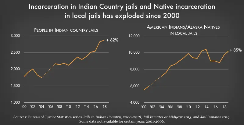


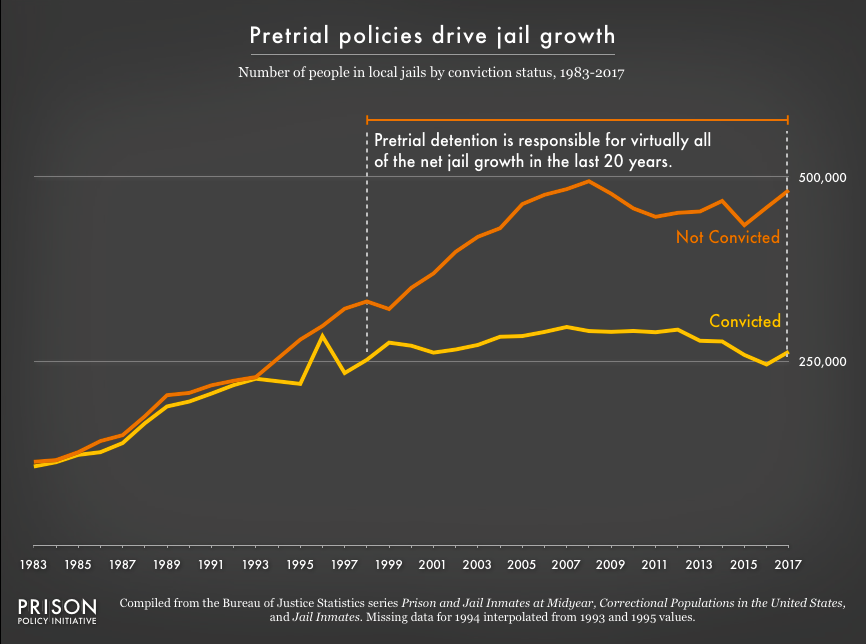
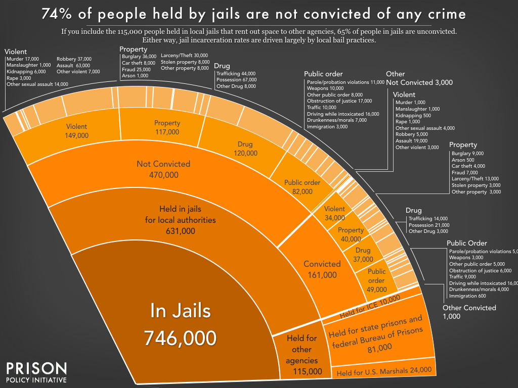